Lab 5: Machine Learning in Hydrology
Using Tidymodels & CAMELS Data
Introduction
In this lab, we will explore predictive modeling in hydrology using the tidymodels framework and the CAMELS (Catchment Attributes and Meteorology for Large-sample Studies) dataset.
What is tidymodels?
tidymodels is an R framework designed for machine learning and statistical modeling. Built on the principles of the tidyverse, tidymodels provides a consistent and modular approach to tasks like data preprocessing, model training, evaluation, and validation. By leveraging the strengths of packages such as recipes, parsnip, and yardstick, tidymodels streamlines the modeling workflow, making it easier to experiment with different models while maintaining reproducibility and interpretability.
What is the CAMELS dataset?
The CAMELS dataset is a widely used resource in hydrology and environmental science, providing data on over 500 self-draining river basins across the United States. It includes meteorological forcings, streamflow observations, and catchment attributes such as land cover, topography, and soil properties. This dataset is particularly valuable for large-sample hydrology studies, enabling researchers to develop and test models across diverse climatic and physiographic conditions.
In this lab, we will focus on predicting mean streamflow for these basins using their associated characteristics. CAMELS has been instrumental in various hydrologic and machine learning applications, including:
Calibrating Hydrologic Models – Used for parameter tuning in models like SAC-SMA, VIC, and HBV, improving regional and large-sample studies.
Training Machine Learning Models – Supports deep learning (e.g., LSTMs) and regression-based streamflow predictions, often outperforming traditional methods.
Understanding Model Behavior – Assists in assessing model generalization, uncertainty analysis, and the role of catchment attributes.
Benchmarking & Regionalization – Facilitates large-scale model comparisons and parameter transfer to ungauged basins.
Hybrid Modeling – Enhances physics-based models with machine learning for bias correction and improved hydrologic simulations.
A notable study by Kratzert et al. (2019) demonstrated that LSTMs can outperform conceptual models in streamflow prediction. As part of this lab, we will explore how to programmatically download and load the data into R.
What’s in the data?
Each record in the CAMELS dataset represents a unique river basin, identified by an outlet USGS NWIS gauge_id. The dataset contains a mix of continuous and categorical variables, including meteorological, catchment, and streamflow summaries.
The data we are going to download are the basin-level summaries. For example, if we looked at row 1 of the data (Gage: 01013500), all of the attribute values are areal averages over the drainage basin shown below, while the flow metrics are associated with the outlet gage (in red). We can use dataRetrieval::findNLDI() to fetch the basin polygon and upstream flowlines:
# Use the `findNLDI` function to get the basin and flowlines for the first gauge
basin <- dataRetrieval::findNLDI(nwis = "01013500",
                                 # Navigate the "upper tributaries" of the basin
                                 nav = "UT",
                                 # Return the basin and flowlines
                                 find = c("basin", "flowlines"))

# Plot the basin, flowlines, and gauge ...
ggplot() +
  geom_sf(data = basin$basin, fill = "lightblue") +
  geom_sf(data = basin$UT_flowlines, color = "blue") +
  geom_sf(data = basin$origin, color = "red") +
  theme_minimal()
Lab Goals
This lab’s worked example grounds the minimum tidymodels pipeline — split, recipe, workflow, fit, evaluate. Q3 and Q4 then ask you to extend that foundation with everything taught in the lectures.
By the end of the lab you will have:
- Programmatically downloaded CAMELS data and joined basin-level attribute files into a modeling-ready frame.
- Specified a
recipe, dropped it into aworkflow, and compared multiple models viaworkflow_setagainst cross-validated resamples (Week 5-1). - Extracted variable importance and interpreted predictor ranks through the geographic-proxy lens (Week 5-2).
- Evaluated with spatial cross-validation and reported the honest gap between random and spatial CV (Week 5-2).
- Tuned hyperparameters with
tune_grid()and a named grid, then finalized withlast_fit()(Week 6-1). - Produced a deployed Quarto page communicating the full pipeline.
The worked example below demonstrates (1) and a stripped-down (2). You’ll apply the remaining capabilities — full workflow comparison, spatial CV, VIP, tuning, and last_fit() — in Q4 using the lecture material as reference.
Lab Set Up
- Make a new R project where you want this work to take place.
- Create a Quarto document called
lab-05.qmdin the project folder. - Create a
datadirectory in your project folder. - Instantiate a git archive with
usethis::use_git() - Connect it to a Github repository with
usethis::use_github()
Let’s start by loading the necessary libraries for this lab (you may need to install some!):
library(tidyverse)
library(tidymodels)
library(powerjoin)
library(glue)
library(vip)
library(baguette)
Data Download
The CAMELS dataset is archived on Zenodo. Scroll down to the file listing — you will see a set of .txt files (climate, geology, soil, topography, vegetation, hydrology summaries per basin), along with a PDF describing every column. Each file has a direct-download link of the form https://zenodo.org/records/15529996/files/<filename>?download=1.
We will point all of our downloads at that root:
root <- 'https://zenodo.org/records/15529996/files'Getting the documentation PDF
We can download the documentation PDF which provides descriptions for the various columns (many are not self-explanatory). We use download.file to pull it into our data/ directory — binary files like PDFs need mode = "wb" on Windows.
download.file('https://zenodo.org/records/15529996/files/camels_attributes_v2.0.pdf?download=1',
              '../data/camels_attributes_v2.0.pdf',
              mode = 'wb')
Getting Basin characteristics
Now we want to download the .txt files that store the actual data documented in the PDF. Doing this file by file (like we did with the PDF) is possible, but lets look at a better/easier way…
- Lets create a vector storing the data types/file names we want to download:
types <- c("clim", "geol", "soil", "topo", "vege", "hydro")
glue
The glue package provides an efficient way to interpolate and manipulate strings. It is particularly useful for dynamically constructing text, formatting outputs, and embedding R expressions within strings.
Key Features of glue:
- String Interpolation: Embed R expressions inside strings using
{}. - Improved Readability: Eliminates the need for cumbersome
paste(),paste0()andsprintf()commands. - Multi-line Strings: Easily handle multi-line text formatting.
- Safe and Efficient: Optimized for performance and readability.
Basic Usage
- To use
glue, you need to load the package and then call theglue()function with the desired string template. You can embed R expressions within curly braces{}to interpolate values into the string.
class <- "ESS 330"
year  <- 2024

glue("We are taking {class} together in {year}")
We are taking ESS 330 together in 2024Multiples
- You can also use glue to interpolate multiple values at once
classes <- c("ESS 330", "ESS 523c")

glue("We are taking {classes} together in {year}")
We are taking ESS 330 together in 2024
We are taking ESS 523c together in 2024- Using
glue, we can construct the needed URLs and file names for the data we want to download. Zenodo direct-download links end with?download=1, so we append that to the remote URL but keep the local filename clean:
# Where the files live online ...
remote_files  <- glue('{root}/camels_{types}.txt?download=1')
# where we want to download the data ...
local_files <- glue('data/camels_{types}.txt')- Now we can download the data:
walk2comes from thepurrrpackage and is used to apply a function to multiple arguments in parallel (much likemap2works over paired lists). Here, we are askingwalk2to pass the first element ofremote_filesand the first element oflocal_filesto thedownload.filefunction to download the data, and settingquiet = TRUEto suppress output. The process is then iterated for the second element of each vector, and so on.
walk2(remote_files, local_files, download.file, quiet = TRUE)- Once downloaded, the data can be read it into R using
readr::read_delim(), again instead of applying this to each file individually, we can usemapto apply the function to each element of thelocal_fileslist.
# Read and merge data
camels <- map(local_files, read_delim, show_col_types = FALSE) - This gives us a list of data.frames, one for each file that we want to merge into a single table. So far in class we have focused on *_join functions to merge data based on a primary and foreign key relationship.
In this current list, we have >2 tables, but, have a shared column called gauge_id that we can use to merge the data. However, since we have more then a left and right hand table, we need a more robust tool. We will use the powerjoin package to merge the data into a single data frame. powerjoin is a flexible package for joining lists of data.frames. It provides a wide range of join types, including inner, left, right, full, semi, anti, and cross joins making it a versatile tool for data manipulation and analysis, and one that should feel familiar to users of dplyr.
In this case, we are join to merge every data.frame in the list (n = 6) by the shared gauge_id column. Since we want to keep all data, we want a full join.
camels <- power_full_join(camels ,by = 'gauge_id')
Note
Alternatively, we could have read straight form the urls. Strongly consider the implications of this approach as the longevity and persistence of the data is not guaranteed.
# Read and merge data
camels <- map(remote_files, read_delim, show_col_types = FALSE) |>
  power_full_join(by = 'gauge_id')
Question 1: Your Turn (15 points)
Exploratory Data Analysis
First, lets make a map of the sites. Use the borders() ggplot function to add state boundaries to the map and initially color the points by the mean flow (q_mean) at each site.
ggplot(data = camels, aes(x = gauge_lon, y = gauge_lat)) +
  borders("state", colour = "gray50") +
  geom_point(aes(color = q_mean)) +
  scale_color_gradient(low = "pink", high = "dodgerblue") +
  ggthemes::theme_map()
We can take a moment here to learn a few new things about ggplot2!
Color scales
In ggplot, sometimes you want different things (like bars, dots, or lines) to have different colors. But how does R know which colors to use? That’s where color scales come in!
scales can be used to map data values to colors (scale_color_*) or fill aesthetics (scale_fill_*). There are two main types of color scales:
- Discrete color scales – for things that are categories, like “apples,” “bananas,” and “cherries.” Each gets its own separate color.
scale_color_manual(values = c("red", "yellow", "pink")) #lets you pick your own colors.Or
scale_color_brewer(palette = "Set1") #uses a built-in color set.- Continuous color scales – for numbers, like temperature (cold to hot) or height (short to tall). The color changes smoothly.
scale_color_gradient(low = "blue", high = "red") #makes small numbers blue and big numbers red.Question 2: Your Turn (20 points)
Model Preparation
As an initial analysis, lets look at the relationship between aridity, rainfall and mean flow. First, lets make sure there is not significant correlation between these variables. Here, we make sure to drop NAs and only view the 3 columns of interest.
camels |>
  select(aridity, p_mean, q_mean) |>
  drop_na() |>
  cor()
aridity p_mean q_mean
aridity 1.0000000 -0.7550090 -0.5817771
p_mean -0.7550090 1.0000000 0.8865757
q_mean -0.5817771 0.8865757 1.0000000As expected, there is a strong correlation between rainfall and mean flow, and an inverse correlation between aridity and rainfall. While both are high, we are going to see if we can build a model to predict mean flow using aridity and rainfall.
Visual EDA
- Lets start by looking that the 3 dimensions (variables) of this data. We’ll start with a XY plot of aridity and rainfall. We are going to use the
scale_color_viridis_c()function to color the points by theq_meancolumn. This scale functions maps the color of the points to the values in theq_meancolumn along the viridis continuous (c) palette. Because ascale_color_*function is applied, it maps to the known color aesthetic in the plot.
# Create a scatter plot of aridity vs rainfall
ggplot(camels, aes(x = aridity, y = p_mean)) +
  # Add points colored by mean flow
  geom_point(aes(color = q_mean)) +
  # Add a linear regression line
  geom_smooth(method = "lm", color = "red", linetype = 2) +
  # Apply the viridis color scale
  scale_color_viridis_c() +
  # Add a title, axis labels, and theme (w/ legend on the bottom)
  theme_linedraw() +
  theme(legend.position = "bottom") +
  labs(title = "Aridity vs Rainfall vs Runoff",
       x = "Aridity",
       y = "Rainfall",
       color = "Mean Flow")
`geom_smooth()` using formula = 'y ~ x'
Ok! so it looks like there is a relationship between rainfall, aridity, and rainfall but it looks like an exponential decay function and is certainly not linear.
To test a transformation, we can log transform the x and y axes using the scale_x_log10() and scale_y_log10() functions:
ggplot(camels, aes(x = aridity, y = p_mean)) +
  geom_point(aes(color = q_mean)) +
  geom_smooth(method = "lm") +
  scale_color_viridis_c() +
  # Apply log transformations to the x and y axes
  scale_x_log10() +
  scale_y_log10() +
  theme_linedraw() +
  theme(legend.position = "bottom") +
  labs(title = "Aridity vs Rainfall vs Runoff",
       x = "Aridity",
       y = "Rainfall",
       color = "Mean Flow")
`geom_smooth()` using formula = 'y ~ x'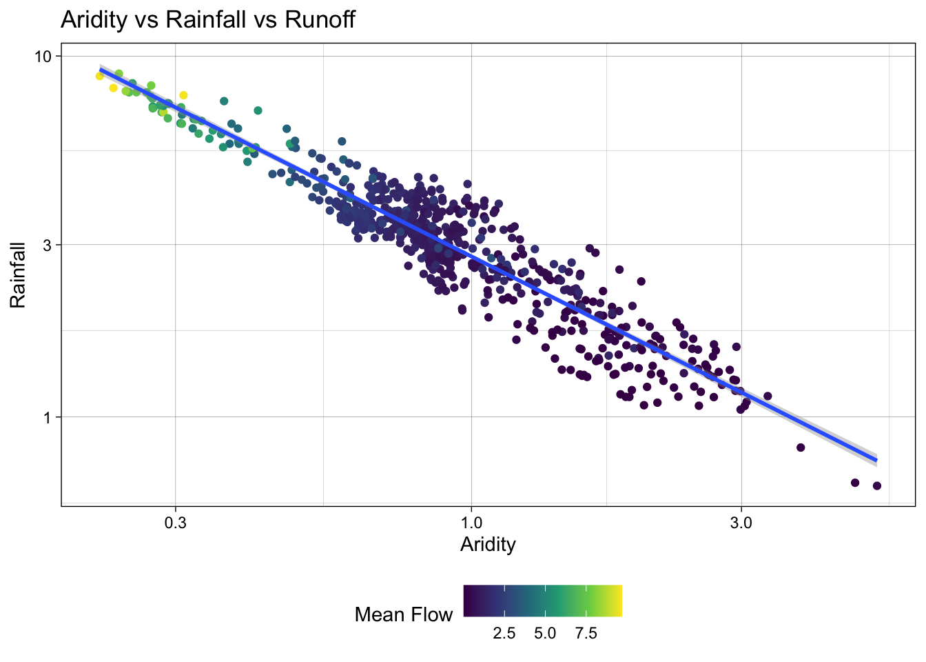
Great! We can see a log-log relationship between aridity and rainfall provides a more linear relationship. This is a common relationship in hydrology and is often used to estimate rainfall in ungauged basins. However, once the data is transformed, the lack of spread in the streamflow data is quite evident with high mean flow values being compressed to the low end of aridity/high end of rainfall.
To address this, we can visualize how a log transform may benefit the q_mean data as well. Since the data is represented by color, rather than an axis, we can use the trans (transform) argument in the scale_color_viridis_c() function to log transform the color scale.
ggplot(camels, aes(x = aridity, y = p_mean)) +
  geom_point(aes(color = q_mean)) +
  geom_smooth(method = "lm") +
  # Apply a log transformation to the color scale
  scale_color_viridis_c(trans = "log") +
  scale_x_log10() +
  scale_y_log10() +
  theme_linedraw() +
  theme(legend.position = "bottom",
        # Expand the legend width ...
        legend.key.width = unit(2.5, "cm"),
        legend.key.height = unit(.5, "cm")) +
  labs(title = "Aridity vs Rainfall vs Runoff",
       x = "Aridity",
       y = "Rainfall",
       color = "Mean Flow")
`geom_smooth()` using formula = 'y ~ x'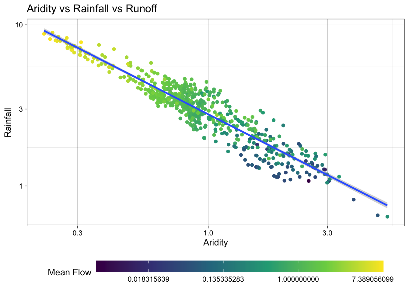
Excellent! Treating these three right skewed variables as log transformed, we can see a more evenly spread relationship between aridity, rainfall, and mean flow. This is a good sign for building a model to predict mean flow using aridity and rainfall.
Model Building
Lets start by splitting the data
First, we set a seed for reproducibility, then transform the q_mean column to a log scale. Remember it is error prone to apply transformations to the outcome variable within a recipe. So, we’ll do it a priori.
Once set, we can split the data into a training and testing set. We are going to use 80% of the data for training and 20% for testing. We are leaving stratification off in this minimal example, but as Week 5-1 covered, stratified splits often matter when the outcome has structure — you’ll revisit this choice in Q4.
Additionally, we are going to create a 10-fold cross validation dataset to help us evaluate multi-model setups.
set.seed(123)
# Bad form to perform simple transformations on the outcome variable within a
# recipe. So, we'll do it here.
camels <- camels |>
  mutate(logQmean = log(q_mean))

# Generate the split
camels_split <- initial_split(camels, prop = 0.8)
camels_train <- training(camels_split)
camels_test  <- testing(camels_split)

camels_cv <- vfold_cv(camels_train, v = 10)
Preprocessor: recipe
In Week 5-1 we saw how a recipe lets us declare a preprocessing pipeline once, estimate its parameters on the training data, and reuse it everywhere — folds, test set, new predictions.
We learned quite a lot about the data in the visual EDA. We know that the q_mean, aridity, and p_mean columns are right skewed and can be helped by log transformations. We also know that the relationship between aridity and p_mean is non-linear and can be helped by adding an interaction term. Let’s build a small recipe that encodes those decisions (your Q4 recipe will be bigger):
# Create a recipe to preprocess the data
rec <-  recipe(logQmean ~ aridity + p_mean, data = camels_train) %>%
  # Log transform the predictor variables (aridity and p_mean)
  step_log(all_predictors()) %>%
  # Add an interaction term between aridity and p_mean
  step_interact(terms = ~ aridity:p_mean) |>
  # Drop any rows with missing values in the pred
  step_naomit(all_predictors(), all_outcomes())
Naive base lm approach:
Ok, to start, lets do what we are comfortable with … fitting a linear model to the data. First, we use prep and bake on the training data to apply the recipe. Then, we fit a linear model to the data.
# Prepare the data
baked_data <- prep(rec, camels_train) |>
  bake(new_data = NULL)

# Interaction with lm
#  Base lm sets interaction terms with the * symbol
lm_base <- lm(logQmean ~ aridity * p_mean, data = baked_data)
summary(lm_base)
Call:
lm(formula = logQmean ~ aridity * p_mean, data = baked_data)

Residuals:
     Min       1Q   Median       3Q      Max
-2.91162 -0.21601 -0.00716  0.21230  2.85706

Coefficients:
               Estimate Std. Error t value Pr(>|t|)
(Intercept)    -1.77586    0.16365 -10.852  < 2e-16 ***
aridity        -0.88397    0.16145  -5.475 6.75e-08 ***
p_mean          1.48438    0.15511   9.570  < 2e-16 ***
aridity:p_mean  0.10484    0.07198   1.457    0.146
---
Signif. codes:  0 '***' 0.001 '**' 0.01 '*' 0.05 '.' 0.1 ' ' 1

Residual standard error: 0.5696 on 531 degrees of freedom
Multiple R-squared:  0.7697,    Adjusted R-squared:  0.7684
F-statistic: 591.6 on 3 and 531 DF,  p-value: < 2.2e-16
# Sanity Interaction term from recipe ... these should be equal!!
summary(lm(logQmean ~ aridity + p_mean + aridity_x_p_mean, data = baked_data))
Call:
lm(formula = logQmean ~ aridity + p_mean + aridity_x_p_mean,
    data = baked_data)

Residuals:
     Min       1Q   Median       3Q      Max
-2.91162 -0.21601 -0.00716  0.21230  2.85706

Coefficients:
                 Estimate Std. Error t value Pr(>|t|)
(Intercept)      -1.77586    0.16365 -10.852  < 2e-16 ***
aridity          -0.88397    0.16145  -5.475 6.75e-08 ***
p_mean            1.48438    0.15511   9.570  < 2e-16 ***
aridity_x_p_mean  0.10484    0.07198   1.457    0.146
---
Signif. codes:  0 '***' 0.001 '**' 0.01 '*' 0.05 '.' 0.1 ' ' 1

Residual standard error: 0.5696 on 531 degrees of freedom
Multiple R-squared:  0.7697,    Adjusted R-squared:  0.7684
F-statistic: 591.6 on 3 and 531 DF,  p-value: < 2.2e-16
Where things get a little messy…
Ok so now we have our trained model lm_base and want to validate it on the test data.
Remember a models ability to predict on new data is the most important part of the modeling process. It really doesnt matter how well it does on data it has already seen!
We have to be careful about how we do this with the base R approach:
Wrong version 1: augment
The broom package provides a convenient way to extract model predictions and residuals. We can use the augment function to add predicted values to the test data. However, if we use augment directly on the test data, we will get incorrect results because the preprocessing steps defined in the recipe object have not been applied to the test data.
nrow(camels_test)[1] 135nrow(camels_train)[1] 536broom::augment(lm_base, data = camels_test)Error in `$<-`:
! Assigned data `unname(predict(x, na.action = na.pass, ...))` must be
compatible with existing data.
✖ Existing data has 135 rows.
✖ Assigned data has 535 rows.
ℹ Only vectors of size 1 are recycled.
Caused by error in `vectbl_recycle_rhs_rows()`:
! Can't recycle input of size 535 to size 135.Wrong version 2: predict
The predict function can be used to make predictions on new data. However, if we use predict directly on the test data, we will get incorrect results because the preprocessing steps defined in the recipe object have not been applied to the test data.
camels_test$p2 = predict(lm_base, newdata = camels_test)

## Scales way off!
ggplot(camels_test, aes(x = p2, y = logQmean)) +
  geom_point() +
  # Linear fit line, no error bands
  geom_smooth(method = "lm", se = FALSE, linewidth = 1) +
  # 1:1 line
  geom_abline(color = "red", linewidth = 1) +
  labs(title = "Linear Model Using `predict()`",
       x = "Predicted Log Mean Flow",
       y = "Observed Log Mean Flow") +
  theme_linedraw()
`geom_smooth()` using formula = 'y ~ x'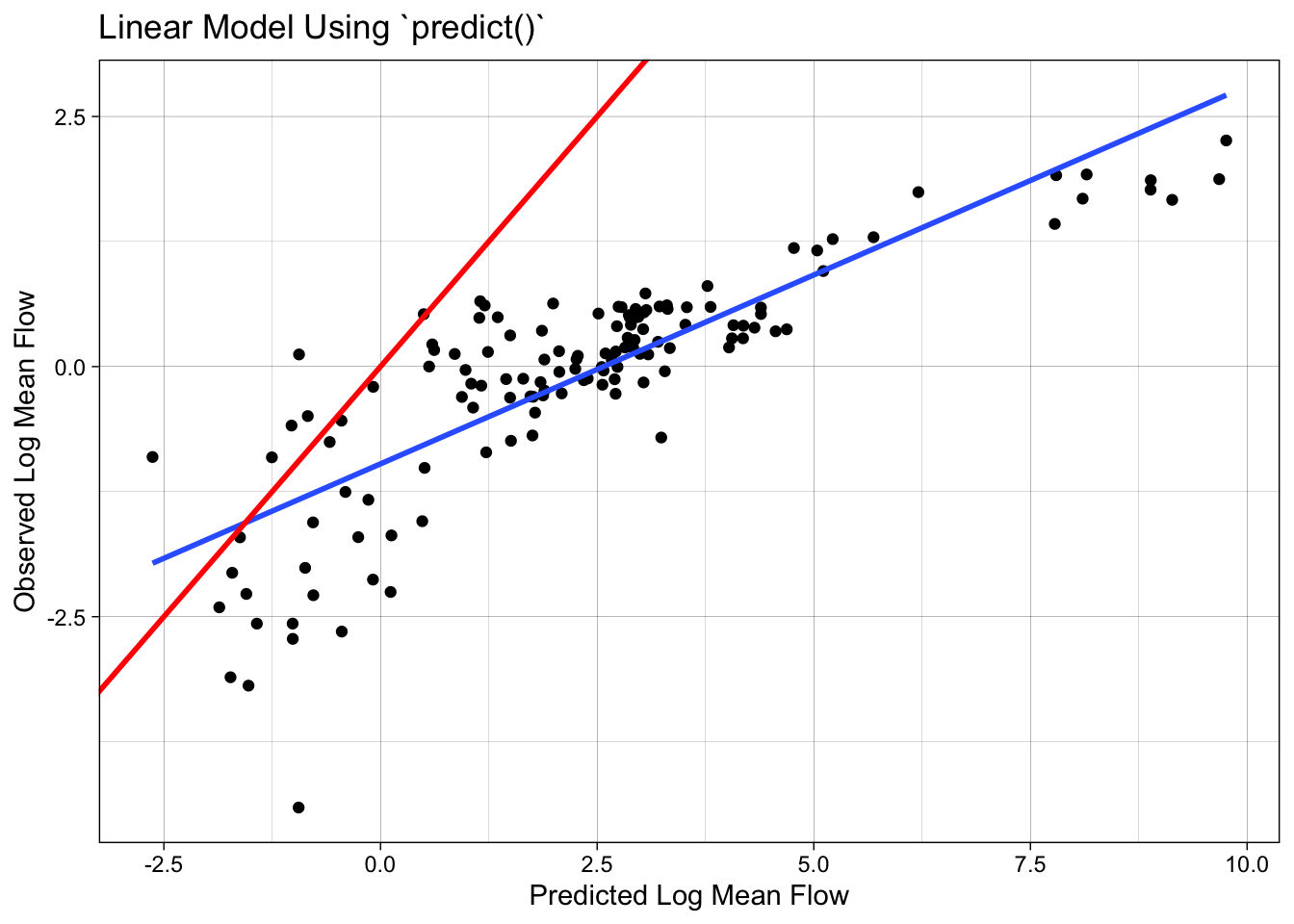
Correct version: prep -> bake -> predict
To correctly evaluate the model on the test data, we need to apply the same preprocessing steps to the test data that we applied to the training data. We can do this using the prep and bake functions with the recipe object. This ensures the test data is transformed in the same way as the training data before making predictions.
test_data <-  bake(prep(rec), new_data = camels_test)
test_data$lm_pred <- predict(lm_base, newdata = test_data)
Model Evaluation: statistical and visual
Now that we have the predicted values, we can evaluate the model using the metrics function from the yardstick package. This function calculates common regression metrics such as RMSE, R-squared, and MAE between the observed and predicted values.
metrics(test_data, truth = logQmean, estimate = lm_pred)# A tibble: 3 × 3
.metric .estimator .estimate
<chr> <chr> <dbl>
1 rmse standard 0.583
2 rsq standard 0.742
3 mae standard 0.390ggplot(test_data, aes(x = logQmean, y = lm_pred, colour = aridity)) +
# Apply a gradient color scale
scale_color_gradient2(low = "brown", mid = "orange", high = "darkgreen") +
geom_point() +
geom_abline(linetype = 2) +
theme_linedraw() +
labs(title = "Linear Model: Observed vs Predicted",
x = "Observed Log Mean Flow",
y = "Predicted Log Mean Flow",
color = "Aridity")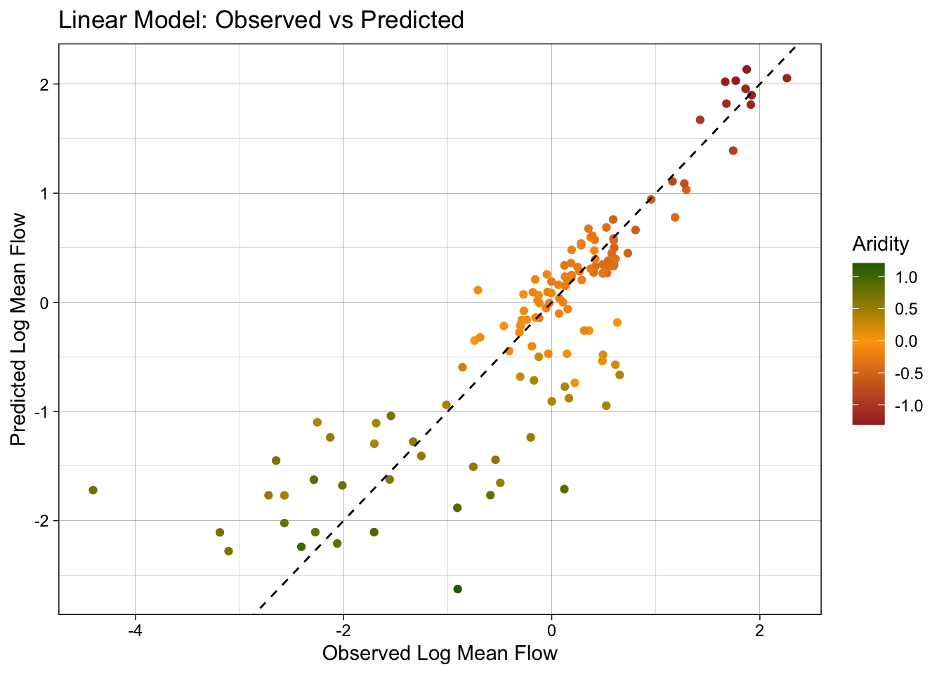
Ok so that was a bit burdensome, is really error prone (fragile), and is worthless if we wanted to test a different algorithm… lets look at a better approach!
Using a workflow instead
tidymodels provides a framework for building and evaluating models using a consistent and modular workflow. The workflows package lets you bundle a preprocessor (recipe or formula) and a model spec into a single object, then fit them together. This makes it easier to experiment with different models, compare performance, and ensure reproducibility.
Here, we use linear_reg() to define a linear regression model, set the engine to lm, and the mode to regression. We then add our recipe to the workflow, fit the model to the training data, and extract the coefficients.
# Define model
lm_model <- linear_reg() %>%
  # define the engine
  set_engine("lm") %>%
  # define the mode
  set_mode("regression")

# Instantiate a workflow ...
lm_wf <- workflow() %>%
  # Add the recipe
  add_recipe(rec) %>%
  # Add the model
  add_model(lm_model) %>%
  # Fit the model to the training data
  fit(data = camels_train)

# Extract the model coefficients from the workflow
summary(extract_fit_engine(lm_wf))$coefficients
Estimate Std. Error t value Pr(>|t|)
(Intercept) -1.7758557 0.16364755 -10.851710 6.463654e-25
aridity -0.8839738 0.16144589 -5.475357 6.745512e-08
p_mean 1.4843771 0.15511117 9.569762 4.022500e-20
aridity_x_p_mean 0.1048449 0.07198145 1.456555 1.458304e-01Lets ensure we replicated the results from the lm_base model. How do they look to you?
# From the base implementation
summary(lm_base)$coefficients
Estimate Std. Error t value Pr(>|t|)
(Intercept) -1.7758557 0.16364755 -10.851710 6.463654e-25
aridity -0.8839738 0.16144589 -5.475357 6.745512e-08
p_mean 1.4843771 0.15511117 9.569762 4.022500e-20
aridity:p_mean 0.1048449 0.07198145 1.456555 1.458304e-01Making Predictions
Now that lm_wf is a workflow, data is not embedded in the model, we can use augment with the new_data argument to make predictions on the test data.
#
lm_data <- augment(lm_wf, new_data = camels_test)
dim(lm_data)
[1] 135 62Model Evaluation: statistical and visual
As with EDA, graphical and statistical evaluation of the model is key. Here, we use the metrics function to extract the default regression metrics (rmse, rsq, mae) between the observed and predicted mean streamflow values.
We then create a scatter plot of the observed vs predicted values, colored by aridity, to visualize the model performance.
metrics(lm_data, truth = logQmean, estimate = .pred)# A tibble: 3 × 3
.metric .estimator .estimate
<chr> <chr> <dbl>
1 rmse standard 0.583
2 rsq standard 0.742
3 mae standard 0.390ggplot(lm_data, aes(x = logQmean, y = .pred, colour = aridity)) +
scale_color_viridis_c() +
geom_point() +
geom_abline() +
theme_linedraw()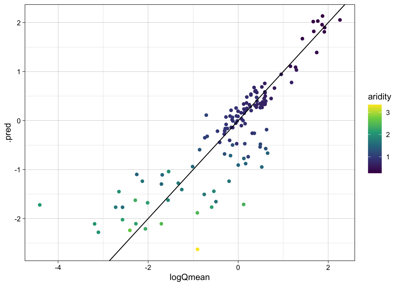
Switch it up!
The real power of this approach is that we can easily switch out the models/recipes and see how it performs. Here, we are going to instead use a random forest model to predict mean streamflow. We define a random forest model using the rand_forest function, set the engine to ranger, and the mode to regression. We then add the recipe, fit the model, and evaluate the skill.
library(baguette)
rf_model <- rand_forest() %>%
  set_engine("ranger", importance = "impurity") %>%
  set_mode("regression")

rf_wf <- workflow() %>%
  # Add the recipe
  add_recipe(rec) %>%
  # Add the model
  add_model(rf_model) %>%
  # Fit the model
  fit(data = camels_train)
Predictions
- Make predictions on the test data using the
augmentfunction and thenew_dataargument.
rf_data <- augment(rf_wf, new_data = camels_test)
dim(rf_data)
[1] 135 61Model Evaluation: statistical and visual
Evaluate the model using the metrics function and create a scatter plot of the observed vs predicted values, colored by aridity.
metrics(rf_data, truth = logQmean, estimate = .pred)# A tibble: 3 × 3
.metric .estimator .estimate
<chr> <chr> <dbl>
1 rmse standard 0.587
2 rsq standard 0.741
3 mae standard 0.363ggplot(rf_data, aes(x = logQmean, y = .pred, colour = aridity)) +
scale_color_viridis_c() +
geom_point() +
geom_abline() +
theme_linedraw()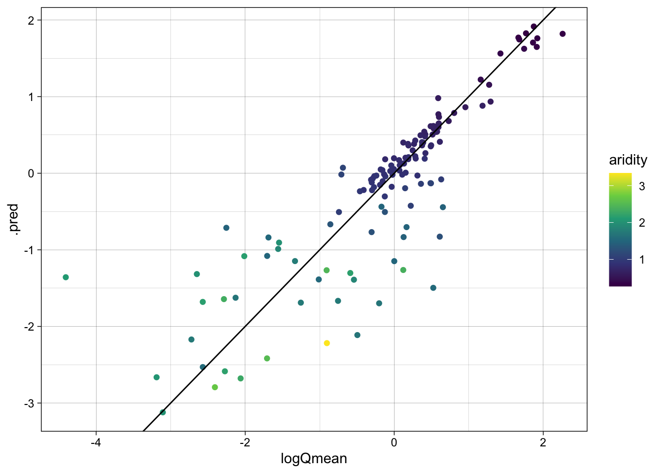
Awesome! We just set up a completely new model and were able to utilize all of the things we had done for the linear model. This is the power of the tidymodels framework!
That said, we still have some repetition — and, more importantly, we are eyeballing metrics on a single train/test split rather than comparing the two models head-to-head under a fair, resampled evaluation. workflow_set() lets us do both in a few lines.
A workflowset approach
workflow_set is a powerful tool for comparing multiple models on the same data. It allows you to define a set of workflows, fit them to the same data, and evaluate their performance using a common metric. Here, we are going to create a workflow_set object with the linear regression and random forest models, fit them to the training data, and compare their performance using the autoplot and rank_results functions.
wf <- workflow_set(list(rec), list(lm_model, rf_model)) %>%
  workflow_map('fit_resamples', resamples = camels_cv)

autoplot(wf)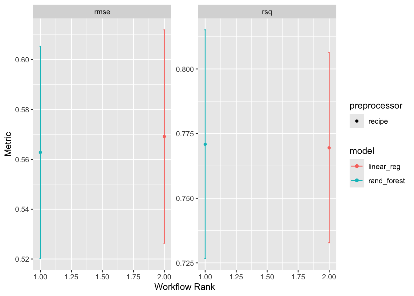
rank_results(wf, rank_metric = "rsq", select_best = TRUE)# A tibble: 4 × 9
wflow_id .config .metric mean std_err n preprocessor model rank
<chr> <chr> <chr> <dbl> <dbl> <int> <chr> <chr> <int>
1 recipe_rand_fore… pre0_m… rmse 0.563 0.0259 10 recipe rand… 1
2 recipe_rand_fore… pre0_m… rsq 0.771 0.0269 10 recipe rand… 1
3 recipe_linear_reg pre0_m… rmse 0.569 0.0260 10 recipe line… 2
4 recipe_linear_reg pre0_m… rsq 0.770 0.0223 10 recipe line… 2Overall it seems the random forest model is outperforming the linear model. This is not surprising given the non-linear relationship between the predictors and the outcome :)
Final Model
The workflow-set comparison above told us the random forest wins. Let’s fit it once more on the full training set so we have a single model object to interrogate:
final <- workflow() |>
  add_recipe(rec) |>
  add_model(rf_model) |>
  fit(data = camels_train)
Evaluation
A proper evaluation has three parts:
- Variable importance — which predictors is the model actually using? Week 5-2 introduced
vip::vip()paired withextract_fit_parsnip()to pull the underlying model object out of a fitted workflow. - Test-set metrics — apply the trained model to data it has never seen.
- A predicted-vs-observed plot — the visual sanity check; the 1:1 line should run through the cloud.
# Variable importance (Week 5-2 pattern)
final |>
  extract_fit_parsnip() |>
  vip::vip()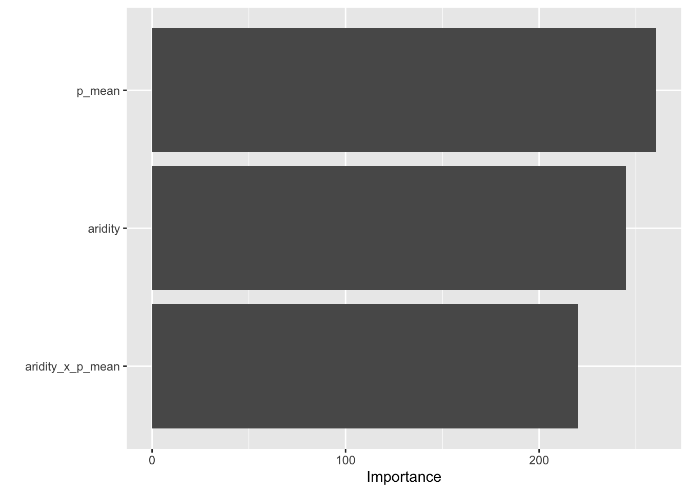
# Predictions on the test set
rf_data <- augment(final, new_data = camels_test)

# Regression metrics (rmse, rsq, mae by default)
metrics(rf_data, truth = logQmean, estimate = .pred)
# A tibble: 3 × 3
.metric .estimator .estimate
<chr> <chr> <dbl>
1 rmse standard 0.593
2 rsq standard 0.735
3 mae standard 0.366ggplot(rf_data, aes(x = logQmean, y = .pred, colour = aridity)) +
scale_color_viridis_c() +
geom_point() +
# 1:1 line — perfect prediction
geom_abline(linetype = 2) +
# Actual regression line for contrast
geom_smooth(method = "lm", col = 'red', linetype = 2, se = FALSE) +
theme_linedraw() +
labs(title = "Random Forest Model: Observed vs Predicted",
x = "Observed Log Mean Flow",
y = "Predicted Log Mean Flow",
color = "Aridity")`geom_smooth()` using formula = 'y ~ x'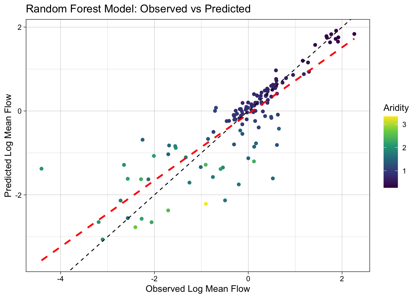
That’s the minimum end-to-end loop. Q4 asks you to do the full version: swap in spatial CV, tune the hyperparameters, and close with last_fit() — all patterns the lectures cover in detail.
Question 3: Your Turn! (40 points)
Extend the workflow_set above (which already contains the linear model and the random forest) by adding two more models from the Week 6-1 zoo:
Bridge to Q4: what the lectures cover
The worked example above stops at a single random-forest fit with default hyperparameters. Q4 asks you to extend it with the rest of the unit. Before starting, re-skim the relevant lecture sections — you’ll be lifting patterns directly from them:
| Q4 task | Lecture reference |
|---|---|
EDA with skimr/visdat, normality checks, stratification |
Week 5-1 — Exploratory Data Analysis, Data Normality, Stratification |
recipe design (impute, dummy, normalize, interact) |
Week 5-1 — Feature engineering with recipes, Common normalization techniques |
| Workflow sets across multiple models | Week 5-1 — Further simplification: workflowsets |
| Variable importance & geographic-proxy interpretation | Week 5-2 — Part 1 (VIP), Which predictors carry geography? |
Spatial cross-validation (spatial_block_cv, spatial_clustering_cv, spatial_leave_location_out_cv) |
Week 5-2 — Part 3, Applying this to your data, The same idea in regression |
| Random-vs-spatial CV gap as a leakage diagnostic | Week 5-2 — The moment of truth, What a leaky model looks like, The 2×2 comparison |
Hyperparameter tuning, named grids, finalize_workflow(), last_fit() |
Week 6-1 — Optimizing Models via Tuning, The final fit! |
If a line item in the rubric below doesn’t look familiar, that’s your cue to re-watch the relevant lecture slide — do not try to infer the API from this lab alone.
Question 4: Build your own (200 points)
Borrowing from the workflow presented above, build your own complete ML pipeline to predict mean streamflow using the CAMELS dataset.
This question asks you to apply the full toolkit from Week 5 and Week 6: EDA, recipes, workflow sets, spatial cross-validation (CAMELS is a spatial dataset — random CV will flatter your model), hyperparameter tuning, variable importance, and a clean final fit with last_fit(). Q4 is the bulk of the lab — budget time accordingly.
Tip
Benchmark: a well-built model typically achieves R² > 0.9 under random CV. Under spatial CV, expect a 0.05–0.10 drop — that’s honest generalization, not a failure. Report both. If spatial CV stays within ~0.05 of random CV, you have strong evidence your predictors carry transferable signal.
Data prep & EDA (30) — Week 5-1
Recipe (30) — Week 5-1
Define 3 models (30) — Week 6-1
Workflow set — compare with honest CV (35) — Week 5-2
With your preprocessing steps and models defined, build a workflow_set and compare the models across resamples. Because CAMELS basins are spatially distributed, a random vfold_cv can over-state performance if your model leans on geographic proximity — the Week 5-2 deck walks through this carefully, including when the gap is real and when it isn’t.
Tune the best model (25) — Week 6-1
Variable importance (25) — Week 5-2
Final fit & evaluate (25) — Week 6-1
Use the canonical tidymodels closing move (Week 6-1, The final fit!):
Rubric
Total: 300 points (Q4 = 200 pts / 67%)
Submission:
Once you have completed the above steps, you can submit your lab for grading. The lab should be submitted as a URL to your deployed repo page. The repo should contain the lab-05.qmd file with all the code, data, and output.
Good luck!