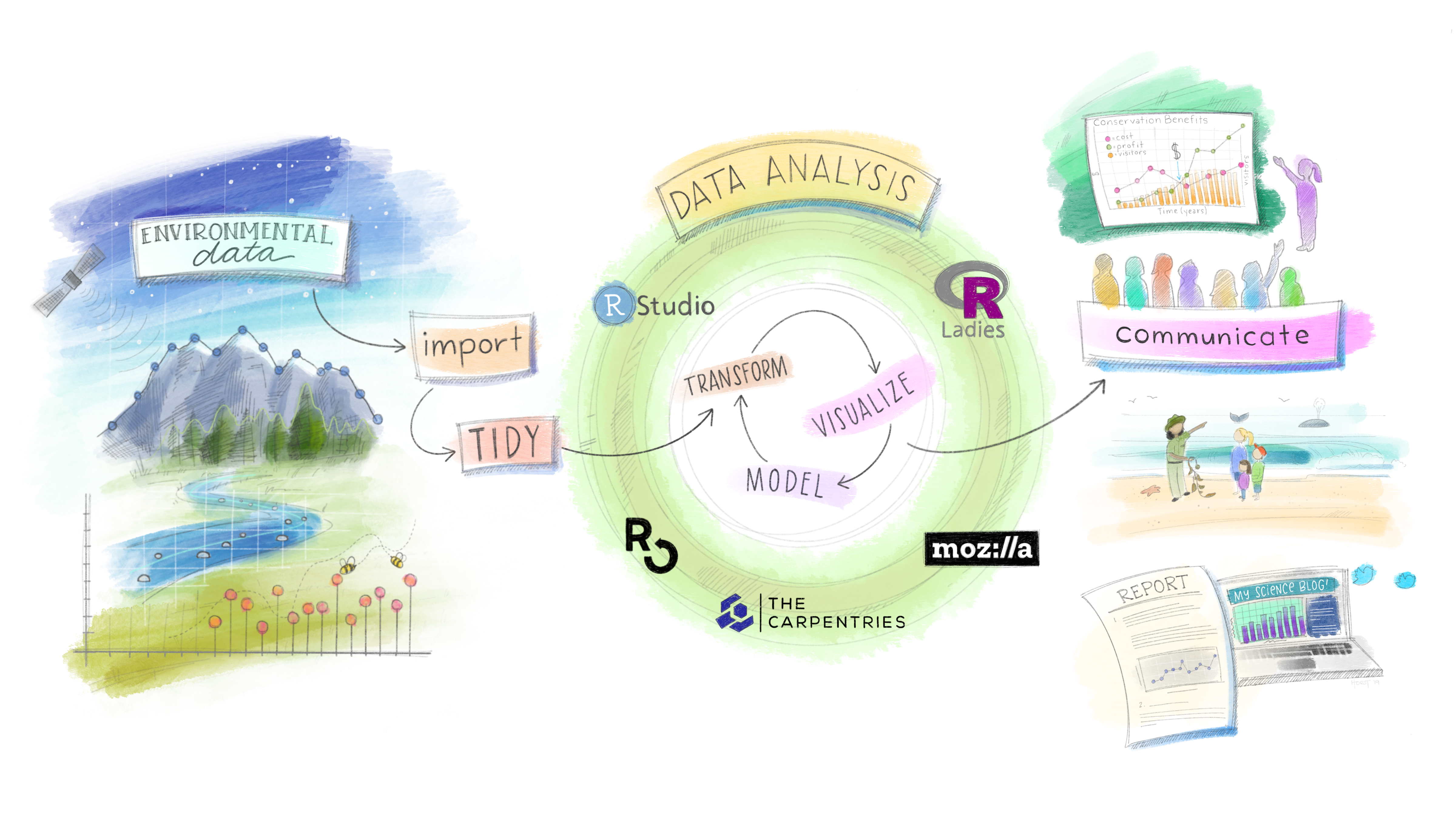
Week 1 | Day 2
Data Manipulation, Visualization & Relational Data
Tidy Data: The Assumed Shape
Tidy data follows three rules: each variable is a column, each observation is a row, each value is a cell. Every tidyverse tool assumes this shape.
When your data doesn’t conform, you fix the data — not the tools.
The Grammar of Data Manipulation
dplyr provides a consistent set of verbs for data manipulation:
| Verb | Does |
|---|---|
select() |
Picks variables based on their names. |
filter() |
Picks cases based on their values. |
mutate() |
Add or transform columns |
summarize() |
Reduces multiple values down to a single summary. |
arrange() |
Reorder rows |
group_by() |
Apply operations by group |
These all combine naturally. Learning the verbs is learning the language.
Connection to SQL
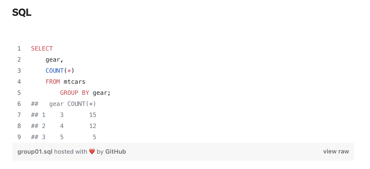
SQL (Structured Query Language) provides a language for databases to store, retrieve, and manage data.
Used in all major databases – PostgreSQL, MySQL, SQL Server, and more.
Essential for data jobs – Analysts, scientists, and engineers rely on it.
Utilized everywhere in business & tech – From small apps to big companies to governments
Building a Plot: Data→Aes→Geom
#> # A tibble: 142 × 6
#>   country     continent  year lifeExp      pop gdpPercap
#>   <fct>       <fct>     <int>   <dbl>    <int>     <dbl>
#> 1 Afghanistan Asia       2007    43.8 31889923      975.
#> 2 Albania     Europe     2007    76.4  3600523     5937.
#> 3 Algeria     Africa     2007    72.3 33333216     6223.
#> # ℹ 139 more rows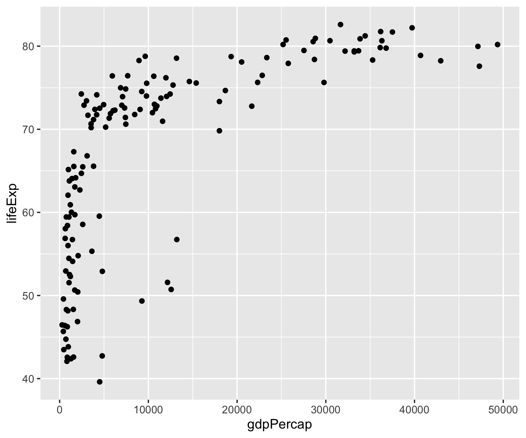
All ggplot2 plots follow the same structure: data + aesthetics (which variables to visual properties) + geometry (what shape).
Key point: Aesthetic mappings in aes() describe how variables are visualized — placed in ggplot(), they apply globally to all layers.
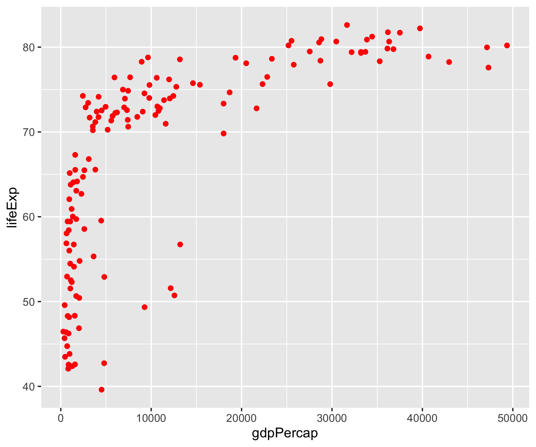
Fixed vs. Data-Driven Aesthetics
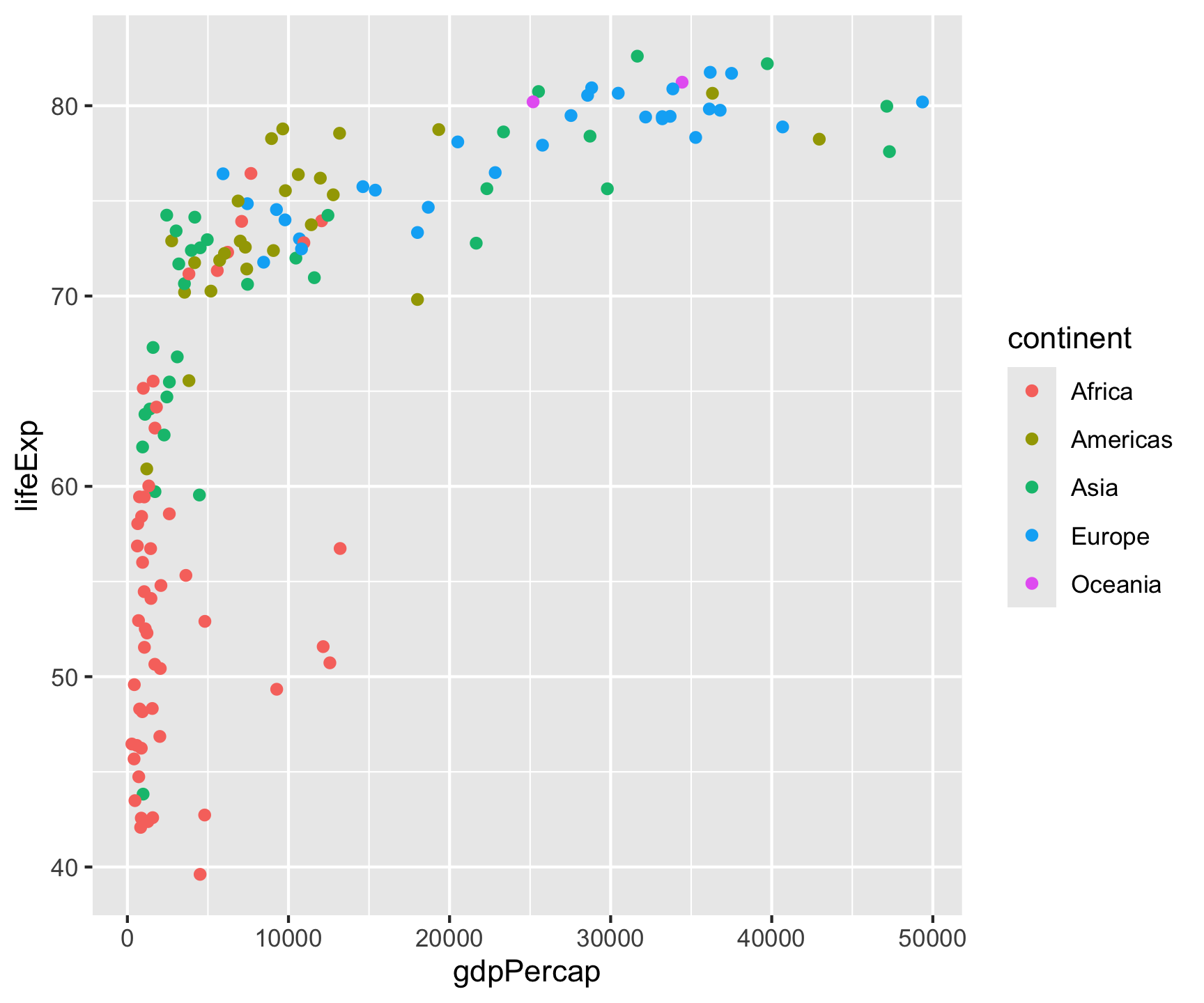
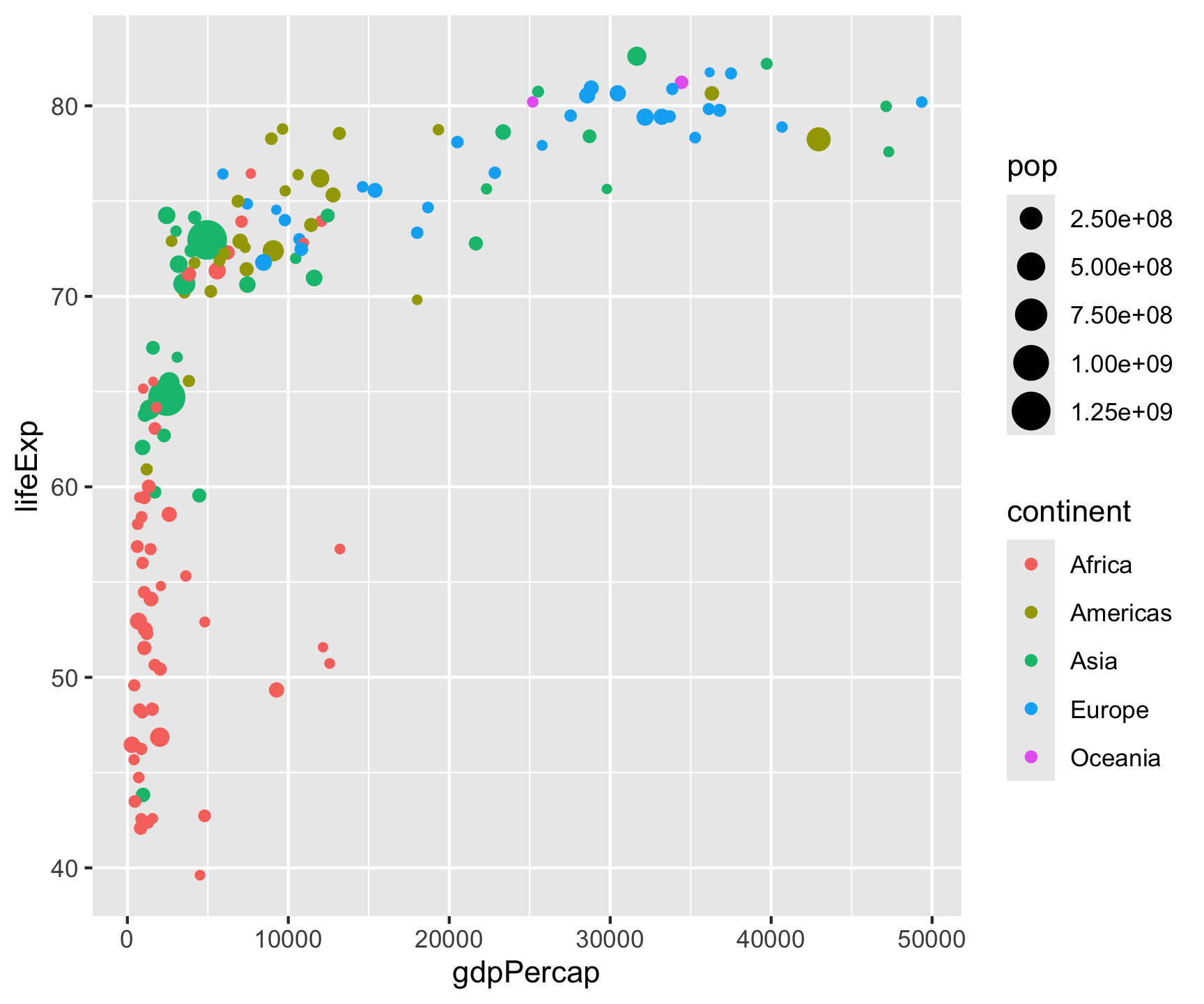
Step 2: Layers

Step 2: Layers
Step 2: Layers
Step 2: Layers

Step 2: Layers
Layers compose — each + adds a new geometric object:
Step 3: Labels
Step 3: Labels

Step 3: Labels
Step 3: Labels
Step 3: Labels
Step 3: Labels
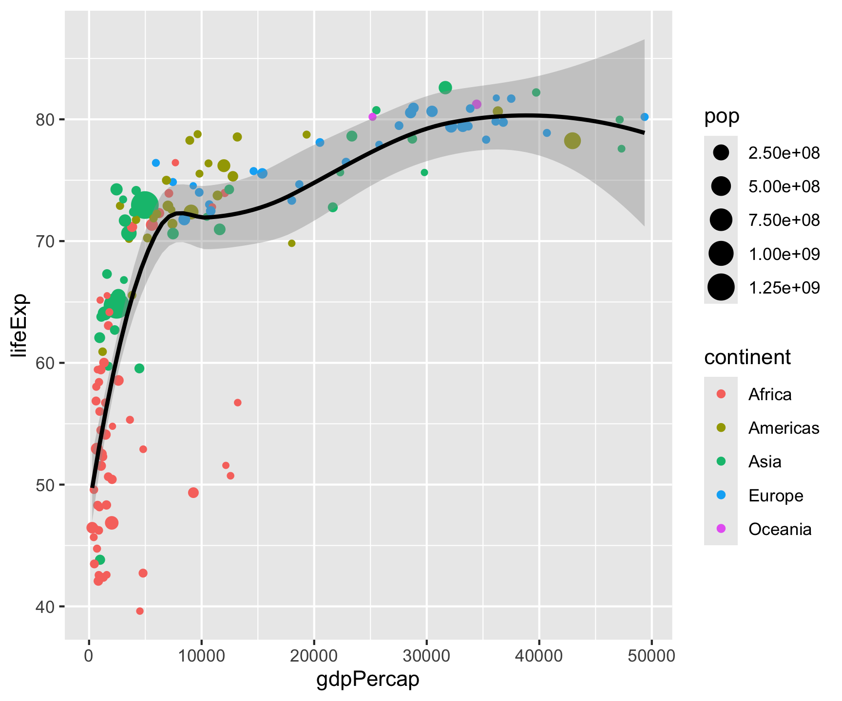
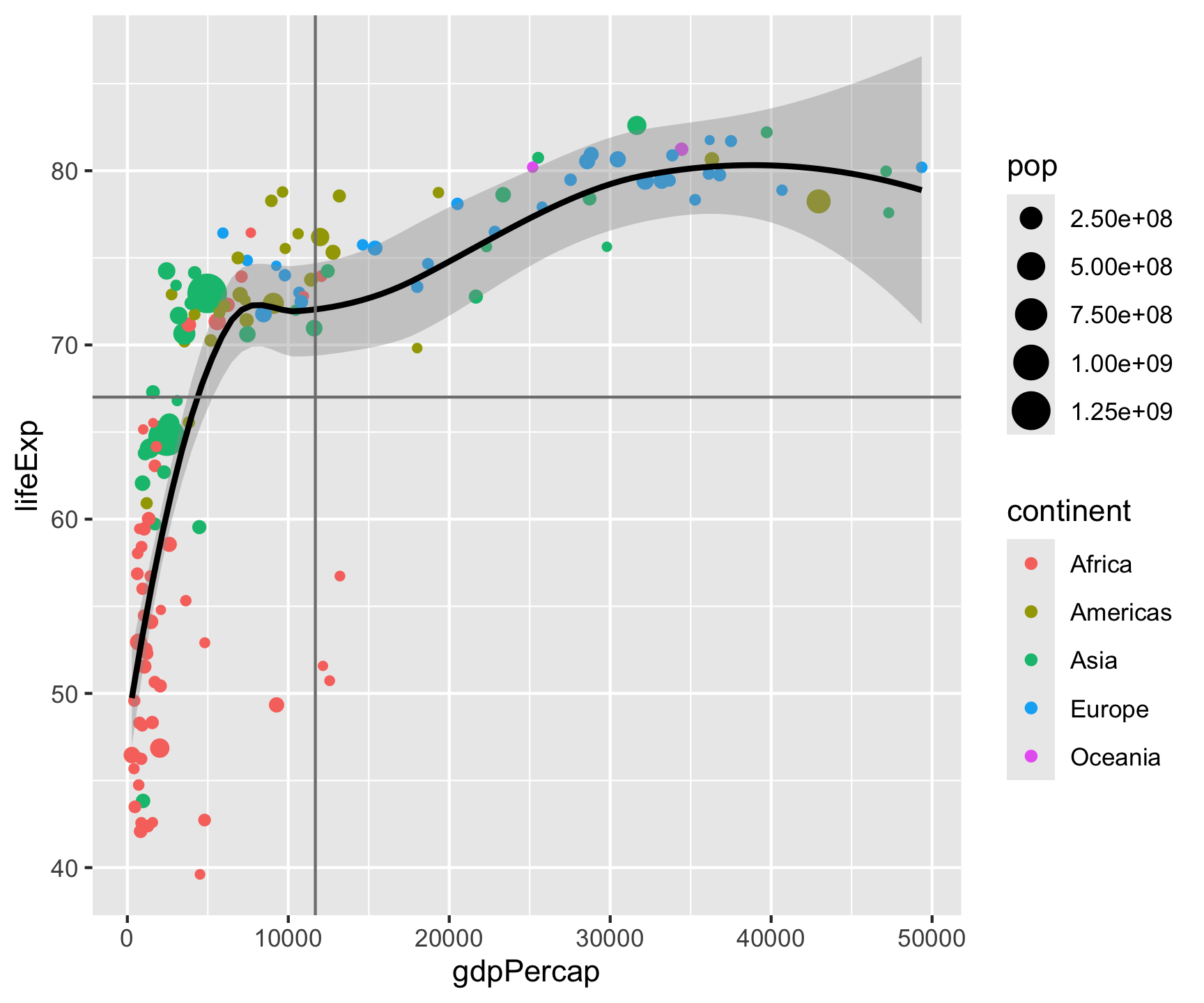
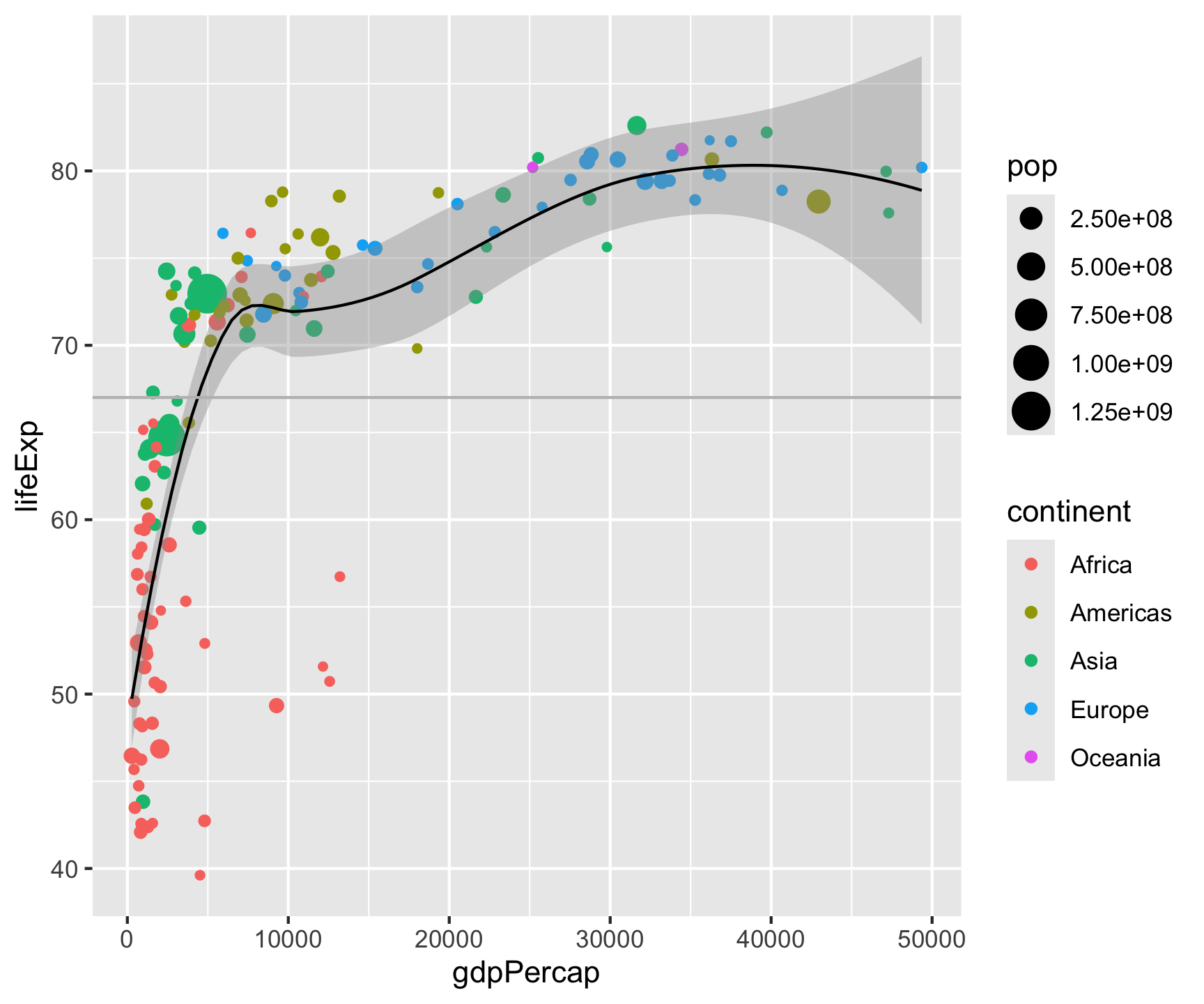
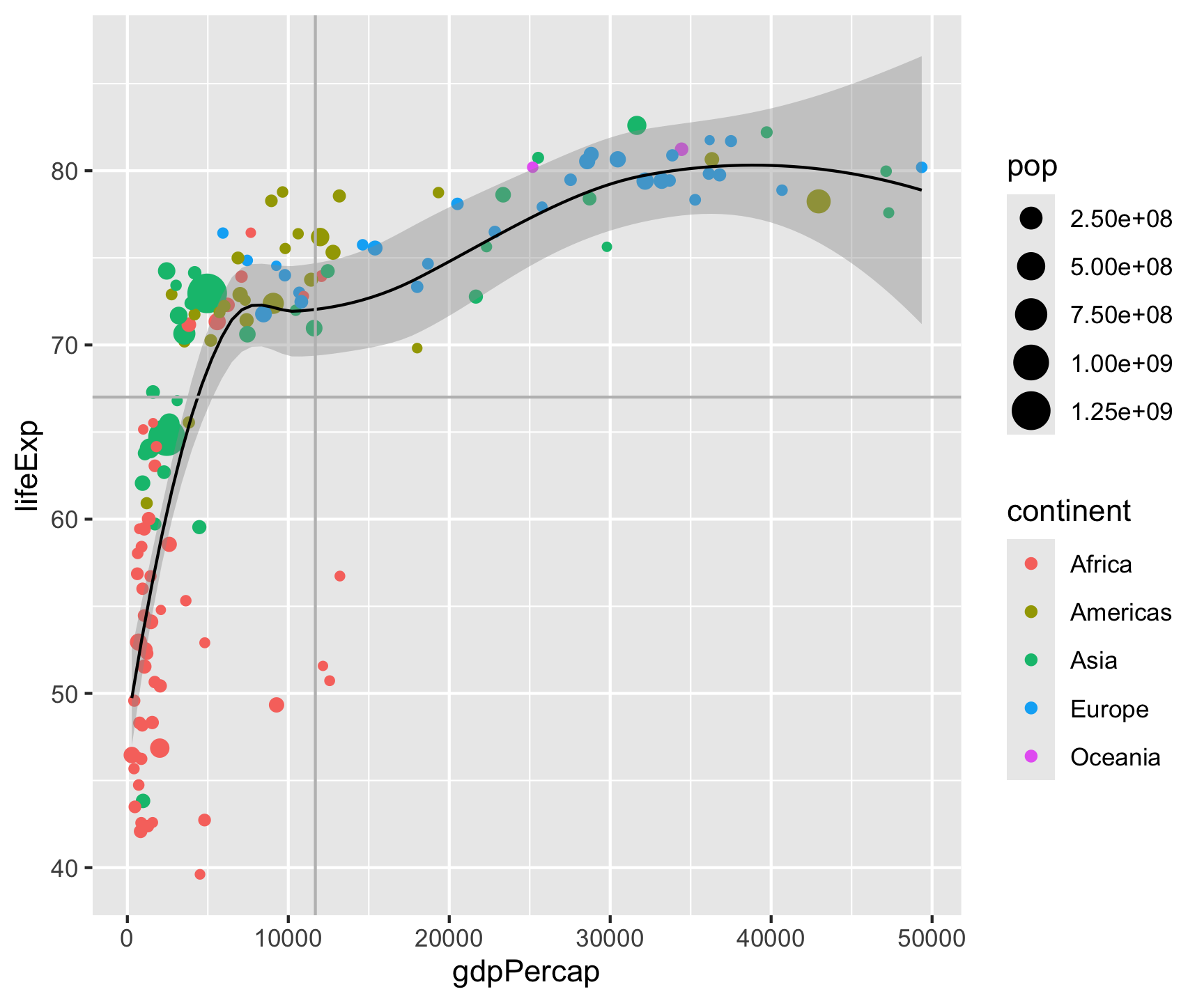
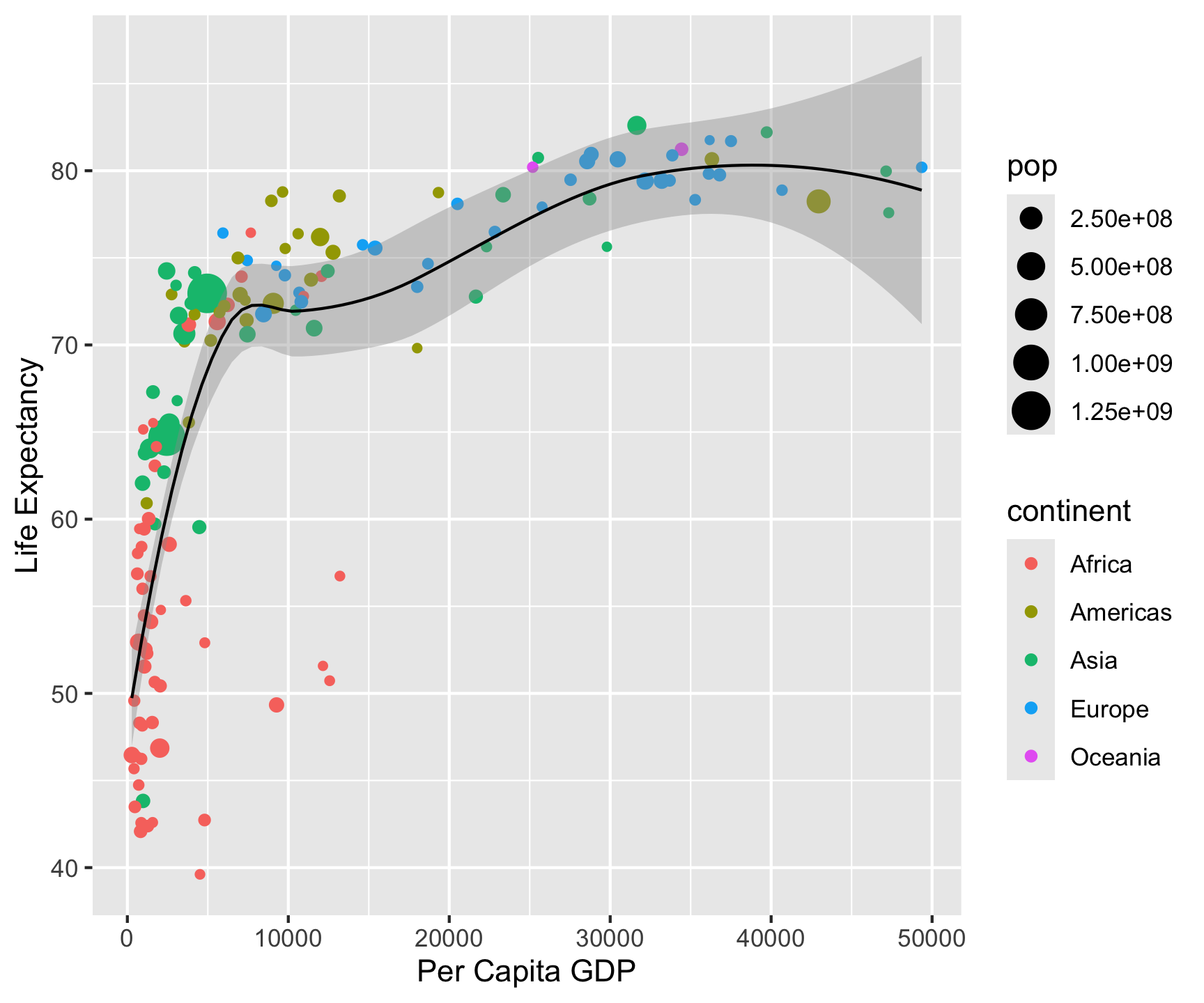
ggplot(data = gm2007, aes(x = gdpPercap, y = lifeExp)) +
geom_point(aes(color = continent, size = pop)) +
geom_smooth(color = "black", size = .5) +
geom_hline(yintercept = mean(gm2007$lifeExp), color = "gray") +
geom_vline(xintercept = mean(gm2007$gdpPercap), color = "gray") +
labs(title = "Per capita GDP versus life expectency in 2007",
x = "Per Capita GDP",
y = "Life Expectancy",
caption = "Based on Hans Rosling Plots",
subtitle = 'Data Source: Gapminder',
color = "",
size = "Population")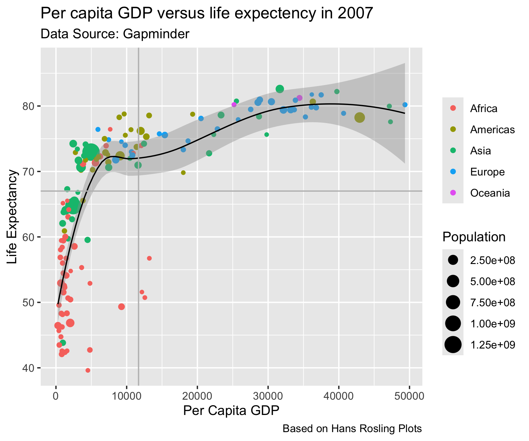
- Now that you have drawn the main parts of the graph. You might want to add labs that clarify what is being shown.
Step 4: Facets

Step 4: Facets

Step 4: Facets

Step 4: Facets
Step 4: Facets
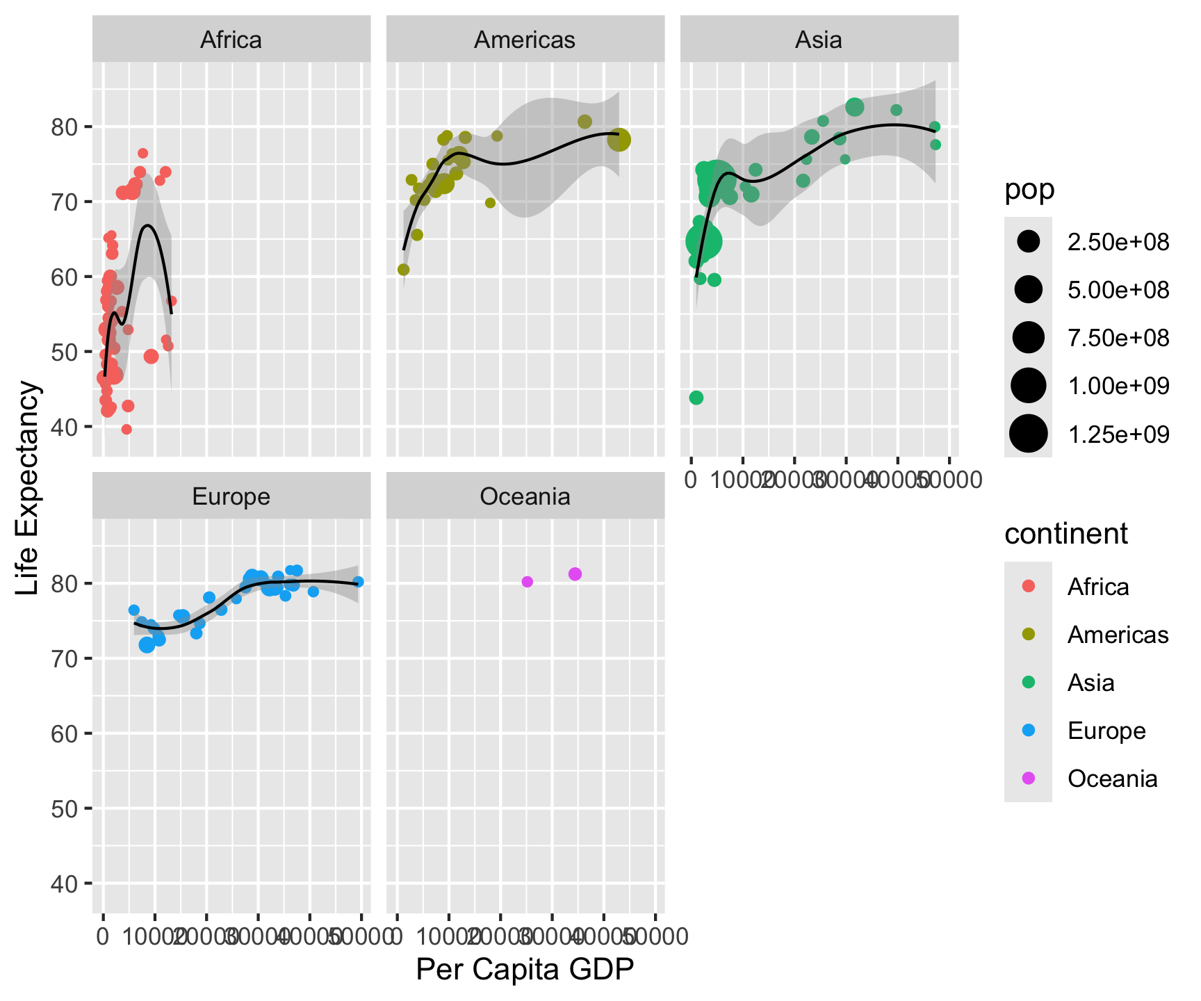
Split one plot into many by a categorical variable:
facet_wrap() vs. facet_grid()
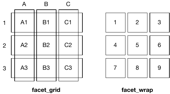
facet_wrap(~x): one faceting variable, auto-wraps into rows/columns — flexible layoutfacet_grid(y~x): two faceting variables, strict row-column grid — enforces structure
Use facet_wrap() for many categories without hierarchy; facet_grid() for structured two-way comparisons.
Built in Themes…

Built in Themes…

Built in Themes…
gm2007 %>%
ggplot(aes(x = gdpPercap, y = lifeExp)) +
geom_point(aes(color = continent, size = pop)) +
labs(title = "Per capita GDP versus life expectency in 2007",
x = "Per Capita GDP",
y = "Life Expectancy",
caption = "Based on Hans Rosling Plots",
subtitle = 'Data Source: Gapminder',
color = "",
size = "Population")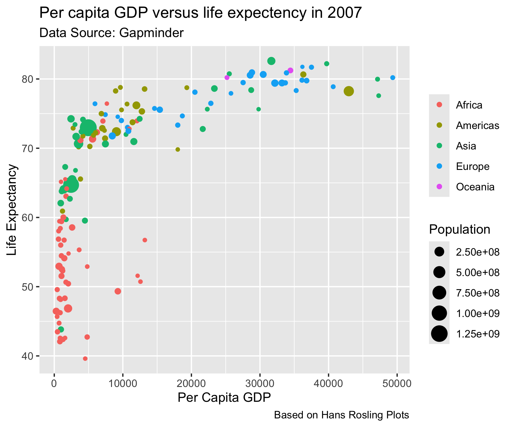
Built in Themes…
gm2007 %>%
  ggplot(aes(x = gdpPercap, y = lifeExp)) +
geom_point(aes(color = continent, size = pop)) +
labs(title = "Per capita GDP versus life expectency in 2007",
x = "Per Capita GDP",
y = "Life Expectancy",
caption = "Based on Hans Rosling Plots",
subtitle = 'Data Source: Gapminder',
color = "",
size = "Population") +
theme_bw()
Built in Themes…
gm2007 %>%
  ggplot(aes(x = gdpPercap, y = lifeExp)) +
  geom_point(aes(color = continent, size = pop)) +
  labs(title = "Per capita GDP versus life expectency in 2007",
       x = "Per Capita GDP",
       y = "Life Expectancy",
       caption = "Based on Hans Rosling Plots",
       subtitle = 'Data Source: Gapminder',
       color = "",
size = "Population") +
theme_bw() +
theme_dark()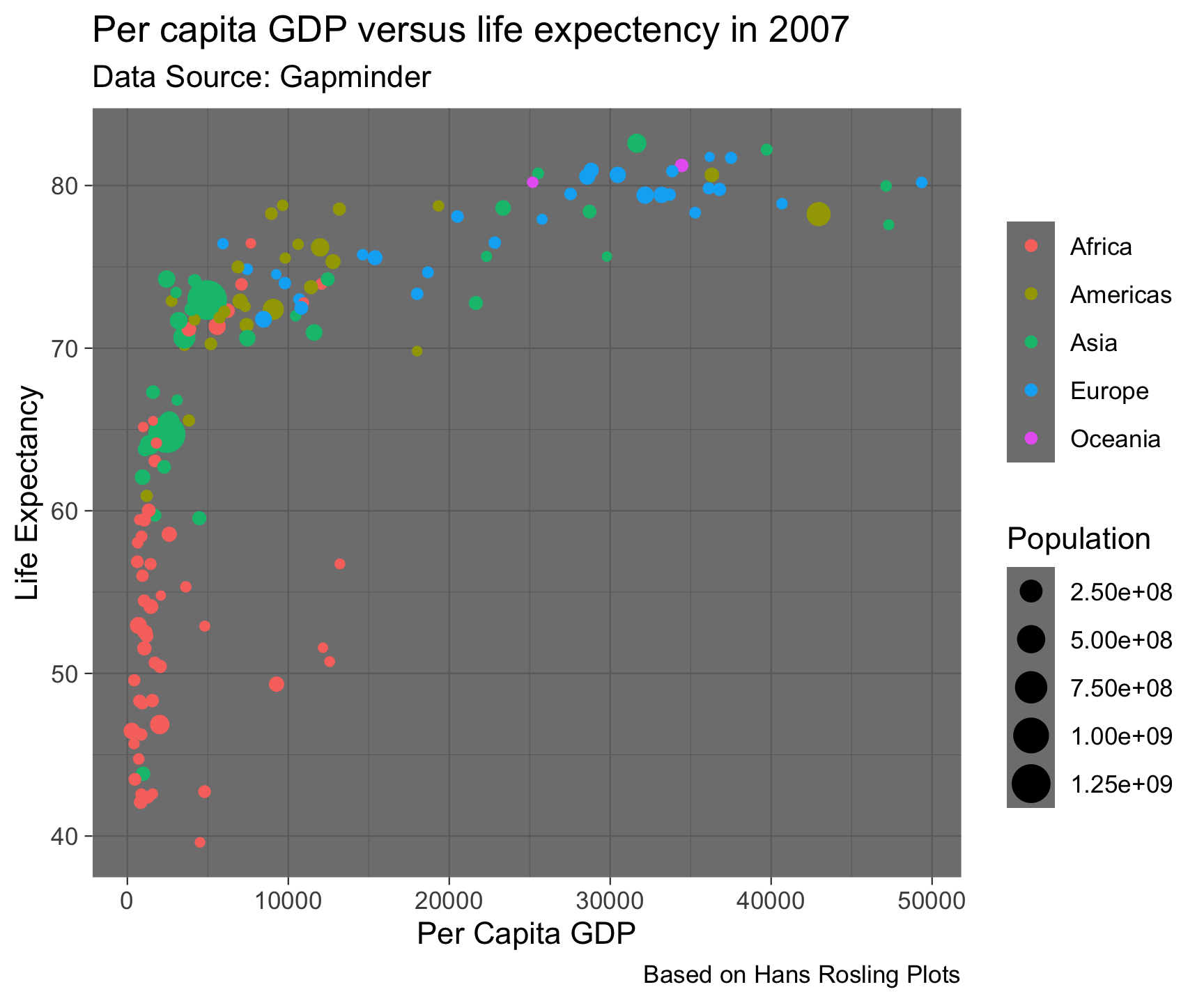
Built in Themes…
gm2007 %>%
  ggplot(aes(x = gdpPercap, y = lifeExp)) +
  geom_point(aes(color = continent, size = pop)) +
  labs(title = "Per capita GDP versus life expectency in 2007",
       x = "Per Capita GDP",
       y = "Life Expectancy",
       caption = "Based on Hans Rosling Plots",
       subtitle = 'Data Source: Gapminder',
       color = "",
       size = "Population") +
theme_bw() +
theme_dark() +
theme_gray()
Built in Themes…
gm2007 %>%
  ggplot(aes(x = gdpPercap, y = lifeExp)) +
  geom_point(aes(color = continent, size = pop)) +
  labs(title = "Per capita GDP versus life expectency in 2007",
       x = "Per Capita GDP",
       y = "Life Expectancy",
       caption = "Based on Hans Rosling Plots",
       subtitle = 'Data Source: Gapminder',
       color = "",
       size = "Population") +
  theme_bw() +
theme_dark() +
theme_gray() +
theme_minimal()
Built in Themes…
gm2007 %>%
  ggplot(aes(x = gdpPercap, y = lifeExp)) +
  geom_point(aes(color = continent, size = pop)) +
  labs(title = "Per capita GDP versus life expectency in 2007",
       x = "Per Capita GDP",
       y = "Life Expectancy",
       caption = "Based on Hans Rosling Plots",
       subtitle = 'Data Source: Gapminder',
       color = "",
       size = "Population") +
  theme_bw() +
  theme_dark() +
theme_gray() +
theme_minimal() +
theme_light()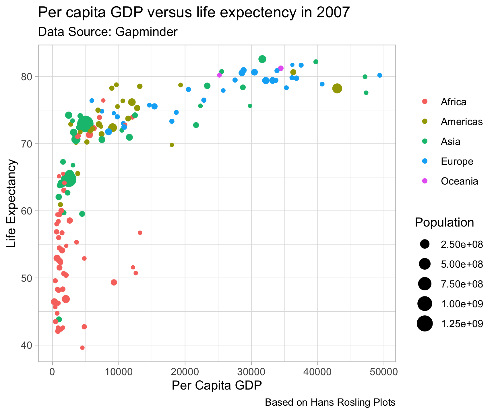
ggtheme package…

ggtheme package…

ggtheme package…
library(ggthemes)

gm2007 %>%
ggplot(aes(x = gdpPercap, y = lifeExp)) +
geom_point(aes(color = continent, size = pop)) +
labs(title = "Per capita GDP versus life expectency in 2007",
x = "Per Capita GDP",
y = "Life Expectancy",
caption = "Based on Hans Rosling Plots",
subtitle = 'Data Source: Gapminder',
color = "",
size = "Population")
ggtheme package…
library(ggthemes)

gm2007 %>%
ggplot(aes(x = gdpPercap, y = lifeExp)) +
geom_point(aes(color = continent, size = pop)) +
labs(title = "Per capita GDP versus life expectency in 2007",
x = "Per Capita GDP",
y = "Life Expectancy",
caption = "Based on Hans Rosling Plots",
subtitle = 'Data Source: Gapminder',
color = "",
size = "Population") +
ggthemes::theme_stata()
ggtheme package…
library(ggthemes)

gm2007 %>%
  ggplot(aes(x = gdpPercap, y = lifeExp)) +
geom_point(aes(color = continent, size = pop)) +
labs(title = "Per capita GDP versus life expectency in 2007",
x = "Per Capita GDP",
y = "Life Expectancy",
caption = "Based on Hans Rosling Plots",
subtitle = 'Data Source: Gapminder',
color = "",
size = "Population") +
ggthemes::theme_stata() +
ggthemes::theme_economist()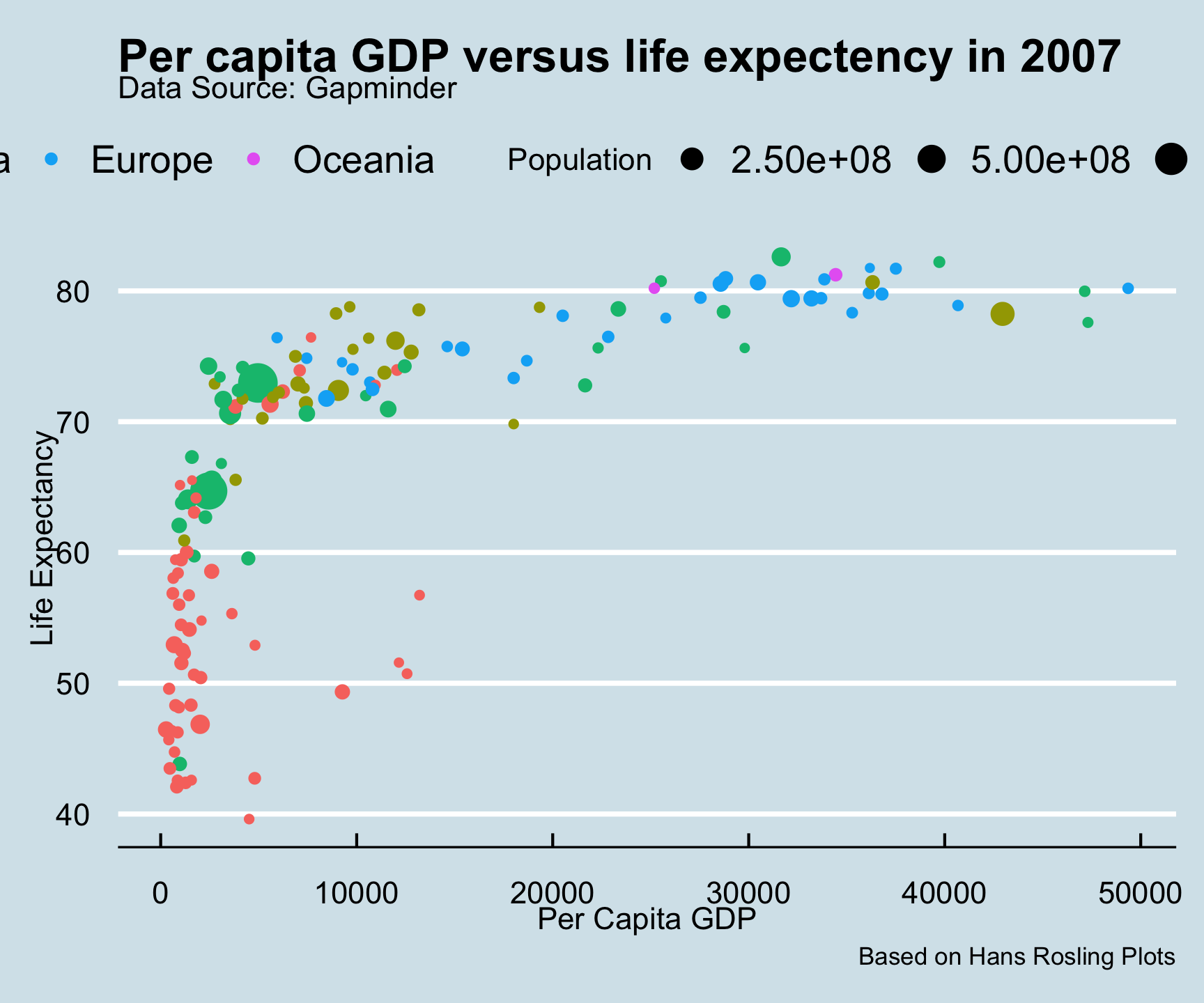
ggtheme package…
library(ggthemes)

gm2007 %>%
  ggplot(aes(x = gdpPercap, y = lifeExp)) +
  geom_point(aes(color = continent, size = pop)) +
  labs(title = "Per capita GDP versus life expectency in 2007",
       x = "Per Capita GDP",
       y = "Life Expectancy",
       caption = "Based on Hans Rosling Plots",
       subtitle = 'Data Source: Gapminder',
       color = "",
size = "Population") +
ggthemes::theme_stata() +
ggthemes::theme_economist() +
ggthemes::theme_economist_white()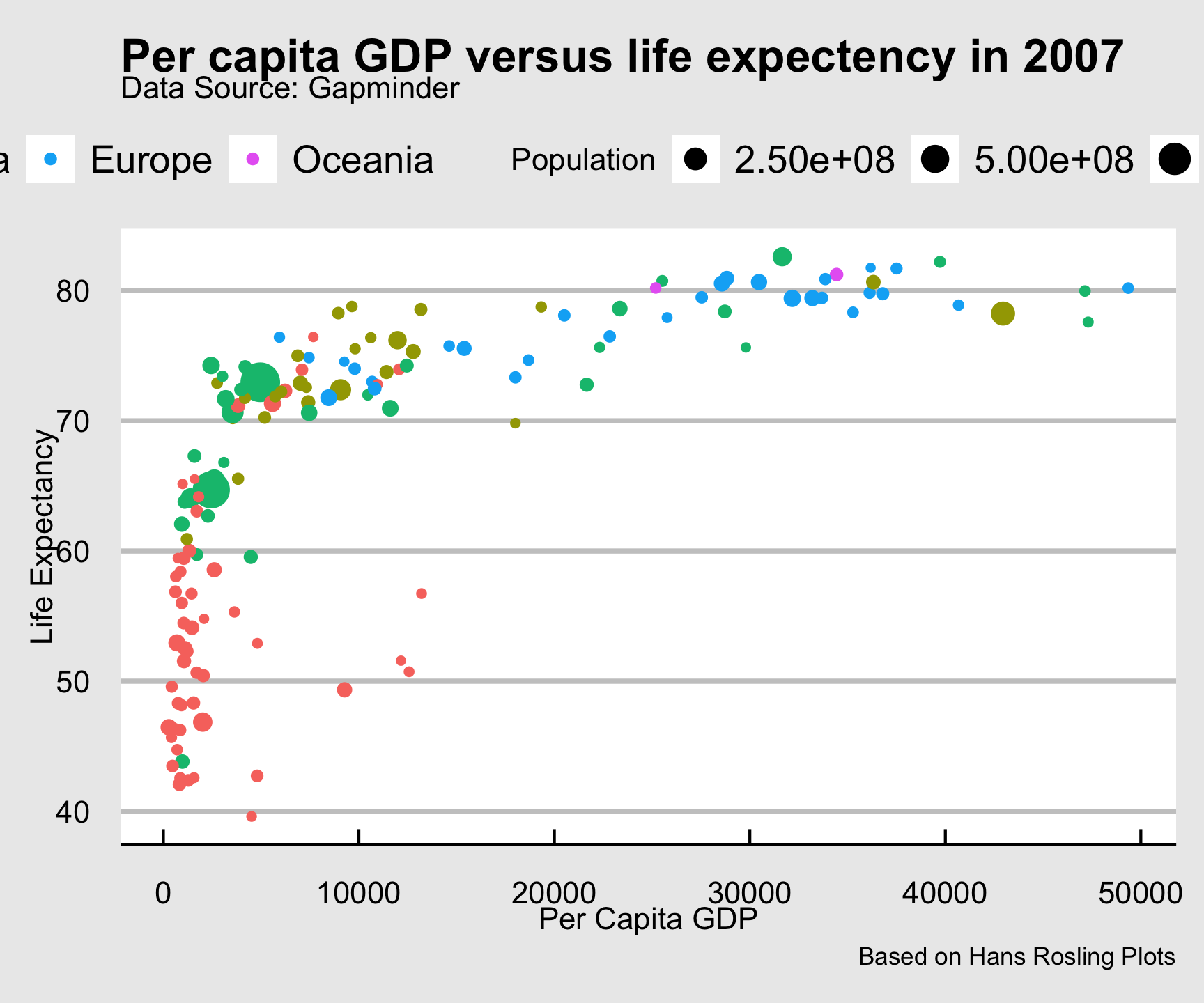
ggtheme package…
library(ggthemes)

gm2007 %>%
  ggplot(aes(x = gdpPercap, y = lifeExp)) +
  geom_point(aes(color = continent, size = pop)) +
  labs(title = "Per capita GDP versus life expectency in 2007",
       x = "Per Capita GDP",
       y = "Life Expectancy",
       caption = "Based on Hans Rosling Plots",
       subtitle = 'Data Source: Gapminder',
       color = "",
       size = "Population") +
ggthemes::theme_stata() +
ggthemes::theme_economist() +
ggthemes::theme_economist_white() +
ggthemes::theme_fivethirtyeight()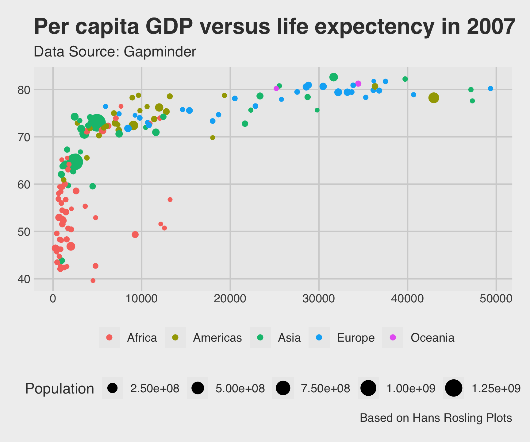
ggtheme package…
library(ggthemes)

gm2007 %>%
  ggplot(aes(x = gdpPercap, y = lifeExp)) +
  geom_point(aes(color = continent, size = pop)) +
  labs(title = "Per capita GDP versus life expectency in 2007",
       x = "Per Capita GDP",
       y = "Life Expectancy",
       caption = "Based on Hans Rosling Plots",
       subtitle = 'Data Source: Gapminder',
       color = "",
       size = "Population") +
  ggthemes::theme_stata() +
ggthemes::theme_economist() +
ggthemes::theme_economist_white() +
ggthemes::theme_fivethirtyeight() +
ggthemes::theme_gdocs()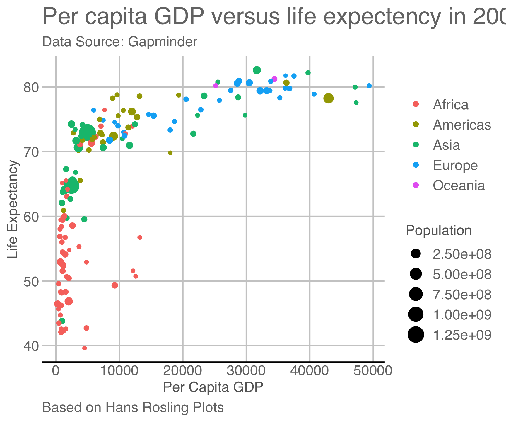
ggtheme package…
library(ggthemes)

gm2007 %>%
  ggplot(aes(x = gdpPercap, y = lifeExp)) +
  geom_point(aes(color = continent, size = pop)) +
  labs(title = "Per capita GDP versus life expectency in 2007",
       x = "Per Capita GDP",
       y = "Life Expectancy",
       caption = "Based on Hans Rosling Plots",
       subtitle = 'Data Source: Gapminder',
       color = "",
       size = "Population") +
  ggthemes::theme_stata() +
  ggthemes::theme_economist() +
ggthemes::theme_economist_white() +
ggthemes::theme_fivethirtyeight() +
ggthemes::theme_gdocs() +
ggthemes::theme_excel()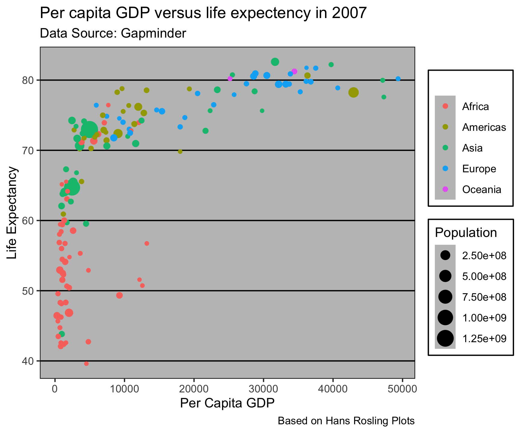
ggtheme package…
library(ggthemes)

gm2007 %>%
  ggplot(aes(x = gdpPercap, y = lifeExp)) +
  geom_point(aes(color = continent, size = pop)) +
  labs(title = "Per capita GDP versus life expectency in 2007",
       x = "Per Capita GDP",
       y = "Life Expectancy",
       caption = "Based on Hans Rosling Plots",
       subtitle = 'Data Source: Gapminder',
       color = "",
       size = "Population") +
  ggthemes::theme_stata() +
  ggthemes::theme_economist() +
  ggthemes::theme_economist_white() +
ggthemes::theme_fivethirtyeight() +
ggthemes::theme_gdocs() +
ggthemes::theme_excel() +
ggthemes::theme_wsj()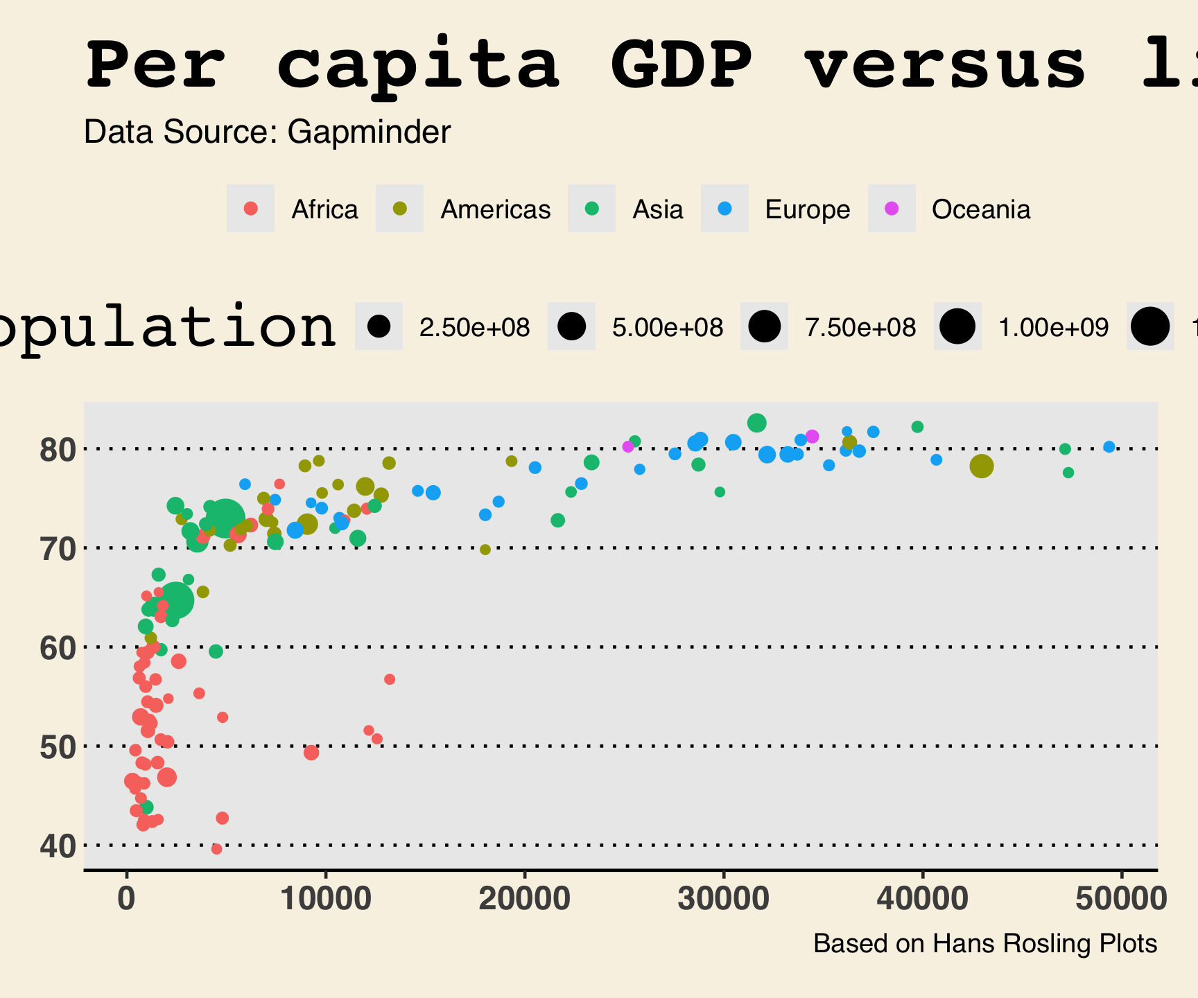
ggtheme package…
library(ggthemes)

gm2007 %>%
  ggplot(aes(x = gdpPercap, y = lifeExp)) +
  geom_point(aes(color = continent, size = pop)) +
  labs(title = "Per capita GDP versus life expectency in 2007",
       x = "Per Capita GDP",
       y = "Life Expectancy",
       caption = "Based on Hans Rosling Plots",
       subtitle = 'Data Source: Gapminder',
       color = "",
       size = "Population") +
  ggthemes::theme_stata() +
  ggthemes::theme_economist() +
  ggthemes::theme_economist_white() +
  ggthemes::theme_fivethirtyeight() +
ggthemes::theme_gdocs() +
ggthemes::theme_excel() +
ggthemes::theme_wsj() +
ggthemes::theme_hc()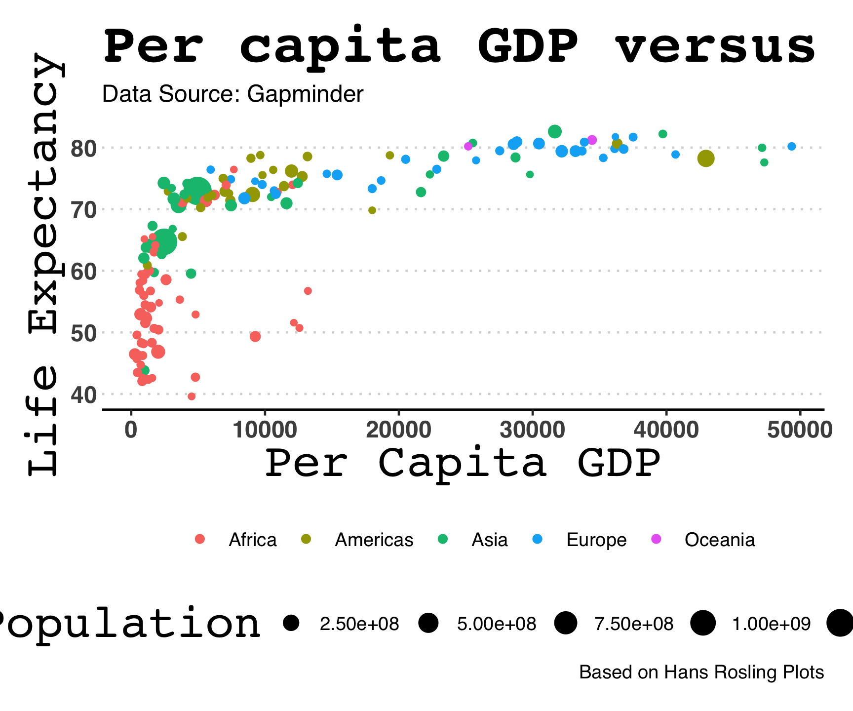
The Four (primary) Joins
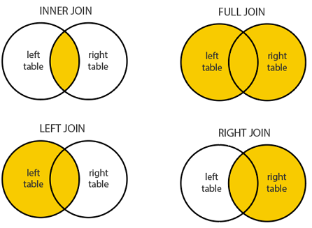
| Function | Keeps rows from… | Non-matches |
|---|---|---|
left_join(x, y) |
All of x |
y columns → NA |
right_join(x, y) |
All of y |
x columns → NA |
inner_join(x, y) |
Only rows matching in both | Dropped |
full_join(x, y) |
Both tables | NAs on whichever side has no match |
Today’s Data:

Tidy Data: The Standard
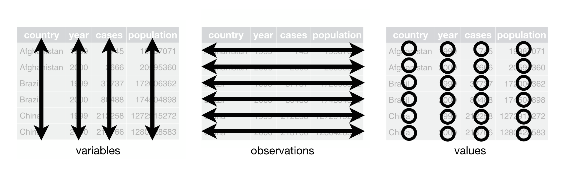
Three rules that tidyverse tools assume:
- Each variable has its own column
- Each observation has its own row
- Each value has its own cell
In practice: put each dataset in a tibble, put each variable in a column. The rest follows.
The World Is Messy
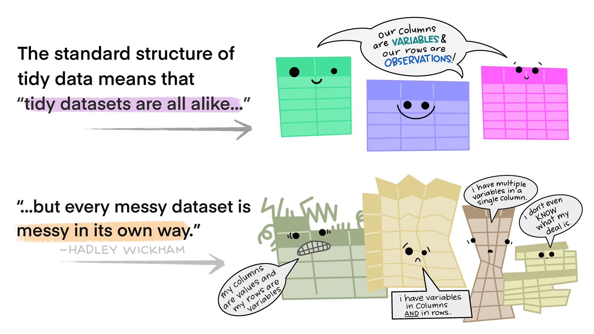
Real data almost never arrives tidy. Two common problems:
- A variable is spread across multiple columns — column names are values, not variable names
- An observation is scattered across multiple rows — a single record spans several rows
tidyr (part of tidyverse) fixes both.
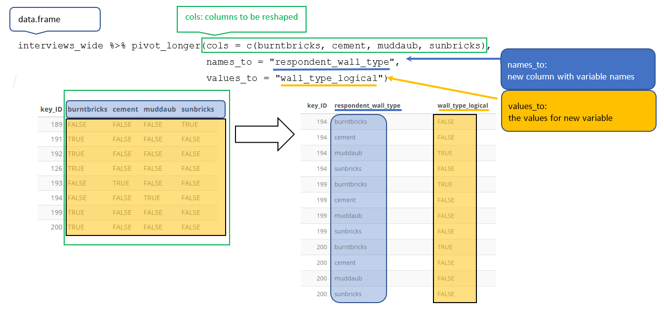
pivot_longer() — Wide to Long
When column names are actually values of a variable, pivot longer:
lifeExp_wide <- gapminder |>
  filter(country %in% c("India", "Brazil")) |>
  select(country, year, lifeExp) |>
  pivot_wider(names_from = year, values_from = lifeExp)

lifeExp_wide
#> # A tibble: 2 × 13
#>   country `1952` `1957` `1962` `1967` `1972` `1977` `1982` `1987` `1992` `1997`
#>   <fct>    <dbl>  <dbl>  <dbl>  <dbl>  <dbl>  <dbl>  <dbl>  <dbl>  <dbl>  <dbl>
#> 1 Brazil    50.9   53.3   55.7   57.6   59.5   61.5   63.3   65.2   67.1   69.4
#> 2 India     37.4   40.2   43.6   47.2   50.7   54.2   56.6   58.6   60.2   61.8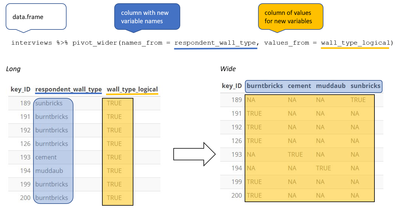
#> # ℹ 2 more variables: `2002` <dbl>, `2007` <dbl>pivot_wider() — Long to Wide
When one observation is scattered across multiple rows, pivot wider:
Pivot Within a Pipeline
Pivot Within a Pipeline
Pivot Within a Pipeline
Pivot Within a Pipeline
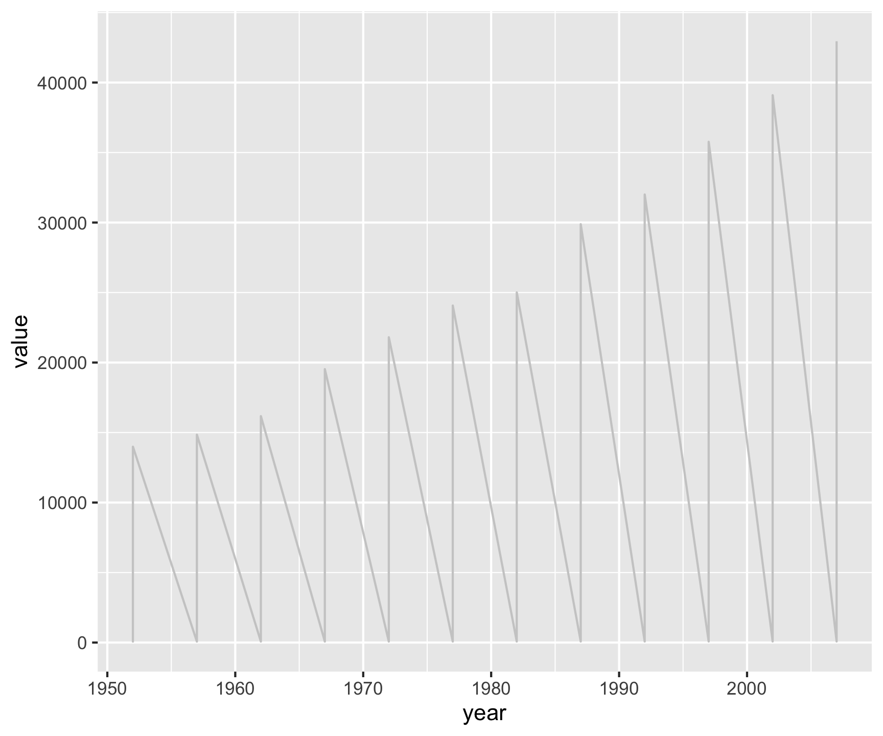
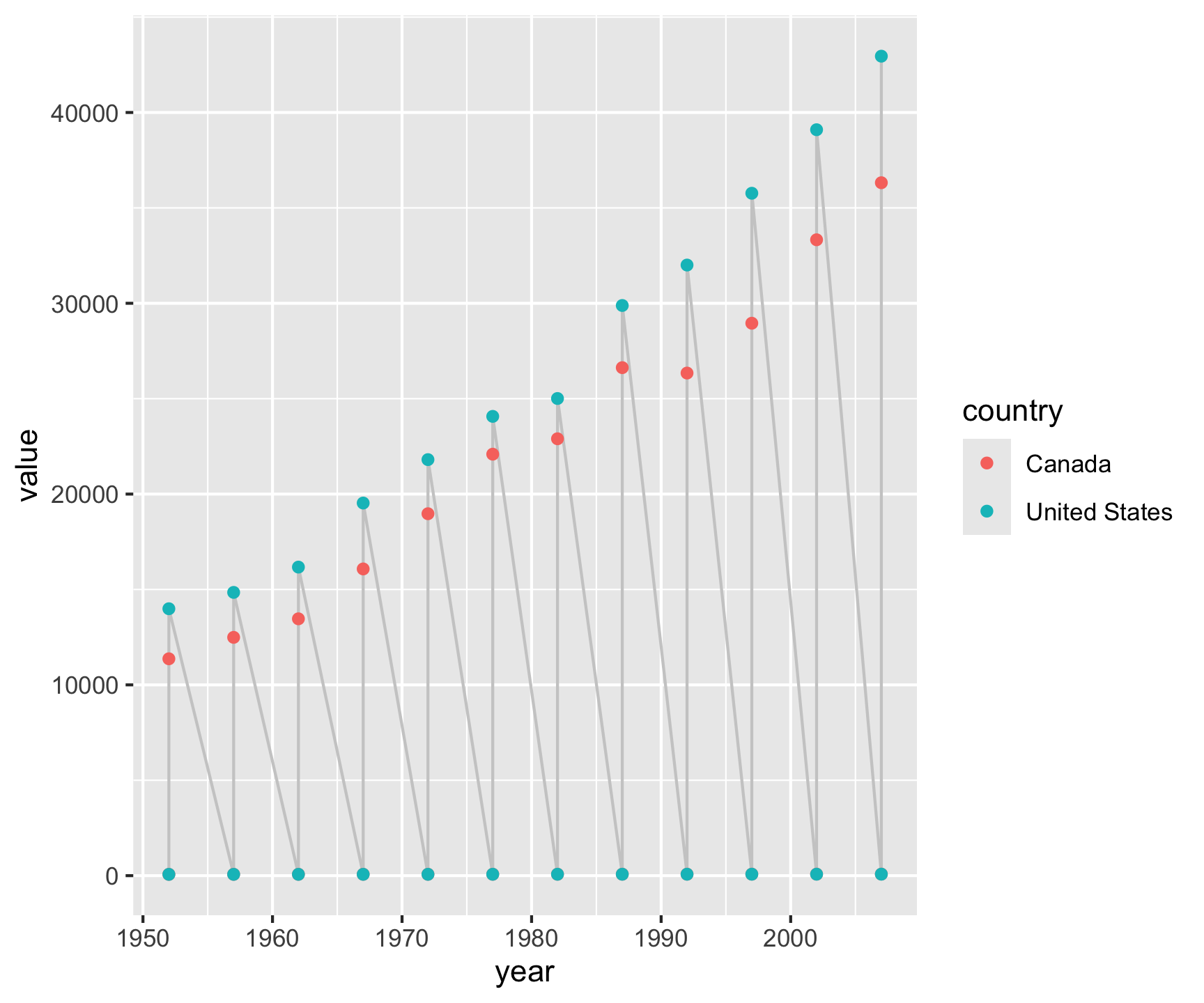
gapminder |>
filter(country %in% c("Canada", "United States")) |>
select(country, year, lifeExp, gdpPercap) |>
pivot_longer(cols = c(lifeExp, gdpPercap),
names_to = "metric",
values_to = "value") |>
ggplot(aes(x = year, y = value)) +
geom_line(color = "gray80") +
geom_point(aes(color = country)) +
facet_grid(metric ~ country, scales = "free_y")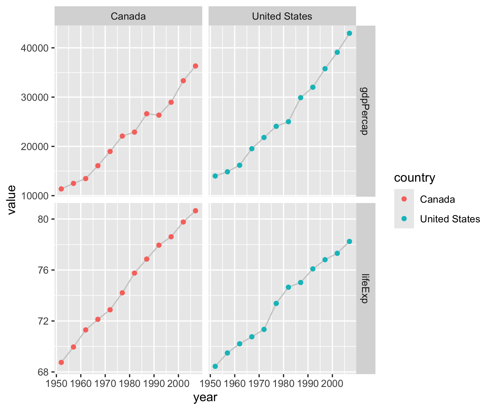
Pivot Within a Pipeline
gapminder |>
  filter(country %in% c("Canada", "United States")) |>
select(country, year, lifeExp, gdpPercap) |>
pivot_longer(cols = c(lifeExp, gdpPercap),
names_to = "metric",
values_to = "value") |>
ggplot(aes(x = year, y = value)) +
geom_line(color = "gray80") +
geom_point(aes(color = country)) +
facet_grid(metric ~ country, scales = "free_y") +
labs(x = "", y = "",
title = "North America: GDP & Life Expectancy",
subtitle = "1950–2007",
caption = "Data: Gapminder R package")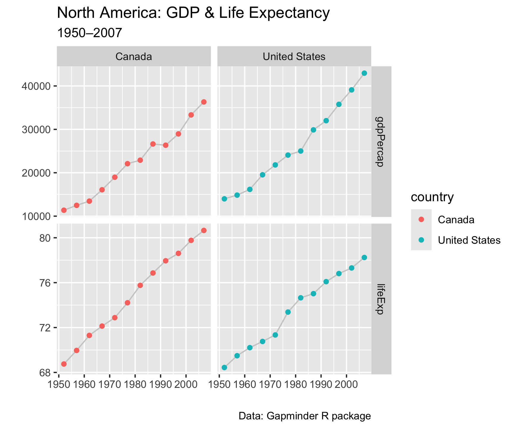
Pivot Within a Pipeline
gapminder |>
  filter(country %in% c("Canada", "United States")) |>
  select(country, year, lifeExp, gdpPercap) |>
  pivot_longer(cols = c(lifeExp, gdpPercap),
               names_to  = "metric",
values_to = "value") |>
ggplot(aes(x = year, y = value)) +
geom_line(color = "gray80") +
geom_point(aes(color = country)) +
facet_grid(metric ~ country, scales = "free_y") +
labs(x = "", y = "",
title = "North America: GDP & Life Expectancy",
subtitle = "1950–2007",
caption = "Data: Gapminder R package") +
theme_linedraw()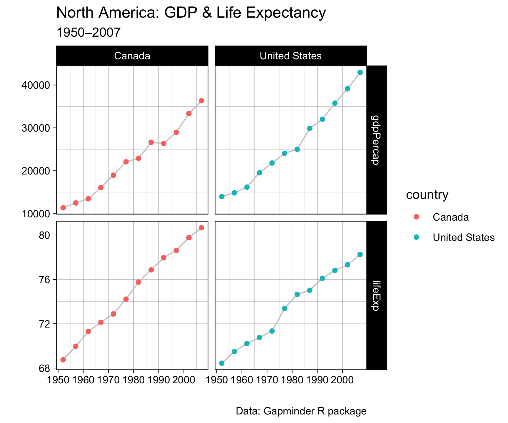
Pivot Within a Pipeline
gapminder |>
  filter(country %in% c("Canada", "United States")) |>
  select(country, year, lifeExp, gdpPercap) |>
  pivot_longer(cols = c(lifeExp, gdpPercap),
               names_to  = "metric",
               values_to = "value") |>
ggplot(aes(x = year, y = value)) +
geom_line(color = "gray80") +
geom_point(aes(color = country)) +
facet_grid(metric ~ country, scales = "free_y") +
labs(x = "", y = "",
title = "North America: GDP & Life Expectancy",
subtitle = "1950–2007",
caption = "Data: Gapminder R package") +
theme_linedraw() +
theme(legend.position = "none",
axis.text.x = element_text(angle = 90, face = "bold"))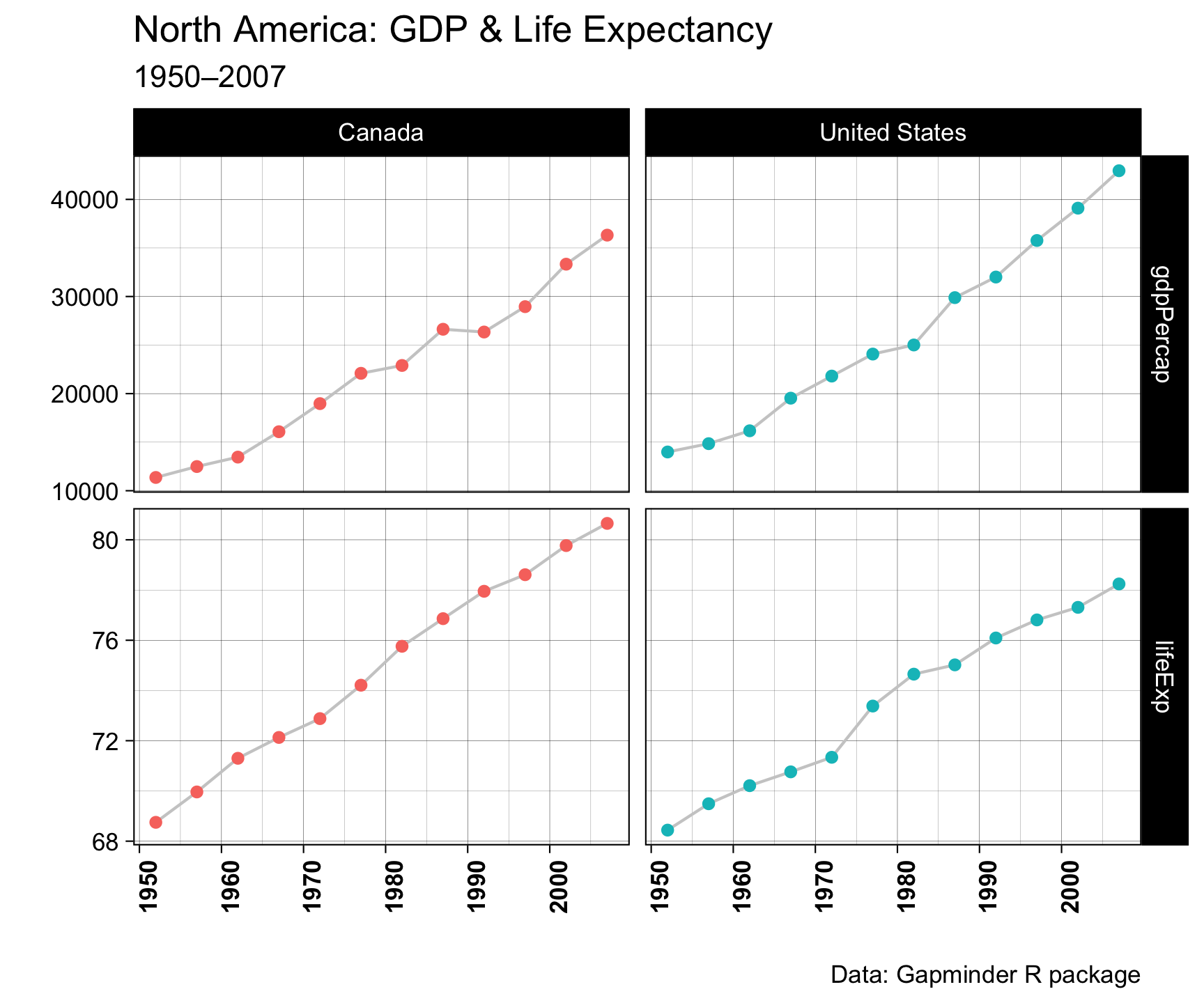
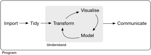
The real power: wrangling shape and visualization in one chain:
Before Next Class
Lab 1 is due next Wednesday
All the tools are now in your hands. The data is live. Start early — the data pull takes a few minutes the first time.
Next Topic
Week 2: Vector Spatial Data
You will apply these same wrangling skills to geometries and spatial features. The sf package treats spatial features as data frames. Everything you learned today will carry through!