Lab 3: COVID-19
Data Wrangling and Visualization
In this lab you will practice data wrangling and visualization skills using COVID-19 data curated by the New York Times. This data is a large dataset measuring the cases and deaths per US county across the lifespan of COVID from its early beginnings to just past the peak.
Set-up
- Create a
csu-ess-lab3GitHub repository - Clone it to your machine
- Create a
data,docs, andimgdirectory - In docs, create a new .qmd file called
lab-03.qmd - Populate its YML with a title, author, subtitle, output type and theme. For example:
Code
---
title: "Lab 3: COVID-19"
subtitle: 'Ecosystem Science and Sustainability 330'
author:
  - name: ...
    email: ...
format: html
---
Be sure to associate your name with your personal webpage via a link.
Libraries
You will need a few libraries for this lab. Make sure they are installed and loaded in your Qmd
tidyverse(data wrangling and visualization)flextable(make nice tables)zoo(rolling averages)
Data
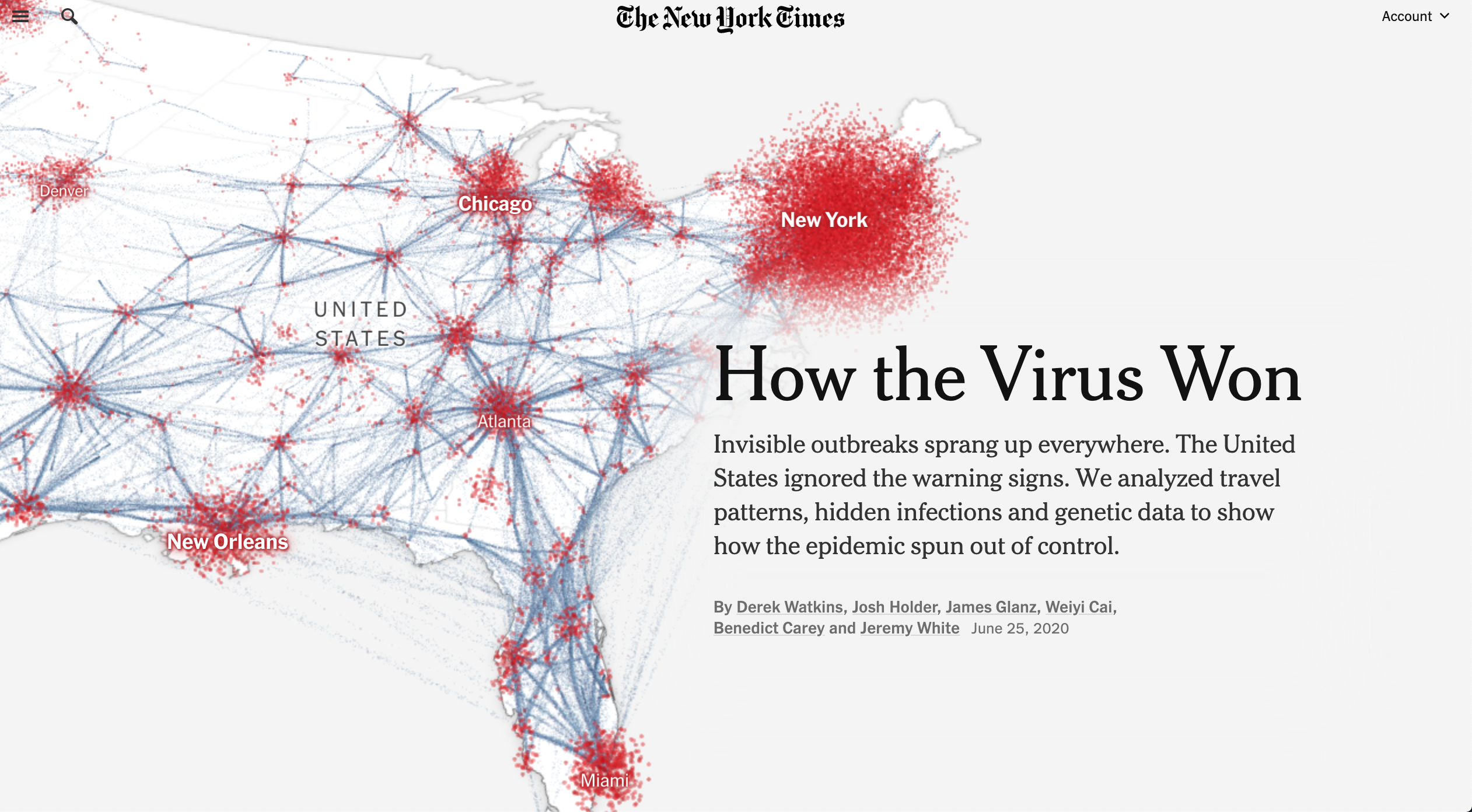
We are going to practice some data wrangling skills using a real-world dataset about COVID cases curated and maintained by the New York Times. The data was used in the peak of the pandemic to create reports and data visualizations like this, and are archived on a GitHub repo here. A history of the importance can be found here.
Question 1: Public Data
With public data—particularly in environmental and health sciences—no longer carrying the same promised persistence it once did, the importance of external archiving efforts by journalists, scientists, and researchers has grown significantly. The availability of reliable, well-documented datasets is crucial for advancing environmental science, informing policy, and fostering transparency.
Take a moment to reflect on the value of open data: How does easy access to historical and real-time environmental data shape our understanding of climate trends, resource management, and public health? What happens when this data disappears or becomes inaccessible? The role of independent archiving and collaborative stewardship has never been more critical in ensuring scientific progress and accountability.
…
Looking at the README in the NYT repository we read:
“We are providing two sets of data with cumulative counts of coronavirus cases and deaths: one with our most current numbers for each geography and another with historical data showing the tally for each day for each geography … the historical files are the final counts at the end of each day … The historical and live data are released in three files, one for each of these geographic levels: U.S., states and counties.”
For this lab we will use the historic, county level data which is stored as a CSV at this URL:
Code
https://raw.githubusercontent.com/nytimes/covid-19-data/master/us-counties.csvQuestion 2: Daily Summary
Lets pretend it in January 1st, 2022. You are a data scientist for the state of Colorado Department of Public Health.
You’ve been tasked with giving a report to Governor Polis each morning about the most current COVID-19 conditions at the county level.
As it stands, the Colorado Department of Public Health maintains a watch list of counties that are being monitored for worsening corona virus trends. There are six criteria used to place counties on the watch list:
- Doing fewer than 150 tests per 100,000 residents daily (over a 7-day average)
- More than 100 new cases per 100,000 residents over the past 14 days…
- 25 new cases per 100,000 residents and an 8% test positivity rate
- 10% or greater increase in COVID-19 hospitalized patients over the past 3 days
- Fewer than 20% of ICU beds available
- Fewer than 25% ventilators available
Of these 6 conditions, you are in charge of monitoring condition number 2.
To do this job well, you should set up a reproducible framework to communicate the following in a way that can be updated every time new data is released (daily):
- cumulative cases in the 5 worst counties
- total NEW cases in the 5 worst counties
- A list of safe counties
- A text report describing the total new cases, total cumulative cases, and number of safe counties.
You should build this analysis in such a way that running it will extract the most current data straight from the NY-Times URL and the state name and date are parameters that can be changed allowing this report to be run for other states/dates.
Steps:
- Start by reading in the data from the NY-Times URL with
read_csv(make sure to attach thetidyverse)
Code
library(tidyverse); library(flextable)
data = read_csv('https://raw.githubusercontent.com/nytimes/covid-19-data/master/us-counties.csv')- Create an object called
my.dateand set it as “2022-02-01” - ensure this is adateobject:. Create a object calledmy.stateand set it to “Colorado”.
Tip
In R, as.Date() is a function used to convert character strings, numeric values, or other date-related objects into Date objects. It ensures that dates are stored in the correct format for date-based calculations and manipulations.
Code
txt <- "2025-02-15"
class(txt)
[1] "character"Code
date_example <- as.Date(txt)
class(date_example)
[1] "Date"- The URL based data read from Github is considered our “raw data”. Remember to always leave “raw-data-raw” and to generate meaningful subsets as you go.
Start by making a subset that limits (filter) the data to Colorado and add a new column (mutate) with the daily new cases using diff/lag by county (group_by). Do the same for new deaths as well.
(Hint: you will need some combination of filter, group_by, arrange, mutate, diff/lag, and ungroup)
- Using your subset, generate (2) tables. The first should show the 5 counties with the most CUMULATIVE cases, and the second should show the 5 counties with the most NEW cases. Remember to use your
my.dateobject as a proxy for today’s date:
Your tables should have clear column names and descriptive captions.
Question 3: Normalizing Data
Raw count data can be deceiving given the wide range of populations in Colorado countries. To help us normalize data counts, we need supplemental population data to be added. Population data is offered by the Census and can be found here. Please read in this data.
Code
pop_url <- 'https://www2.census.gov/programs-surveys/popest/datasets/2020-2023/counties/totals/co-est2023-alldata.csv'
FIPs codes: Federal Information Processing
How FIPS codes are used
- FIPS codes are used in census products
- FIPS codes are used to identify geographic areas in files
- FIPS codes are used to identify American Indian, Alaska Native, and Native Hawaiian (AIANNH) areas
How FIPS codes are structured
- The number of digits in a FIPS code depends on the level of geography
- State FIPS codes have two digits
- County FIPS codes have five digits, with the first two digits representing the state FIPS code
You notice that the COVID data provides a 5 digit character FIP code representing the state in the first 2 digits and the county in the last 3. In the population data, the STATE and COUNTY FIP identifiers are read in as numerics.
To make these compatible we need to:
- Convert the
STATEnumeric into a character forced to 2 digits with a leading 0 (when needed) - Convert the COUNTY numeric into a character forced to 3 digits with leading 0’s (when needed)
- Create a FIP variable the STATE numeric into a character forced to 2 digits with a leading 0 (when needed)
Adding leading 0’s
We can use the sprintf() function in base R to add leading zeros. The sprintf() function is powerful and versatile for string formatting.
Code
number <- 123
(formatted_number <- sprintf("%06d", number))
[1] "000123"Here’s what’s happening:
- “%06d” is the format specifier.
- %d tells sprintf() that we’re dealing with an integer.
06indicates that the output should be 6 characters wide, with leading zeros added if necessary.
Concatinating Strings.
In R, paste() provides a tool for concatenation. paste() can do two things:
- concatenate values into one “string”, e.g. where the argument
sepspecifies the character(s) to be used between the arguments to concatenate, or
Code
paste("Hello", "world", sep=" ")[1] "Hello world"collapsespecifies the character(s) to be used between the elements of the vector to be collapsed.
Code
paste(c("Hello", "world"), collapse="-")[1] "Hello-world"In R, it is so common to want to separate no separator (e.g. paste(“Hello”, “world”, sep=““)) that the short cutpaste0` exists:
Code
paste("Hello", "world", sep = "")[1] "Helloworld"Code
paste0("Hello", "world")[1] "Helloworld"- Given the above URL, and guidelines on string concatenation and formatting, read in the population data and (1) create a five digit FIP variable and only keep columns that contain “NAME” or “2021” (remember the tidyselect option found with
?dplyr::select). Additionally, remove all state level rows (e.g. COUNTY FIP == “000”)
- Now, explore the data … what attributes does it have, what are the names of the columns? Do any match the COVID data we have? What are the dimensions… In a few sentences describe the data obtained after modification:
(Hint: names(), dim(), nrow(), str(), glimpse, skimr,…))
- What is the range of populations seen in Colorado counties in 2021:
- Join the population data to the Colorado COVID data and compute the per capita cumulative cases, per capita new cases, and per capita new deaths:
- Generate (2) new tables. The first should show the 5 counties with the most cumulative cases per capita on 2021-01-01, and the second should show the 5 counties with the most NEW cases per capita on the same date. Your tables should have clear column names and descriptive captions.
(Hint: Use `flextable::flextable() and flextable::set_caption())
Question 4: Rolling thresholds
Filter the merged COVID/Population data to only include the last 14 days. Remember this should be a programmatic request and not hard-coded. Then, use the group_by/summarize paradigm to determine the total number of new cases in the last 14 days per 100,000 people. Print a table of the top 5 counties, and, report the number that meet the watch list condition: “More than 100 new cases per 100,000 residents over the past 14 days…”
(Hint: Dates are numeric in R and thus operations like max min, -, +, >, and< work.)
Question 5: Death toll
Given we are assuming it is February 1st, 2022. Your leadership has asked you to determine what percentage of deaths in each county were attributed to COVID last year (2021). You eagerly tell them that with the current Census data, you can do this!
From previous questions you should have a data.frame with daily COVID deaths in Colorado and the Census based, 2021 total deaths. For this question, you will find the ratio of total COVID deaths per county (2021) of all recorded deaths. In a plot of your choosing, visualize all counties where COVID deaths account for 20% or more of the annual death toll.
Dates in R
To extract a element of a date object in R, the lubridate package (part of tidyverse) is very helpful:
Code
tmp.date = as.Date("2025-02-15")
lubridate::year(tmp.date)
[1] 2025Code
lubridate::month(tmp.date)[1] 2Code
lubridate::yday(tmp.date)[1] 46Question 6: Multi-state
In this question, we are going to look at the story of 4 states and the impact scale can have on data interpretation. The states include: New York, Colorado, Alabama, and Ohio. Your task is to make a faceted bar plot showing the number of daily, new cases at the state level.
Steps:
- First, we need to
group/summarizeour county level data to the state level,filterit to the four states of interest, and calculate the number of daily new cases (diff/lag) and the 7-day rolling mean.
Rolling Averages
The rollmean function from the zoo package in R is used to compute the rolling (moving) mean of a numeric vector, matrix, or zoo/ts object.
rollmean(x, k, fill = NA, align = "center", na.pad = FALSE)
- x: Numeric vector, matrix, or time series.
- k: Window size (number of observations).
- fill: Values to pad missing results (default NA).
- align: Position of the rolling window (“center”, “left”, “right”).
- na.pad: If TRUE, pads missing values with NA.
Examples
- Rolling Mean on a Numeric Vector Since
align = "center"by default, values at the start and end are dropped.
Code
library(zoo)

# Sample data
x <- c(1, 2, 3, 4, 5, 6, 7, 8, 9, 10)

# Rolling mean with a window size of 3
rollmean(x, k = 3)
[1] 2 3 4 5 6 7 8 9- Rolling Mean with Padding Missing values are filled at the start and end.
Code
rollmean(x, k = 3, fill = NA) [1] NA 2 3 4 5 6 7 8 9 NA- Aligning Left or Right The rolling mean is calculated with values aligned to the left or right
Code
rollmean(x, k = 3, fill = NA, align = "left") [1] 2 3 4 5 6 7 8 9 NA NACode
rollmean(x, k = 3, fill = NA, align = "right") [1] NA NA 2 3 4 5 6 7 8 9Hint: You will need two group_by calls and the zoo::rollmean function.
- Using the modified data, make a facet plot of the daily new cases and the 7-day rolling mean. Your plot should use compelling geoms, labels, colors, and themes.
- The story of raw case counts can be misleading. To understand why, lets explore the cases per capita of each state. To do this, join the state COVID data to the population estimates and calculate the \(new cases / total population\). Additionally, calculate the 7-day rolling mean of the new cases per capita counts. This is a tricky task and will take some thought, time, and modification to existing code (most likely)!
Hint: You may need to modify the columns you kept in your original population data. Be creative with how you join data (inner vs outer vs full)!
- Using the per capita data, plot the 7-day rolling averages overlying each other (one plot) with compelling labels, colors, and theme.
- Briefly describe the influence scaling by population had on the analysis? Does it make some states look better? Some worse? How so?
…
Question 7: Space & Time
For our final task, we will explore our first spatial example! In it we will calculate the Weighted Mean Center of the COVID-19 outbreak in the USA to better understand the movement of the virus through time.
To do this, we need to join the COVID data with location information. I have staged the latitude and longitude of county centers here. For reference, this data was processed like this:
Code
counties = USAboundaries::us_counties() %>%
  dplyr::select(fips = geoid) %>%
  sf::st_centroid() %>%
  dplyr::mutate(LON = sf::st_coordinates(.)[,1],
                LAT = sf::st_coordinates(.)[,2]) %>%
  sf::st_drop_geometry()

write.csv(counties, "../resources/county-centroids.csv", row.names = FALSE)
Please read in the data (readr::read_csv()); and join it to your raw COVID-19 data using the fips attributes using the following URL:
Code
'https://raw.githubusercontent.com/mikejohnson51/csu-ess-330/refs/heads/main/resources/county-centroids.csv'[1] "https://raw.githubusercontent.com/mikejohnson51/csu-ess-330/refs/heads/main/resources/county-centroids.csv"- The mean center of a set of spatial points is defined as the average X and Y coordinate. A weighted mean center can be found by weighting the coordinates by another variable, in this total cases such that:
\[X_{coord} = \sum{(X_{i} * w_{i})} / \sum(w_{i})\] \[Y_{coord} = \sum{(Y_{i} * w_{i})}/ \sum(w_{i})\]
- For each date, calculate the Weighted Mean \(X_{coord}\) and \(Y_{coord}\) using the daily cumulative cases and the weight \(w_{i}\). In addition, calculate the total cases for each day, as well as the month.
Hint: the month can be extracted from the date column using format(date, "%m")
- Plot the weighted mean center (
aes(x = LNG, y = LAT)), colored by month, and sized by total cases for each day. These points should be plotted over a map of the USA states which can be added to a ggplot object with:
Code
borders("state", fill = "gray90", colour = "white")(feel free to modify fill and colour (must be colour (see documentation)))
- In a few sentences, describe the movement of the COVID-19 weighted mean throughout the USA and possible drivers of its movement given your knowledge of the outbreak hot spots.
Question 8: Cases vs. Deaths
As extra credit, extend your analysis in problem three to also compute the weighted mean center of daily COVID deaths.
Make two plots next to each other (using patchwork) showing cases in red and deaths in navy. Once completed describe the differences in the plots and what they mean about the spatial patterns seen with COVID impacts.
Multiplots
patchwork is an R package designed for combining multiple ggplot2 plots into a cohesive layout.
Key Features:
- Simple Composition: Use +, /, and | operators to arrange plots intuitively.
- Flexible Layouts: Supports nesting, alignment, and customized positioning of plots.
- Annotation and Styling: Add titles, captions, and themes across multiple plots.
Example:
Code
library(patchwork)

p1 <- ggplot(mtcars, aes(mpg, hp)) + geom_point()
p2 <- ggplot(mtcars, aes(mpg, wt)) + geom_point()

p1 | p2  # Arrange side by side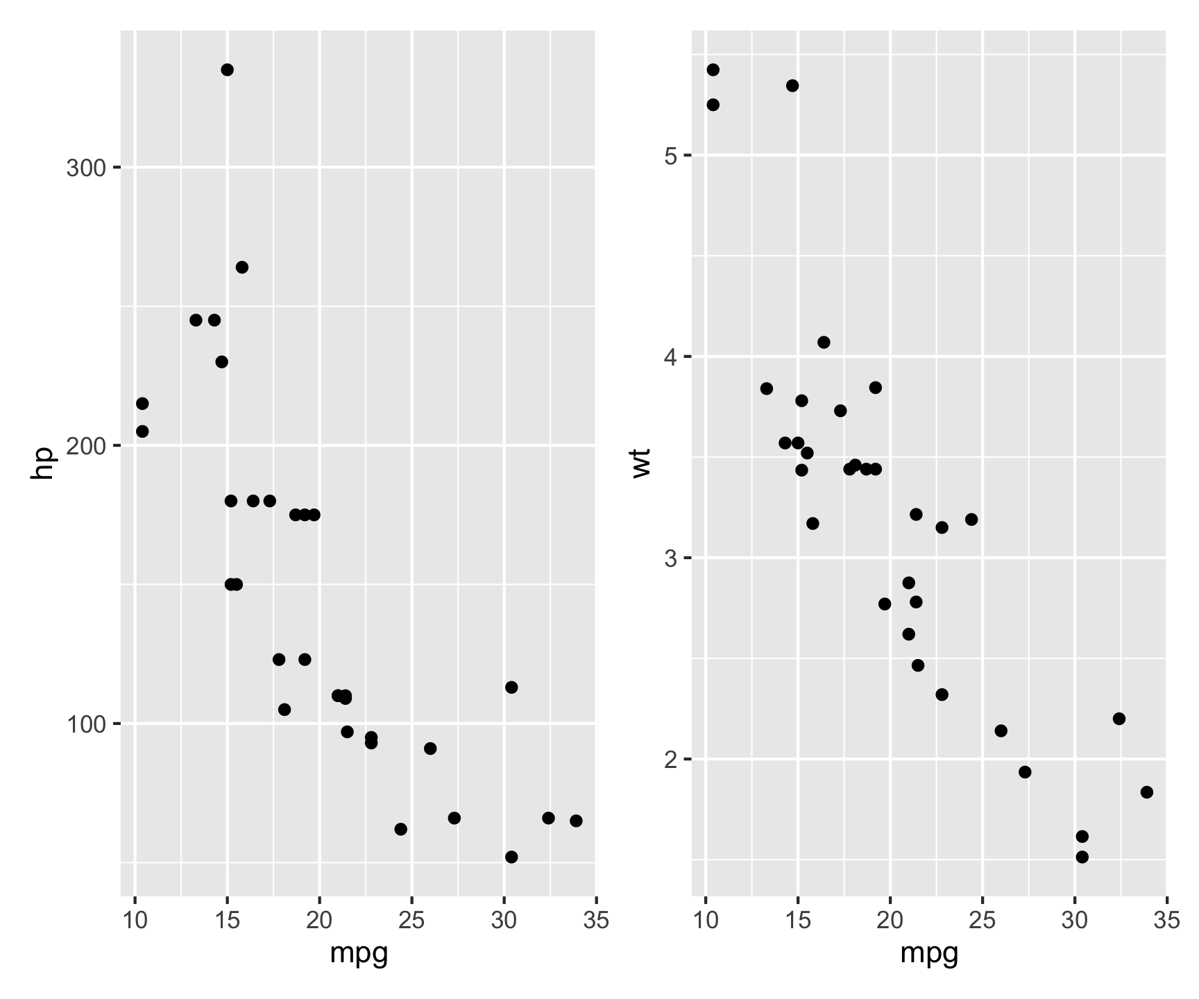
This places p1 and p2 next to each other in a single figure.
Rubric
Total: 200 points (230 available)
Submission
For this lab you will submit a URL to a webpage deployed with GitHub pages To do this:
- Knit your lab 2 document
- Stage/commit/push your files
- Activate Github Pages (GitHub –> Setting –> GitHub pages) and deploy from the docs folder
- If you followed the naming conventions in the “Set Up”, your lab 2 link will be available at:
https://USERNAME.github.io/csu-ess-lab2/lab-02.html
Submit this URL in the appropriate Canvas dropbox. Also take a moment to update your personal webpage with this link and some bullet points of what you learned. While not graded as part of this lab, it will be eventually serve as extras credit!