Lecture 21
Introduction to Time Series Data in R
lubridate Package ![]()

The
lubridatepackage comes with thetidyverseand is designed to make working with dates and times easier.It provides a consistent set of functions for parsing, manipulating, and formatting date-time objects.
Use lubridate to handle inconsistent formats and to align data with time zones, daylight savings, etc.
lubridate timezones ![]()
lubridate also provides functions for working with time zones. You can convert between time zones using with_tz() and force_tz().
(date <- ymd_hms("2024-04-08 14:30:00", tz = "America/New_York"))
#> [1] "2024-04-08 14:30:00 EDT"

# Change time zone without changing time
force_tz(date, "America/Los_Angeles")
#> [1] "2024-04-08 14:30:00 PDT"

# Convert to another timezone
with_tz(date, "America/Los_Angeles")
#> [1] "2024-04-08 11:30:00 PDT"Initial Plot
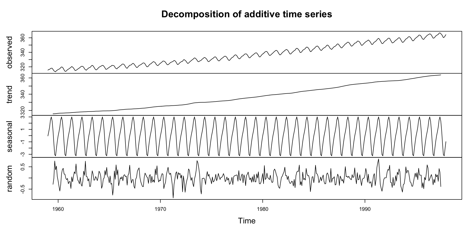
The
co2dataset is a time series object (ts) with 12 observations per year, starting from January 1959.There is a default plot method for
tsobjects that we can take advantage of:
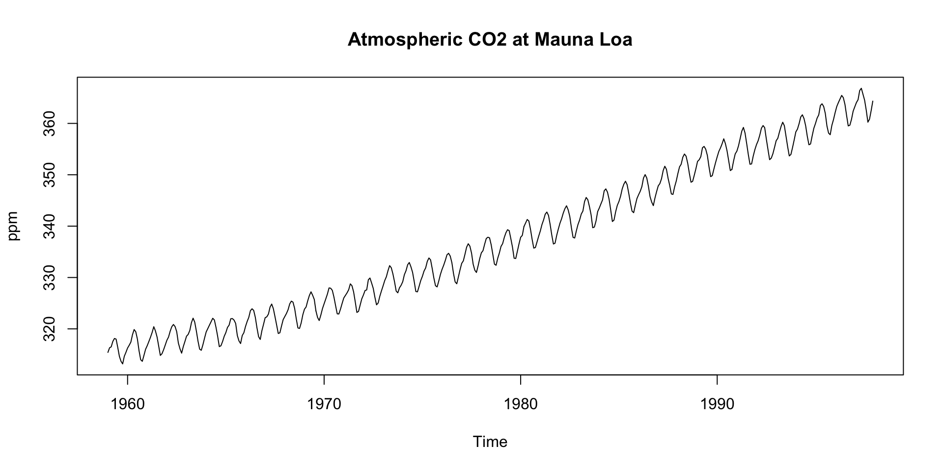
We see:
- An upward trend
- Regular seasonal oscillations (higher in winter, lower in summer)
Example
Decompostion in R
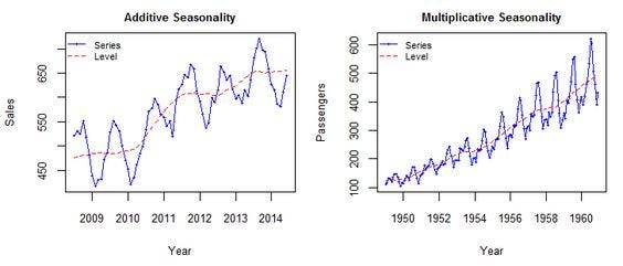
- The
decompose()function in R can be used to perform this operation. - The
decompose()function by default assumes that the time series is additive

Deep Dive: Trend Component
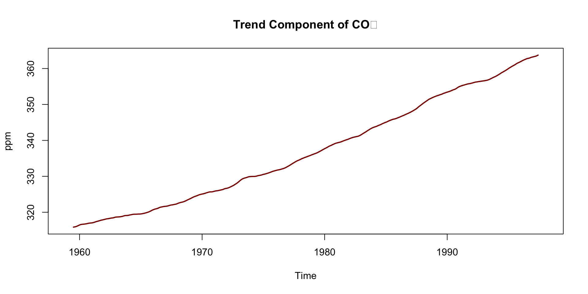
Steady upward slope from ~316 ppm in 1959 to ~365 ppm in the late 1990s
Captures the long-term forcing from human activity:
- Fossil fuel combustion
- Deforestation
This trend underpins climate change science — known as the Keeling Curve
Notice how the trend smooths short-term fluctuations
Interpreting the Trend
- A linear model or loess smoother can also help quantify the trend:
co2_df <- data.frame(time = time(co2), co2 = as.numeric(co2))

lm(as.numeric(co2) ~ time(co2)) |>
  summary()
#>
#> Call:
#> lm(formula = as.numeric(co2) ~ time(co2))
#>
#> Residuals:
#>     Min      1Q  Median      3Q     Max
#> -6.0399 -1.9476 -0.0017  1.9113  6.5149
#>
#> Coefficients:
#>               Estimate Std. Error t value Pr(>|t|)
#> (Intercept) -2.250e+03  2.127e+01  -105.8   <2e-16 ***
#> time(co2)    1.308e+00  1.075e-02   121.6   <2e-16 ***
#> ---
#> Signif. codes:  0 '***' 0.001 '**' 0.01 '*' 0.05 '.' 0.1 ' ' 1
#>
#> Residual standard error: 2.618 on 466 degrees of freedom
#> Multiple R-squared:  0.9695, Adjusted R-squared:  0.9694
#> F-statistic: 1.479e+04 on 1 and 466 DF,  p-value: < 2.2e-16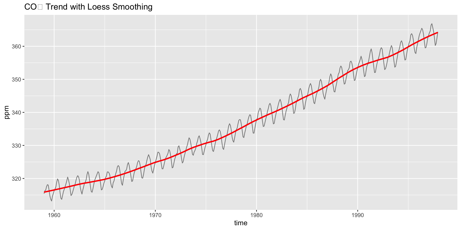
Do you see acceleration in the rise over time?
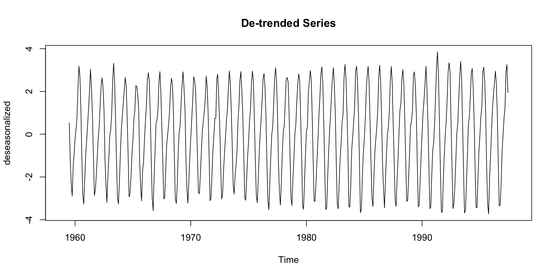
De-Trending
- Detrending is the process of removing the trend component from a time series.
- This can help for modeling the trend + residual only:
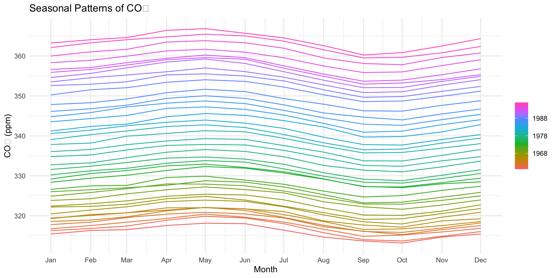
Deep Dive: Seasonal Component
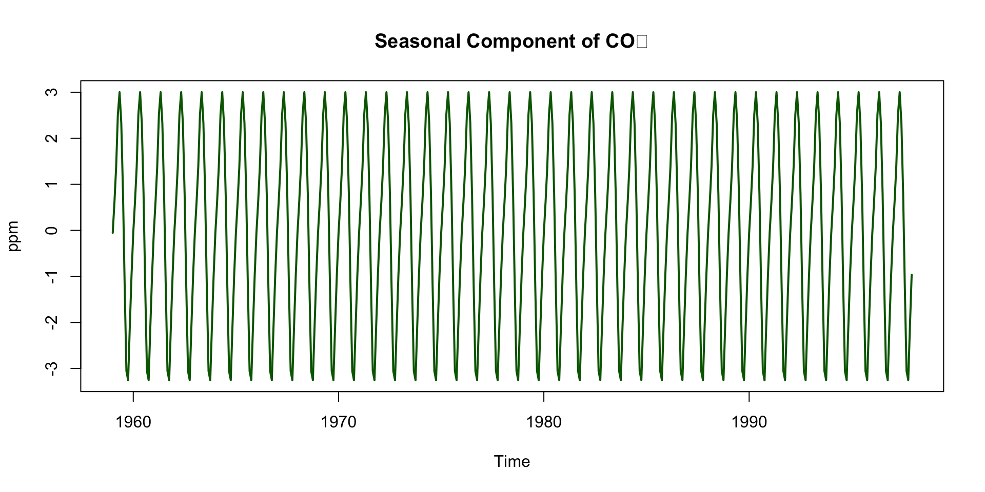
Repeats every 12 months
Peaks around May, drops in September–October
Driven by biospheric fluxes:
- Photosynthesis during spring/summer → CO₂ drawdown
- Decomposition and respiration in winter → CO₂ release
Seasonal Cycle is Northern Hemisphere-Dominated (Mauna Loa is in the Northern Hemisphere)
Northern Hemisphere contains more landmass and vegetation
So its biosphere exerts a stronger influence on global CO₂ than the Southern Hemisphere
This explains the pronounced seasonal cycle in the signal
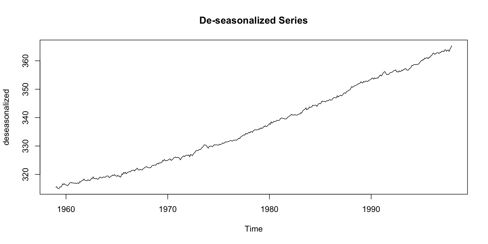
De-seasonalizing
This can help for modeling the seasonal + residual only:
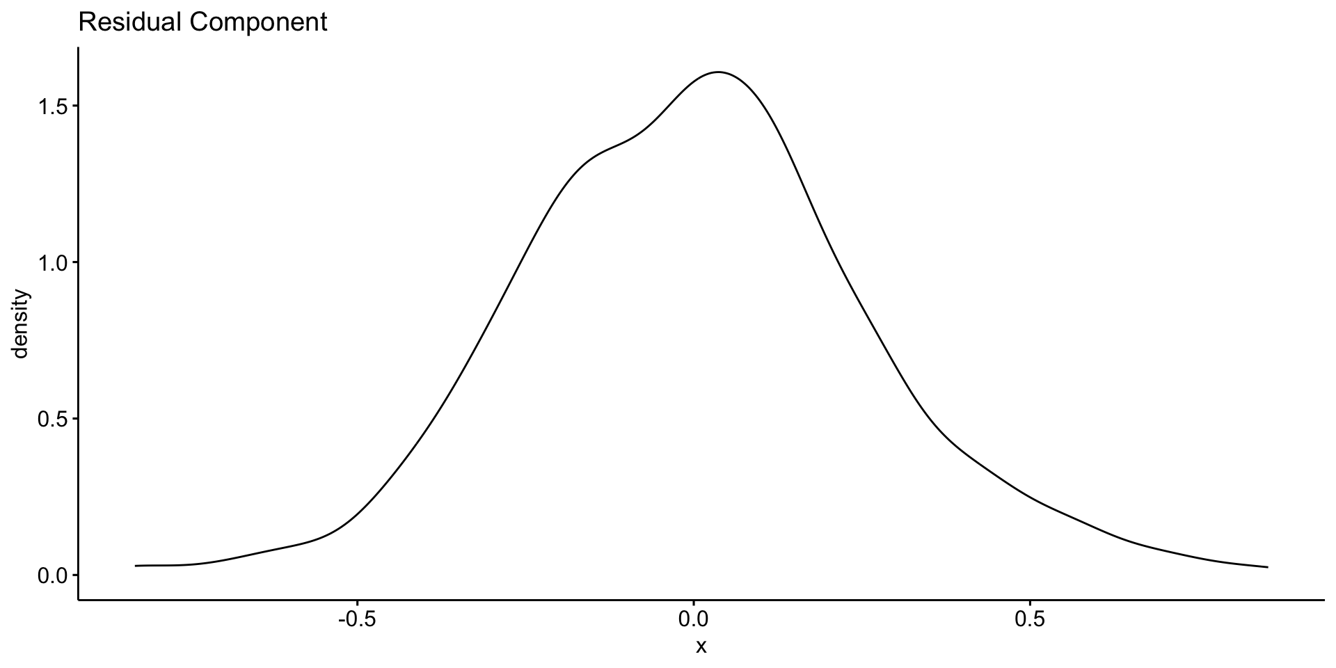
Deep Dive: Remainder Component
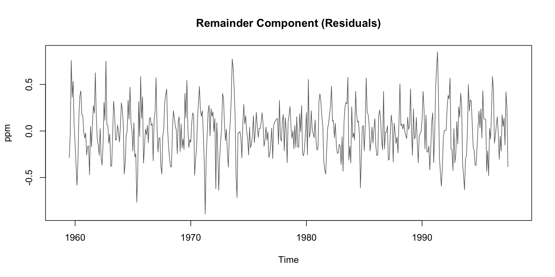
Residuals are the “leftover” part of the time series after removing trend and seasonality
Contains irregular, short-term fluctuations
Can be used to identify anomalies or outliers
Important for understanding noise in the data
Possible sources:
- Volcanic activity (e.g. El Chichón, Mt. Pinatubo)
- Measurement error
- El Niño/La Niña events (which affect carbon flux)
Typically small amplitude: ±0.2 ppm
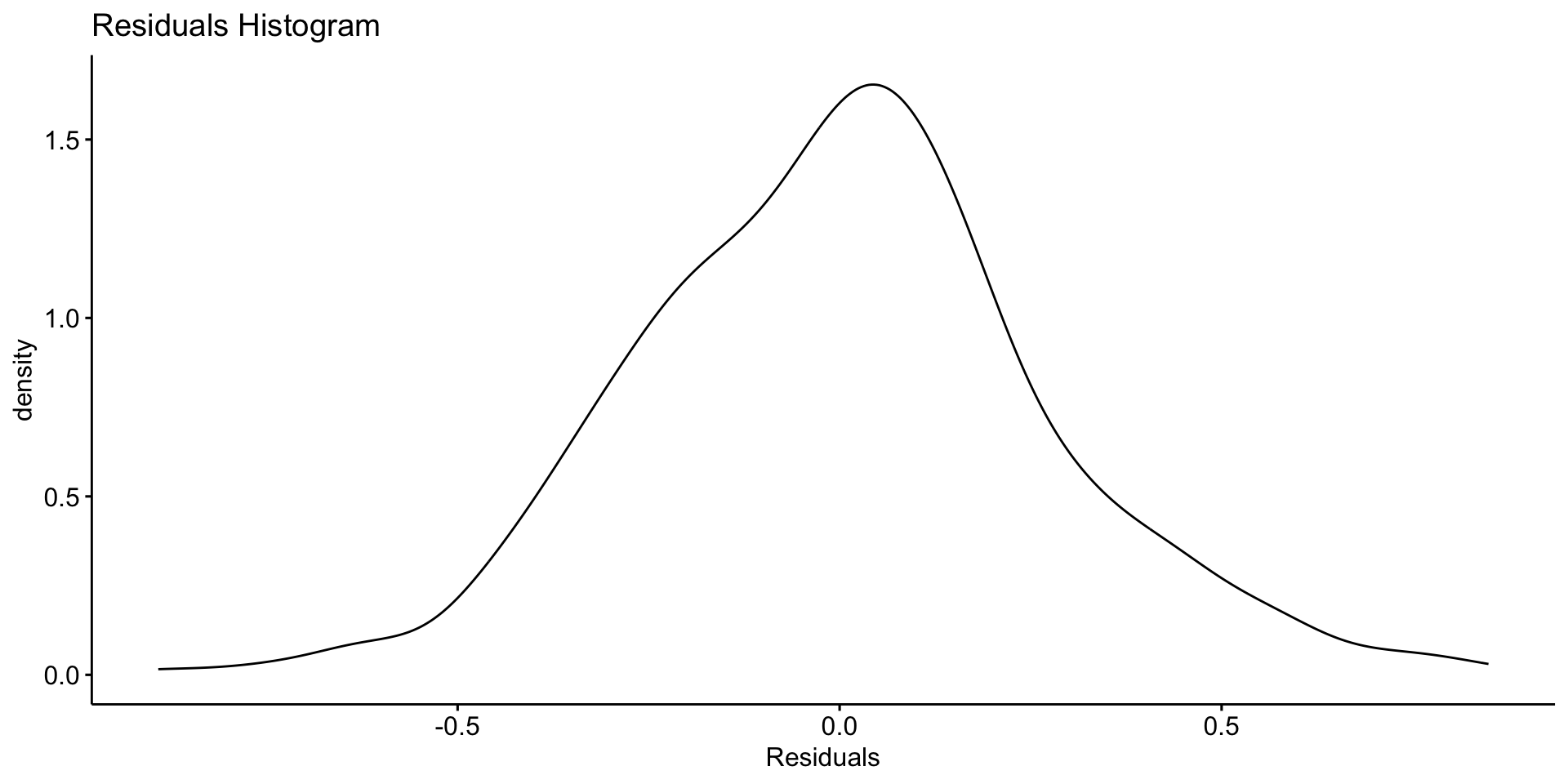
Asssessing Patterns in Error?
You might compute the standard deviation of the residuals to assess noise:
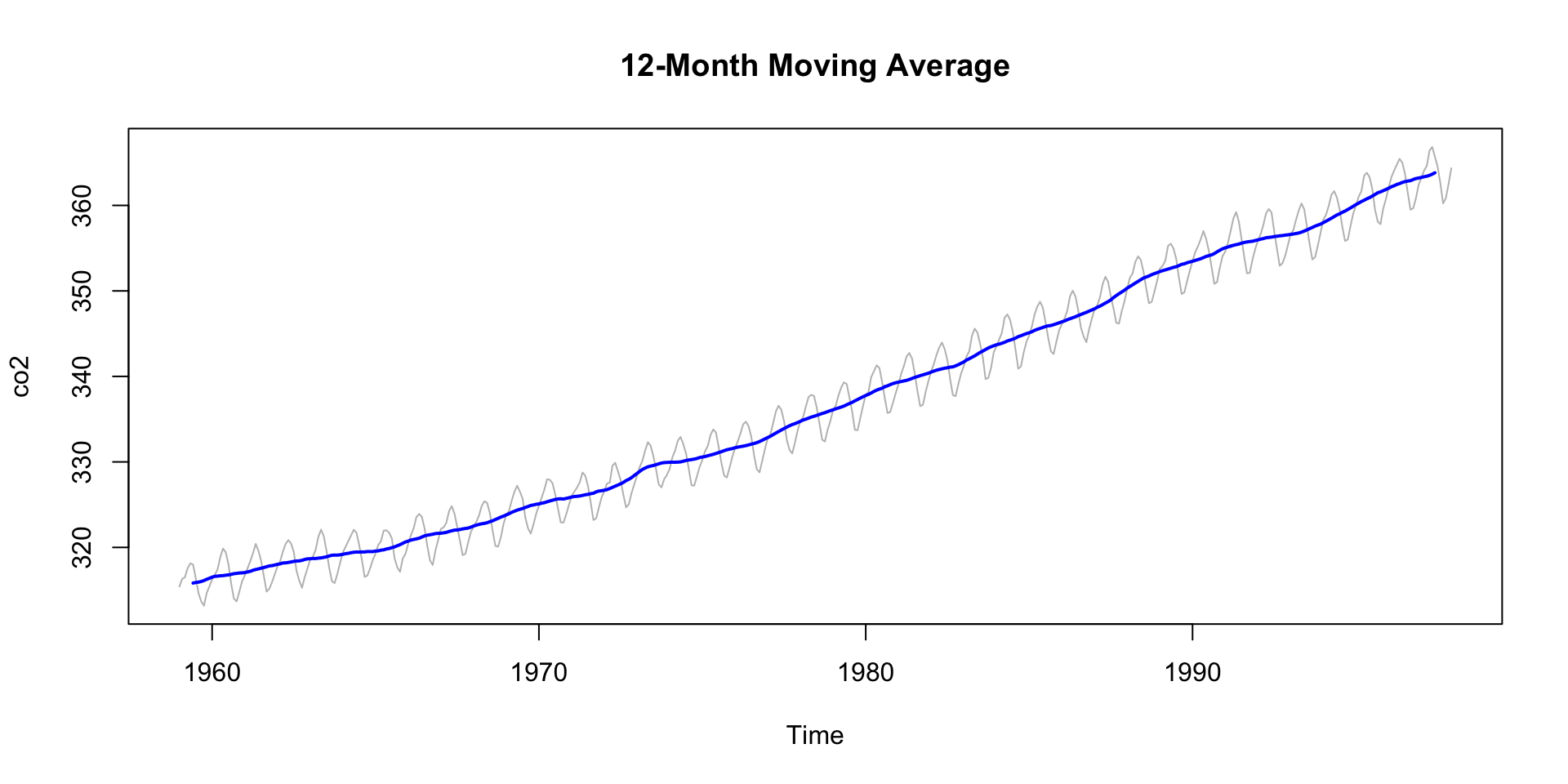
Smoothing to Remove Noise
If your data is noisy - and without usefull pattern - you can use a moving average to smooth it out.
- The
zoopackage provides a convenient function for this that we have already seen in the COVID lab. - The
rollmean()function from thezoopackage is useful for this. - The
kparameter specifies the window size for the moving average. - The
alignparameter specifies how to align the moving average with the original data (e.g., “center”, “left”, “right”). - The
na.padparameter specifies whether to pad the result withNAvalues.
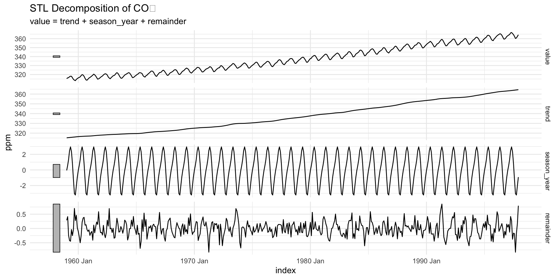
STL Decomposition (Loess-based)
stl()uses local regression (loess) to estimate the trend and seasonal components.s.window = "periodic"specifies that the seasonal component is periodic.Other options include
- “none” (no seasonal component)
- or a numeric value for the seasonal window size.
Component Access
Autoplot
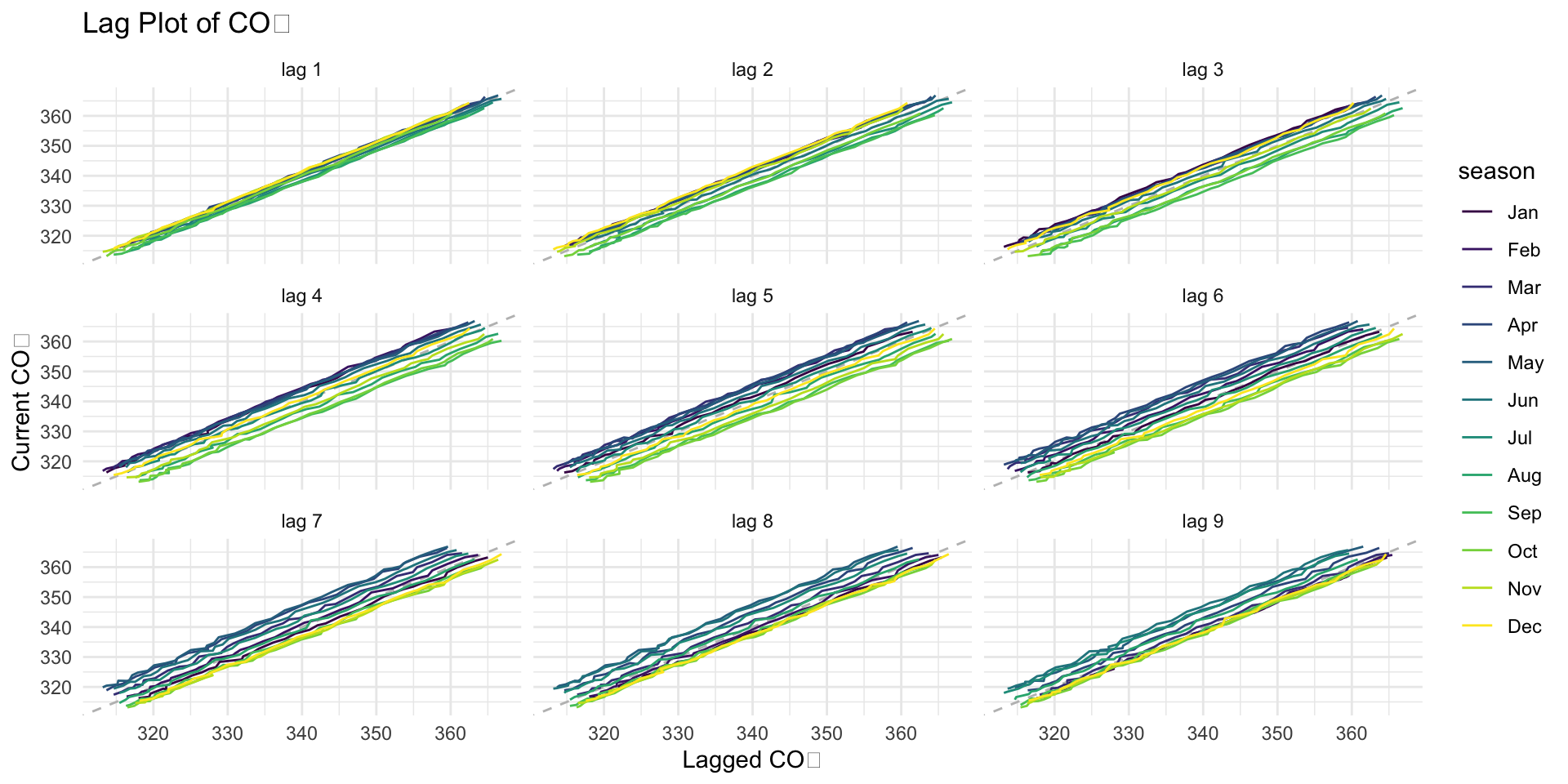
gg_lag()
🧠 Why this is useful:
It helps us see if there are patterns in the data.
It helps us understand how past values affect current values.
It helps us decide if we can use this data to make predictions in the future.
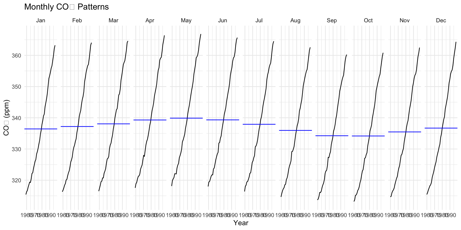
gg_subseries()
gg_season