Lecture 07

Data Visualization

2025-02-15

Data Visualization

ggplot

  • ggplot2 is a library is based on the grammar of graphics

  • the idea is you can build every graph from the same few components:

    1. a data set
    2. geom(s)
    3. a coordinate system
  • ggplot2 provides a programmatic interface for specifying

    1. what variables to plot
    2. how they are displayed
    3. general visual properties.
library(ggplot2)

ggplot

  • Therefore, we only need minimal changes if the underlying data changes or if we decide to change our visual.

  • This helps create publication quality plots with minimal amounts of adjustments and tweaking.

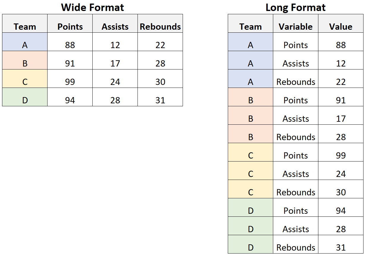
  • ggplot likes data in the ‘long’ format: i.e., a column for every dimension, and a row for every observation. (more on this next week…)

Components of a ggplot:

  • ggplot graphics are built step by step by adding new elements and layers

    1. Data
    2. Geometry (geom)
    3. Aesthetic mapping
    4. Theme
  • Elements of a plot are layered by iteratively adding elements

  • These can be added in a series of 5 steps:

    1. Setup
    2. Layers
    3. Labels
    4. Facets
    5. Themes

Example Data for today …

library(gapminder); library(dplyr);library(ggplot2)

(gm2007 = filter(gapminder, year == 2007))
#> # A tibble: 142 × 6
#>    country     continent  year lifeExp       pop gdpPercap
#>    <fct>       <fct>     <int>   <dbl>     <int>     <dbl>
#>  1 Afghanistan Asia       2007    43.8  31889923      975.
#>  2 Albania     Europe     2007    76.4   3600523     5937.
#>  3 Algeria     Africa     2007    72.3  33333216     6223.
#>  4 Angola      Africa     2007    42.7  12420476     4797.
#>  5 Argentina   Americas   2007    75.3  40301927    12779.
#>  6 Australia   Oceania    2007    81.2  20434176    34435.
#>  7 Austria     Europe     2007    79.8   8199783    36126.
#>  8 Bahrain     Asia       2007    75.6    708573    29796.
#>  9 Bangladesh  Asia       2007    64.1 150448339     1391.
#> 10 Belgium     Europe     2007    79.4  10392226    33693.
#> # ℹ 132 more rows

1. The Setup: canvas

An empty canvas can be initialized with ggplot()

ggplot()

1. The Setup: data

Every ggplot requires a data argument (data.frame/tibble)

ggplot(data = gm2007)

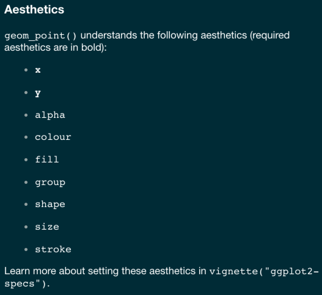
1. The Setup: Aesthetic Mappings

  • Aesthetic mappings describe how variables in the data are visualized

  • Denoted by the aes argument

  • Can be set in ggplot() and/or in individual layers.

  • Aesthetic mappings in the ggplot() call, can be seen by all geom layers.

  • The X and Y axis of the plot as well colors, sizes, shapes, fills are all aesthetic.

  • If you want to have an aesthetic fixed (that is not vary based on a variable) you need to specify it outside the aes()

ggplot(data = gm2007, 
       aes(x = gdpPercap, y = lifeExp))

2. Layers

  • The + sign is used to add layers to a ggplot setup

  • Layers can define geometries, compute summary statistics, define what scales to use, or even change styles.

  • In general a plot construction will look like this:

DATA  |>  
  ggplot(aes(x, y)) + 
  LAYER 1 + 
  LAYER 2 + 

2. Layers: Geometry

  • Many layers in ggplot2 are called ‘geoms’.

  • geoms are the geometric objects (points, lines, bars, etc.) that can be placed on a graph to visualize the X-Y mapping of the input data/aes

  • They are called using functions that start with geom_*.

  • Examples include:

    • points (geom_point, for scatter plots, dot plots, etc)
    • lines (geom_line, for time series, trend lines, etc)
    • boxplots (geom_boxplot)
    • … and many more!
ls(pattern = '^geom_', env = as.environment('package:ggplot2'))
#>  [1] "geom_abline"            "geom_area"              "geom_bar"              
#>  [4] "geom_bin_2d"            "geom_bin2d"             "geom_blank"            
#>  [7] "geom_boxplot"           "geom_col"               "geom_contour"          
#> [10] "geom_contour_filled"    "geom_count"             "geom_crossbar"         
#> [13] "geom_curve"             "geom_density"           "geom_density_2d"       
#> [16] "geom_density_2d_filled" "geom_density2d"         "geom_density2d_filled" 
#> [19] "geom_dotplot"           "geom_errorbar"          "geom_errorbarh"        
#> [22] "geom_freqpoly"          "geom_function"          "geom_hex"              
#> [25] "geom_histogram"         "geom_hline"             "geom_jitter"           
#> [28] "geom_label"             "geom_line"              "geom_linerange"        
#> [31] "geom_map"               "geom_path"              "geom_point"            
#> [34] "geom_pointrange"        "geom_polygon"           "geom_qq"               
#> [37] "geom_qq_line"           "geom_quantile"          "geom_raster"           
#> [40] "geom_rect"              "geom_ribbon"            "geom_rug"              
#> [43] "geom_segment"           "geom_sf"                "geom_sf_label"         
#> [46] "geom_sf_text"           "geom_smooth"            "geom_spoke"            
#> [49] "geom_step"              "geom_text"              "geom_tile"             
#> [52] "geom_violin"            "geom_vline"

2. Layers: Geometry

  • A plot must have at least one geom, but there is no maximum.

  • Adding geoms to a ggplot follows the pattern:

ggplot(data = <DATA>, aes(X, Y)) + 
  <GEOM_FUNCTION>(mapping = aes(<MAPPINGS>))
  <GEOM_FUNCTION>(mapping = aes(<MAPPINGS>))
  • Note again that the aesthetics placed in the ggplot call are the global parameters for the plot, and the aesthetics placed in each geom are specific to that geom.

A first geom_* …

ggplot(data = gm2007,
       aes(x = gdpPercap, y = lifeExp))

A first geom_* …

ggplot(data = gm2007,
       aes(x = gdpPercap, y = lifeExp)) +
  geom_point()

2. Layers: Geometry

Like the set up, geoms can be modified with aesthetics (aes). Examples include:

  • position (i.e., on the x and y axes)
  • color (“outside” color)
  • fill (“inside” color)
  • shape
  • line type
  • size

. . .

Each geom accepts only a subset of these aesthetics

(refer to the geom help pages (e.g. ?geom_point) to see what mappings each geom accepts.

2. Layers: data.frame driven/fixed?

ggplot(data = gm2007, aes(x = gdpPercap, y = lifeExp)) + 
  geom_point(col = "red")

ggplot(data = gm2007, aes(x = gdpPercap, y = lifeExp)) + 
  geom_point(aes(col = continent))

For our example…

ggplot(data = gm2007,
       aes(x = gdpPercap, y = lifeExp))

For our example…

ggplot(data = gm2007,
       aes(x = gdpPercap, y = lifeExp)) +
  geom_point(aes(color = continent,
                 size = pop))

For our example…

ggplot(data = gm2007,
       aes(x = gdpPercap, y = lifeExp)) +
  geom_point(aes(color = continent,
                 size = pop)) +
  geom_smooth(color = "black")

For our example…

ggplot(data = gm2007,
       aes(x = gdpPercap, y = lifeExp)) +
  geom_point(aes(color = continent,
                 size = pop)) +
  geom_smooth(color = "black") +
  geom_hline(yintercept = mean(gm2007$lifeExp), color = "gray")

For our example…

ggplot(data = gm2007,
       aes(x = gdpPercap, y = lifeExp)) +
  geom_point(aes(color = continent,
                 size = pop)) +
  geom_smooth(color = "black") +
  geom_hline(yintercept = mean(gm2007$lifeExp), color = "gray") +
  geom_vline(xintercept = mean(gm2007$gdpPercap), color = "gray")

3. Labels

  • Now that you have drawn the main parts of the graph. You might want to add labs that clarify what is being shown.

  • This can be done using the labs layer.

  • The most typical are: title, x, and y but other options exist!

For our example…

ggplot(data = gm2007, aes(x = gdpPercap, y = lifeExp))

For our example…

ggplot(data = gm2007, aes(x = gdpPercap, y = lifeExp)) +
  geom_point(aes(color = continent, size = pop))

For our example…

ggplot(data = gm2007, aes(x = gdpPercap, y = lifeExp)) +
  geom_point(aes(color = continent, size = pop)) +
  geom_smooth(color = "black", size = .5)

For our example…

ggplot(data = gm2007, aes(x = gdpPercap, y = lifeExp)) +
  geom_point(aes(color = continent, size = pop)) +
  geom_smooth(color = "black", size = .5) +
  geom_hline(yintercept = mean(gm2007$lifeExp), color = "gray")

For our example…

ggplot(data = gm2007, aes(x = gdpPercap, y = lifeExp)) +
  geom_point(aes(color = continent, size = pop)) +
  geom_smooth(color = "black", size = .5) +
  geom_hline(yintercept = mean(gm2007$lifeExp), color = "gray") +
  geom_vline(xintercept = mean(gm2007$gdpPercap), color = "gray")

For our example…

ggplot(data = gm2007, aes(x = gdpPercap, y = lifeExp)) +
  geom_point(aes(color = continent, size = pop)) +
  geom_smooth(color = "black", size = .5) +
  geom_hline(yintercept = mean(gm2007$lifeExp), color = "gray") +
  geom_vline(xintercept = mean(gm2007$gdpPercap), color = "gray") +
  labs(title = "Per capita GDP versus life expectency in 2007",
       x = "Per Capita GDP",
       y = "Life Expectancy",
       caption = "Based on Hans Rosling Plots",
       subtitle = 'Data Source: Gapminder',
       color = "",
       size = "Population")

4. Facets

  • In the previous chart, we showed a scatterplot for all countries plotted in the same chart. What if you want one chart for each continent?

  • Such separation is called faceting

  • facet_wrap() takes in a formula as the argument.

  • Formulas look like this RHS ~ LHS (where RHS = right hand side, LHS = left hand side)

The item on the RHS corresponds to the column. The item on the LHS defines the rows.

  • In facet_wrap, the scales of the X and Y axis are fixed to accommodate all points by default.

  • This makes the comparison of values more meaningful because they would be in the same scale.

  • The scales can be made free by setting the argument scales=free.

Facet Wrap…

ggplot(data = gm2007, aes(x = gdpPercap, y = lifeExp))

Facet Wrap…

ggplot(data = gm2007, aes(x = gdpPercap, y = lifeExp)) +
  geom_point(aes(color = continent, size = pop))

Facet Wrap…

ggplot(data = gm2007, aes(x = gdpPercap, y = lifeExp)) +
  geom_point(aes(color = continent, size = pop)) +
  geom_smooth(color = "black", size = .5)

Facet Wrap…

ggplot(data = gm2007, aes(x = gdpPercap, y = lifeExp)) +
  geom_point(aes(color = continent, size = pop)) +
  geom_smooth(color = "black", size = .5) +
  geom_hline(yintercept = mean(gm2007$lifeExp), color = "gray")

Facet Wrap…

ggplot(data = gm2007, aes(x = gdpPercap, y = lifeExp)) +
  geom_point(aes(color = continent, size = pop)) +
  geom_smooth(color = "black", size = .5) +
  geom_hline(yintercept = mean(gm2007$lifeExp), color = "gray") +
  geom_vline(xintercept = mean(gm2007$gdpPercap), color = "gray")

Facet Wrap…

ggplot(data = gm2007, aes(x = gdpPercap, y = lifeExp)) +
  geom_point(aes(color = continent, size = pop)) +
  geom_smooth(color = "black", size = .5) +
  geom_hline(yintercept = mean(gm2007$lifeExp), color = "gray") +
  geom_vline(xintercept = mean(gm2007$gdpPercap), color = "gray") +
  labs(title = "Per capita GDP versus life expectency in 2007",
       x = "Per Capita GDP",
       y = "Life Expectancy",
       caption = "Based on Hans Rosling Plots",
       subtitle = 'Data Source: Gapminder',
       color = "",
       size = "Population")

Facet Wrap…

ggplot(data = gm2007, aes(x = gdpPercap, y = lifeExp)) +
  geom_point(aes(color = continent, size = pop)) +
  geom_smooth(color = "black", size = .5) +
  geom_hline(yintercept = mean(gm2007$lifeExp), color = "gray") +
  geom_vline(xintercept = mean(gm2007$gdpPercap), color = "gray") +
  labs(title = "Per capita GDP versus life expectency in 2007",
       x = "Per Capita GDP",
       y = "Life Expectancy",
       caption = "Based on Hans Rosling Plots",
       subtitle = 'Data Source: Gapminder',
       color = "",
       size = "Population") +
  facet_wrap(~continent)

Facet Wrap…

ggplot(data = gm2007, aes(x = gdpPercap, y = lifeExp)) +
  geom_point(aes(color = continent, size = pop)) +
  geom_smooth(color = "black", size = .5) +
  geom_hline(yintercept = mean(gm2007$lifeExp), color = "gray") +
  geom_vline(xintercept = mean(gm2007$gdpPercap), color = "gray") +
  labs(title = "Per capita GDP versus life expectency in 2007",
       x = "Per Capita GDP",
       y = "Life Expectancy",
       caption = "Based on Hans Rosling Plots",
       subtitle = 'Data Source: Gapminder',
       color = "",
       size = "Population") +
  facet_wrap(~continent) +
  facet_wrap(~continent, scales = "free")

Facet Grids…

gapminder
#> # A tibble: 1,704 × 6
#>    country     continent  year lifeExp      pop gdpPercap
#>    <fct>       <fct>     <int>   <dbl>    <int>     <dbl>
#>  1 Afghanistan Asia       1952    28.8  8425333      779.
#>  2 Afghanistan Asia       1957    30.3  9240934      821.
#>  3 Afghanistan Asia       1962    32.0 10267083      853.
#>  4 Afghanistan Asia       1967    34.0 11537966      836.
#>  5 Afghanistan Asia       1972    36.1 13079460      740.
#>  6 Afghanistan Asia       1977    38.4 14880372      786.
#>  7 Afghanistan Asia       1982    39.9 12881816      978.
#>  8 Afghanistan Asia       1987    40.8 13867957      852.
#>  9 Afghanistan Asia       1992    41.7 16317921      649.
#> 10 Afghanistan Asia       1997    41.8 22227415      635.
#> # ℹ 1,694 more rows

Facet Grids…

gapminder %>%
  filter(year %in% c(1952, 1977, 2007))
#> # A tibble: 426 × 6
#>    country     continent  year lifeExp      pop gdpPercap
#>    <fct>       <fct>     <int>   <dbl>    <int>     <dbl>
#>  1 Afghanistan Asia       1952    28.8  8425333      779.
#>  2 Afghanistan Asia       1977    38.4 14880372      786.
#>  3 Afghanistan Asia       2007    43.8 31889923      975.
#>  4 Albania     Europe     1952    55.2  1282697     1601.
#>  5 Albania     Europe     1977    68.9  2509048     3533.
#>  6 Albania     Europe     2007    76.4  3600523     5937.
#>  7 Algeria     Africa     1952    43.1  9279525     2449.
#>  8 Algeria     Africa     1977    58.0 17152804     4910.
#>  9 Algeria     Africa     2007    72.3 33333216     6223.
#> 10 Angola      Africa     1952    30.0  4232095     3521.
#> # ℹ 416 more rows

Facet Grids…

gapminder %>%
  filter(year %in% c(1952, 1977, 2007)) %>%
  ggplot(aes(x = gdpPercap, y = lifeExp))

Facet Grids…

gapminder %>%
  filter(year %in% c(1952, 1977, 2007)) %>%
  ggplot(aes(x = gdpPercap, y = lifeExp)) +
  geom_point(aes(size = pop))

Facet Grids…

gapminder %>%
  filter(year %in% c(1952, 1977, 2007)) %>%
  ggplot(aes(x = gdpPercap, y = lifeExp)) +
  geom_point(aes(size = pop)) +
  labs(title = "Per capita GDP versus life expectency in 2007",
       x = "Per Capita GDP",
       y = "Life Expectancy",
       caption = "Based on Hans Rosling Plots",
       subtitle = 'Data Source: Gapminder',
       color = "",
       size = "Population")

Facet Grids…

gapminder %>%
  filter(year %in% c(1952, 1977, 2007)) %>%
  ggplot(aes(x = gdpPercap, y = lifeExp)) +
  geom_point(aes(size = pop)) +
  labs(title = "Per capita GDP versus life expectency in 2007",
       x = "Per Capita GDP",
       y = "Life Expectancy",
       caption = "Based on Hans Rosling Plots",
       subtitle = 'Data Source: Gapminder',
       color = "",
       size = "Population") +
  facet_wrap(year~continent)

Facet Grids…

gapminder %>%
  filter(year %in% c(1952, 1977, 2007)) %>%
  ggplot(aes(x = gdpPercap, y = lifeExp)) +
  geom_point(aes(size = pop)) +
  labs(title = "Per capita GDP versus life expectency in 2007",
       x = "Per Capita GDP",
       y = "Life Expectancy",
       caption = "Based on Hans Rosling Plots",
       subtitle = 'Data Source: Gapminder',
       color = "",
       size = "Population") +
  facet_wrap(year~continent) +
  facet_grid(year~continent)

Facet Grids…

gapminder %>%
  filter(year %in% c(1952, 1977, 2007)) %>%
  ggplot(aes(x = gdpPercap, y = lifeExp)) +
  geom_point(aes(size = pop)) +
  labs(title = "Per capita GDP versus life expectency in 2007",
       x = "Per Capita GDP",
       y = "Life Expectancy",
       caption = "Based on Hans Rosling Plots",
       subtitle = 'Data Source: Gapminder',
       color = "",
       size = "Population") +
  facet_wrap(year~continent) +
  facet_grid(year~continent) +
  facet_grid(continent~year)
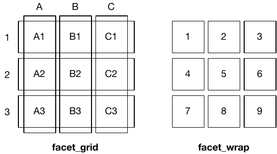
Grids vs Wrap

  • facet_wrap(): Used for one faceting variable (or two), automatically wraps facets into rows and columns for a flexible layout.
  • facet_grid(): Used for two faceting variables, arranges plots in a strict row-column grid.

Layout Difference: facet_wrap() optimizes space, while facet_grid() maintains a fixed structure.

Use Case: Use facet_wrap() for many categories without hierarchy; use facet_grid() for structured relationships between two variables.

5. Theme

  • Great! Now we just need to polish our plots…

  • ggplot offers a themeing system:

    1. elements specify the non-data elements that you can control. For example,
    • plot.title controls the appearance of the plot title;
    • axis.ticks.x controls the ticks on the x axis;
    • legend.key.height, controls the height of the keys in the legend.
    1. Each element is associated with an element function, which describes the visual properties. For example,
    • element_text() sets the font size, color and face of text elements like plot.title.
    1. The theme() function which allows you to override default elements:
    • For example theme(plot.title = element_text(color = "red")).

Built in themes

Wow! That’s a lot :) Fortunately, ggplot comes with many default themes that set all of the theme elements to values designed to work together harmoniously.

#>  [1] "theme_bw"       "theme_classic"  "theme_dark"     "theme_get"     
#>  [5] "theme_gray"     "theme_grey"     "theme_light"    "theme_linedraw"
#>  [9] "theme_minimal"  "theme_replace"  "theme_set"      "theme_test"    
#> [13] "theme_update"   "theme_void"

theme_bw()

  • All themes are )functions_ that “precann” a specified set of rules:
theme_bw
#> function (base_size = 11, base_family = "", base_line_size = base_size/22, 
#>     base_rect_size = base_size/22) 
#> {
#>     theme_grey(base_size = base_size, base_family = base_family, 
#>         base_line_size = base_line_size, base_rect_size = base_rect_size) %+replace% 
#>         theme(panel.background = element_rect(fill = "white", 
#>             colour = NA), panel.border = element_rect(fill = NA, 
#>             colour = "grey20"), panel.grid = element_line(colour = "grey92"), 
#>             panel.grid.minor = element_line(linewidth = rel(0.5)), 
#>             strip.background = element_rect(fill = "grey85", 
#>                 colour = "grey20"), complete = TRUE)
#> }
#> <bytecode: 0x130765670>
#> <environment: namespace:ggplot2>

Built in Themes…

gm2007
#> # A tibble: 142 × 6
#>    country     continent  year lifeExp       pop gdpPercap
#>    <fct>       <fct>     <int>   <dbl>     <int>     <dbl>
#>  1 Afghanistan Asia       2007    43.8  31889923      975.
#>  2 Albania     Europe     2007    76.4   3600523     5937.
#>  3 Algeria     Africa     2007    72.3  33333216     6223.
#>  4 Angola      Africa     2007    42.7  12420476     4797.
#>  5 Argentina   Americas   2007    75.3  40301927    12779.
#>  6 Australia   Oceania    2007    81.2  20434176    34435.
#>  7 Austria     Europe     2007    79.8   8199783    36126.
#>  8 Bahrain     Asia       2007    75.6    708573    29796.
#>  9 Bangladesh  Asia       2007    64.1 150448339     1391.
#> 10 Belgium     Europe     2007    79.4  10392226    33693.
#> # ℹ 132 more rows

Built in Themes…

gm2007 %>%
  ggplot(aes(x = gdpPercap, y = lifeExp))

Built in Themes…

gm2007 %>%
  ggplot(aes(x = gdpPercap, y = lifeExp)) +
  geom_point(aes(color = continent, size = pop))

Built in Themes…

gm2007 %>%
  ggplot(aes(x = gdpPercap, y = lifeExp)) +
  geom_point(aes(color = continent, size = pop)) +
  labs(title = "Per capita GDP versus life expectency in 2007",
       x = "Per Capita GDP",
       y = "Life Expectancy",
       caption = "Based on Hans Rosling Plots",
       subtitle = 'Data Source: Gapminder',
       color = "",
       size = "Population")

Built in Themes…

gm2007 %>%
  ggplot(aes(x = gdpPercap, y = lifeExp)) +
  geom_point(aes(color = continent, size = pop)) +
  labs(title = "Per capita GDP versus life expectency in 2007",
       x = "Per Capita GDP",
       y = "Life Expectancy",
       caption = "Based on Hans Rosling Plots",
       subtitle = 'Data Source: Gapminder',
       color = "",
       size = "Population") +
  theme_bw()

Built in Themes…

gm2007 %>%
  ggplot(aes(x = gdpPercap, y = lifeExp)) +
  geom_point(aes(color = continent, size = pop)) +
  labs(title = "Per capita GDP versus life expectency in 2007",
       x = "Per Capita GDP",
       y = "Life Expectancy",
       caption = "Based on Hans Rosling Plots",
       subtitle = 'Data Source: Gapminder',
       color = "",
       size = "Population") +
  theme_bw() +
  theme_dark()

Built in Themes…

gm2007 %>%
  ggplot(aes(x = gdpPercap, y = lifeExp)) +
  geom_point(aes(color = continent, size = pop)) +
  labs(title = "Per capita GDP versus life expectency in 2007",
       x = "Per Capita GDP",
       y = "Life Expectancy",
       caption = "Based on Hans Rosling Plots",
       subtitle = 'Data Source: Gapminder',
       color = "",
       size = "Population") +
  theme_bw() +
  theme_dark() +
  theme_gray()

Built in Themes…

gm2007 %>%
  ggplot(aes(x = gdpPercap, y = lifeExp)) +
  geom_point(aes(color = continent, size = pop)) +
  labs(title = "Per capita GDP versus life expectency in 2007",
       x = "Per Capita GDP",
       y = "Life Expectancy",
       caption = "Based on Hans Rosling Plots",
       subtitle = 'Data Source: Gapminder',
       color = "",
       size = "Population") +
  theme_bw() +
  theme_dark() +
  theme_gray() +
  theme_minimal()

Built in Themes…

gm2007 %>%
  ggplot(aes(x = gdpPercap, y = lifeExp)) +
  geom_point(aes(color = continent, size = pop)) +
  labs(title = "Per capita GDP versus life expectency in 2007",
       x = "Per Capita GDP",
       y = "Life Expectancy",
       caption = "Based on Hans Rosling Plots",
       subtitle = 'Data Source: Gapminder',
       color = "",
       size = "Population") +
  theme_bw() +
  theme_dark() +
  theme_gray() +
  theme_minimal() +
  theme_light()

ggtheme package…

library(ggthemes)

ggtheme package…

library(ggthemes)

gm2007
#> # A tibble: 142 × 6
#>    country     continent  year lifeExp       pop gdpPercap
#>    <fct>       <fct>     <int>   <dbl>     <int>     <dbl>
#>  1 Afghanistan Asia       2007    43.8  31889923      975.
#>  2 Albania     Europe     2007    76.4   3600523     5937.
#>  3 Algeria     Africa     2007    72.3  33333216     6223.
#>  4 Angola      Africa     2007    42.7  12420476     4797.
#>  5 Argentina   Americas   2007    75.3  40301927    12779.
#>  6 Australia   Oceania    2007    81.2  20434176    34435.
#>  7 Austria     Europe     2007    79.8   8199783    36126.
#>  8 Bahrain     Asia       2007    75.6    708573    29796.
#>  9 Bangladesh  Asia       2007    64.1 150448339     1391.
#> 10 Belgium     Europe     2007    79.4  10392226    33693.
#> # ℹ 132 more rows

ggtheme package…

library(ggthemes)

gm2007 %>%
  ggplot(aes(x = gdpPercap, y = lifeExp))

ggtheme package…

library(ggthemes)

gm2007 %>%
  ggplot(aes(x = gdpPercap, y = lifeExp)) +
  geom_point(aes(color = continent, size = pop))

ggtheme package…

library(ggthemes)

gm2007 %>%
  ggplot(aes(x = gdpPercap, y = lifeExp)) +
  geom_point(aes(color = continent, size = pop)) +
  labs(title = "Per capita GDP versus life expectency in 2007",
       x = "Per Capita GDP",
       y = "Life Expectancy",
       caption = "Based on Hans Rosling Plots",
       subtitle = 'Data Source: Gapminder',
       color = "",
       size = "Population")

ggtheme package…

library(ggthemes)

gm2007 %>%
  ggplot(aes(x = gdpPercap, y = lifeExp)) +
  geom_point(aes(color = continent, size = pop)) +
  labs(title = "Per capita GDP versus life expectency in 2007",
       x = "Per Capita GDP",
       y = "Life Expectancy",
       caption = "Based on Hans Rosling Plots",
       subtitle = 'Data Source: Gapminder',
       color = "",
       size = "Population") +
  ggthemes::theme_stata()

ggtheme package…

library(ggthemes)

gm2007 %>%
  ggplot(aes(x = gdpPercap, y = lifeExp)) +
  geom_point(aes(color = continent, size = pop)) +
  labs(title = "Per capita GDP versus life expectency in 2007",
       x = "Per Capita GDP",
       y = "Life Expectancy",
       caption = "Based on Hans Rosling Plots",
       subtitle = 'Data Source: Gapminder',
       color = "",
       size = "Population") +
  ggthemes::theme_stata() +
  ggthemes::theme_economist()

ggtheme package…

library(ggthemes)

gm2007 %>%
  ggplot(aes(x = gdpPercap, y = lifeExp)) +
  geom_point(aes(color = continent, size = pop)) +
  labs(title = "Per capita GDP versus life expectency in 2007",
       x = "Per Capita GDP",
       y = "Life Expectancy",
       caption = "Based on Hans Rosling Plots",
       subtitle = 'Data Source: Gapminder',
       color = "",
       size = "Population") +
  ggthemes::theme_stata() +
  ggthemes::theme_economist() +
  ggthemes::theme_economist_white()

ggtheme package…

library(ggthemes)

gm2007 %>%
  ggplot(aes(x = gdpPercap, y = lifeExp)) +
  geom_point(aes(color = continent, size = pop)) +
  labs(title = "Per capita GDP versus life expectency in 2007",
       x = "Per Capita GDP",
       y = "Life Expectancy",
       caption = "Based on Hans Rosling Plots",
       subtitle = 'Data Source: Gapminder',
       color = "",
       size = "Population") +
  ggthemes::theme_stata() +
  ggthemes::theme_economist() +
  ggthemes::theme_economist_white() +
  ggthemes::theme_fivethirtyeight()

ggtheme package…

library(ggthemes)

gm2007 %>%
  ggplot(aes(x = gdpPercap, y = lifeExp)) +
  geom_point(aes(color = continent, size = pop)) +
  labs(title = "Per capita GDP versus life expectency in 2007",
       x = "Per Capita GDP",
       y = "Life Expectancy",
       caption = "Based on Hans Rosling Plots",
       subtitle = 'Data Source: Gapminder',
       color = "",
       size = "Population") +
  ggthemes::theme_stata() +
  ggthemes::theme_economist() +
  ggthemes::theme_economist_white() +
  ggthemes::theme_fivethirtyeight() +
  ggthemes::theme_gdocs()

ggtheme package…

library(ggthemes)

gm2007 %>%
  ggplot(aes(x = gdpPercap, y = lifeExp)) +
  geom_point(aes(color = continent, size = pop)) +
  labs(title = "Per capita GDP versus life expectency in 2007",
       x = "Per Capita GDP",
       y = "Life Expectancy",
       caption = "Based on Hans Rosling Plots",
       subtitle = 'Data Source: Gapminder',
       color = "",
       size = "Population") +
  ggthemes::theme_stata() +
  ggthemes::theme_economist() +
  ggthemes::theme_economist_white() +
  ggthemes::theme_fivethirtyeight() +
  ggthemes::theme_gdocs() +
  ggthemes::theme_excel()

ggtheme package…

library(ggthemes)

gm2007 %>%
  ggplot(aes(x = gdpPercap, y = lifeExp)) +
  geom_point(aes(color = continent, size = pop)) +
  labs(title = "Per capita GDP versus life expectency in 2007",
       x = "Per Capita GDP",
       y = "Life Expectancy",
       caption = "Based on Hans Rosling Plots",
       subtitle = 'Data Source: Gapminder',
       color = "",
       size = "Population") +
  ggthemes::theme_stata() +
  ggthemes::theme_economist() +
  ggthemes::theme_economist_white() +
  ggthemes::theme_fivethirtyeight() +
  ggthemes::theme_gdocs() +
  ggthemes::theme_excel() +
  ggthemes::theme_wsj()

ggtheme package…

library(ggthemes)

gm2007 %>%
  ggplot(aes(x = gdpPercap, y = lifeExp)) +
  geom_point(aes(color = continent, size = pop)) +
  labs(title = "Per capita GDP versus life expectency in 2007",
       x = "Per Capita GDP",
       y = "Life Expectancy",
       caption = "Based on Hans Rosling Plots",
       subtitle = 'Data Source: Gapminder',
       color = "",
       size = "Population") +
  ggthemes::theme_stata() +
  ggthemes::theme_economist() +
  ggthemes::theme_economist_white() +
  ggthemes::theme_fivethirtyeight() +
  ggthemes::theme_gdocs() +
  ggthemes::theme_excel() +
  ggthemes::theme_wsj() +
  ggthemes::theme_hc()
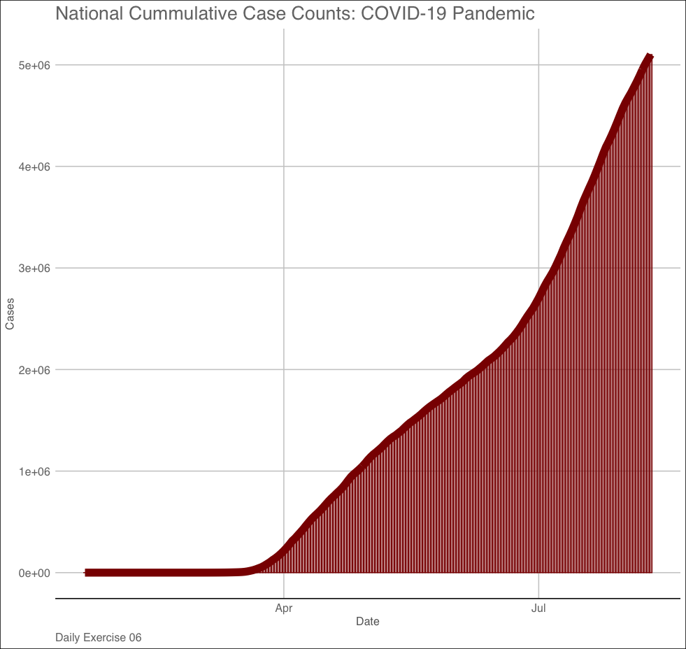
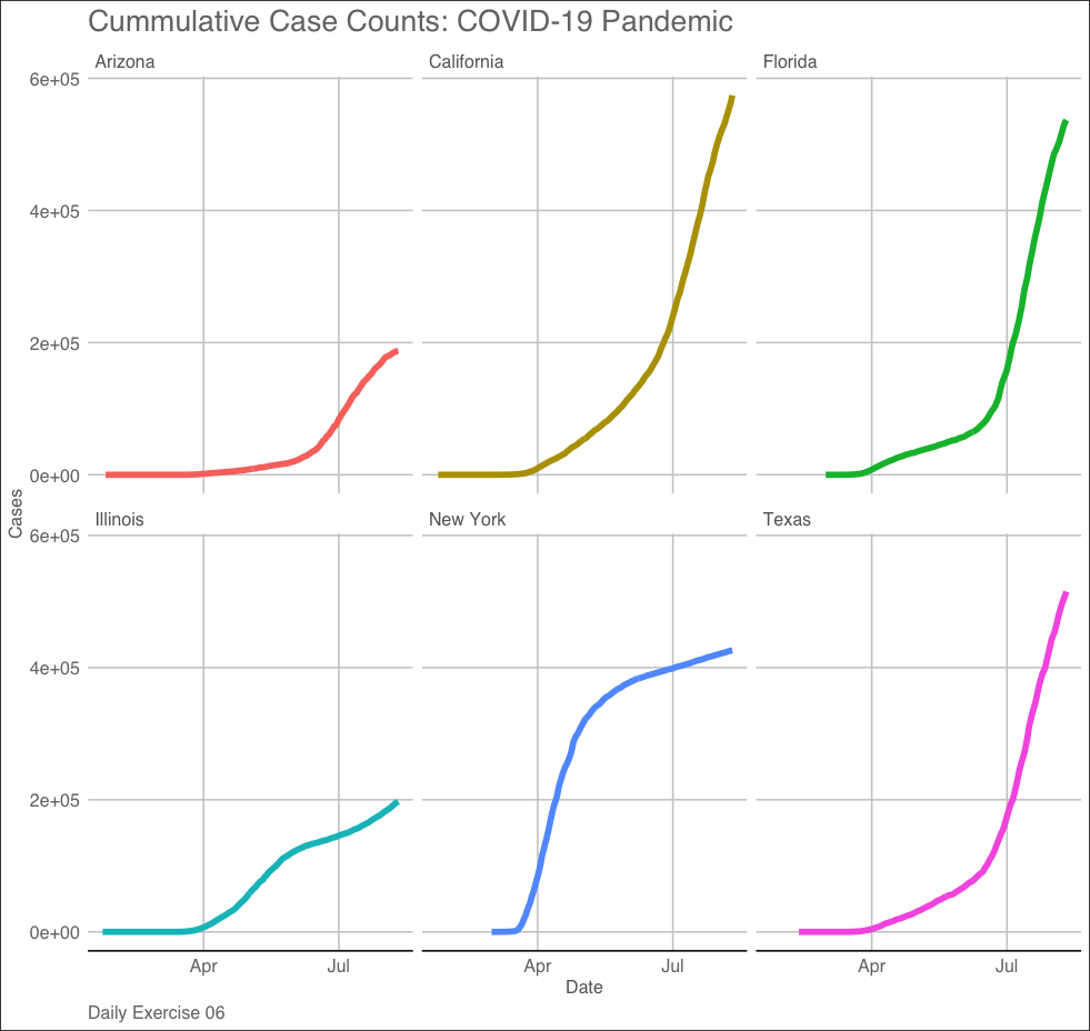
Saving a ggplot element…

  • Remember that in R, we assign object to names. We have seen examples including values, data structures, and functions:
x = 10 
class(x)
#> [1] "numeric"
  • ggplot outputs are also objects!
gg = ggplot()
class(gg)
#> [1] "gg"     "ggplot"

lobstr::obj_addr(gg)
#> [1] "0x133c06cb8"

ggsave()

  • ggplot comes with a function ggsave(), that write a gg object to a file path (with path, name, extension)
ggsave(gg, file = "img/my-beatuiful-plot.png")

# or #

gg  |>  
  ggsave(file = "img/my-beatuiful-plot.png", 
         width = 8, 
         units = c("in"))

Assignment

In your ess-330-daily-exercises project…

  1. Make a new R directory (mkdir R from the parent directory)
  2. Create a new R file called day-07.R (touch R/day-07.R)
  3. Open that file.
  • This is an R script. Unlike Quarto it will not knit, but unlike the console, it will save and keep your code.
  1. In this file add your name, date, and the purpose of the script as comments (preceded by #)
  2. Now, read in the COVID-19 data from the URL like yesterday

Question 1

Make a faceted line plot (geom_line) of the 6** states with most cases. Your X axis should be the date and the y axis cases.**

We can break this task into 4 steps:

  1. Identify the six states with the most current cases (yesterdays assignment + dplyr::pull)
  2. Filter the raw data to those 6 states (hint: %in%)
  3. Set up a ggplot –> add layers –> add labels –> add a facet –> add a theme
  4. save the image to you img directory (hint: ggsave())

Question 2:

Make a column plot (geom_col) of daily total cases in the USA. Your X axis should be the date and the y axis cases.

We can break this task into 3 steps:

  1. Identify the total cases each day in the whole country (hint: group_by(date))
  2. Set up a ggplot –> add layers –> add labels –> add a theme
  3. Save the image to your img directory (hint: ggsave())

Submission:

Turn in your Rscript, and 2 images to the Canvas dropbox