We’ve covered many topics on how to manipulate and reshape a single data.frame:
Storage vs Implementation: Bytes/Bytes vs Interpretation
Location: remote/local/memory
Data: types & structures
Manipulation: dplyr verbs: grammar of data manipulation
Visualization: ggplot2: grammar of data visualization
Today: When one table is not enough, when tidy isn’t “right”
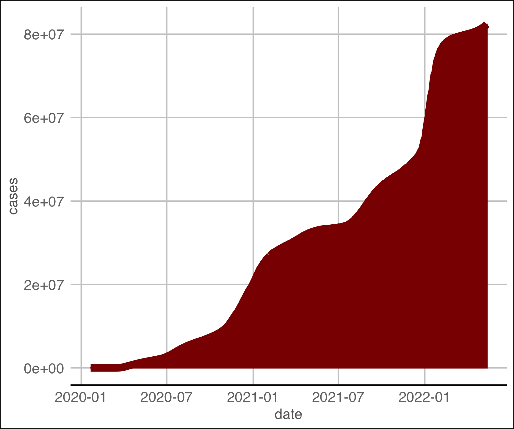
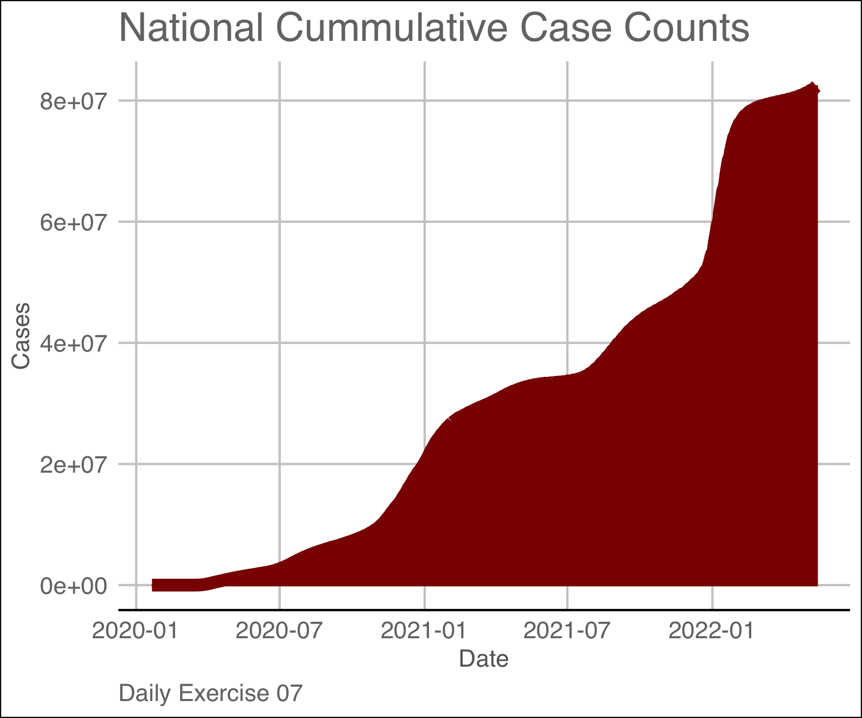
Yesterdays Assignment
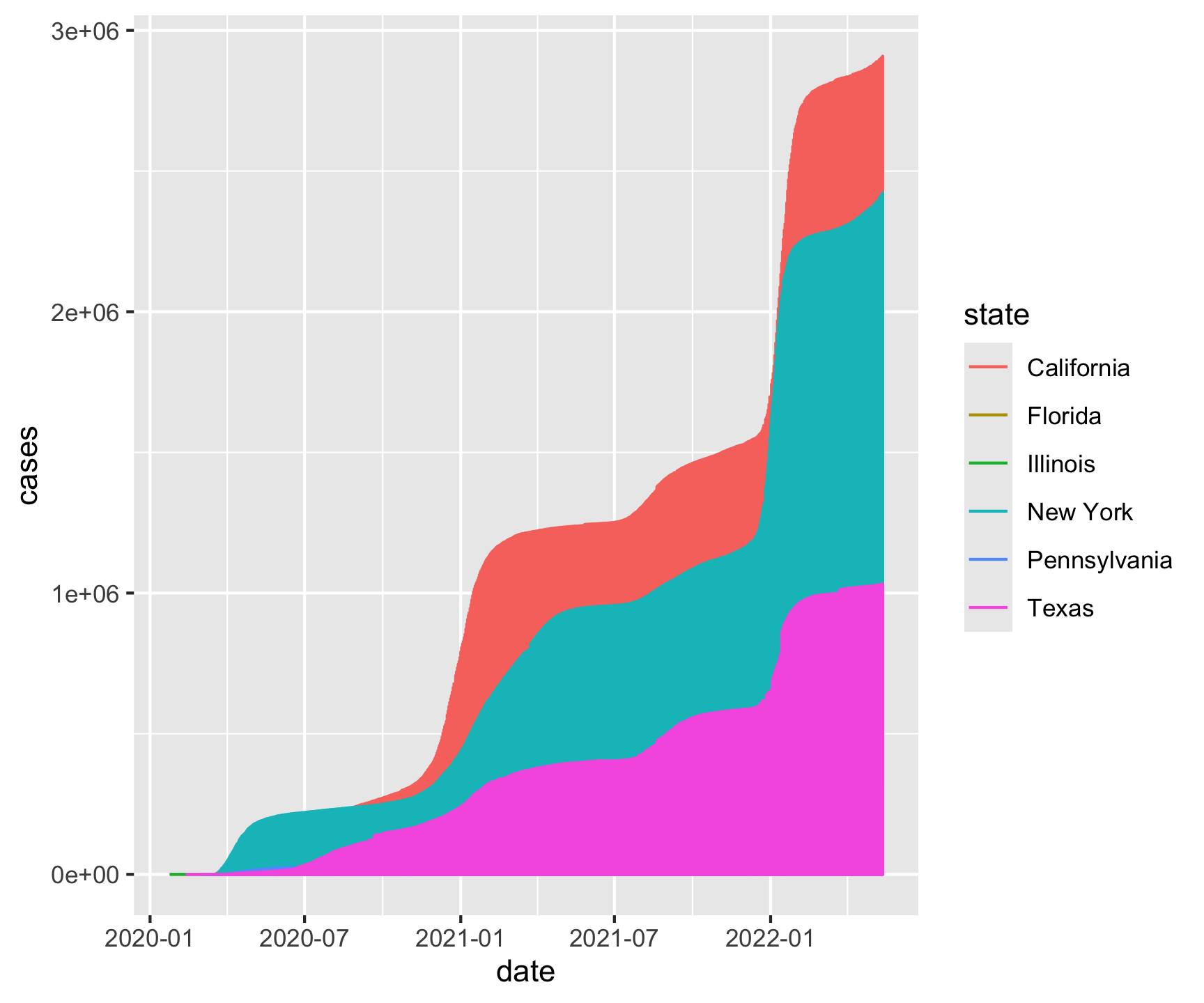
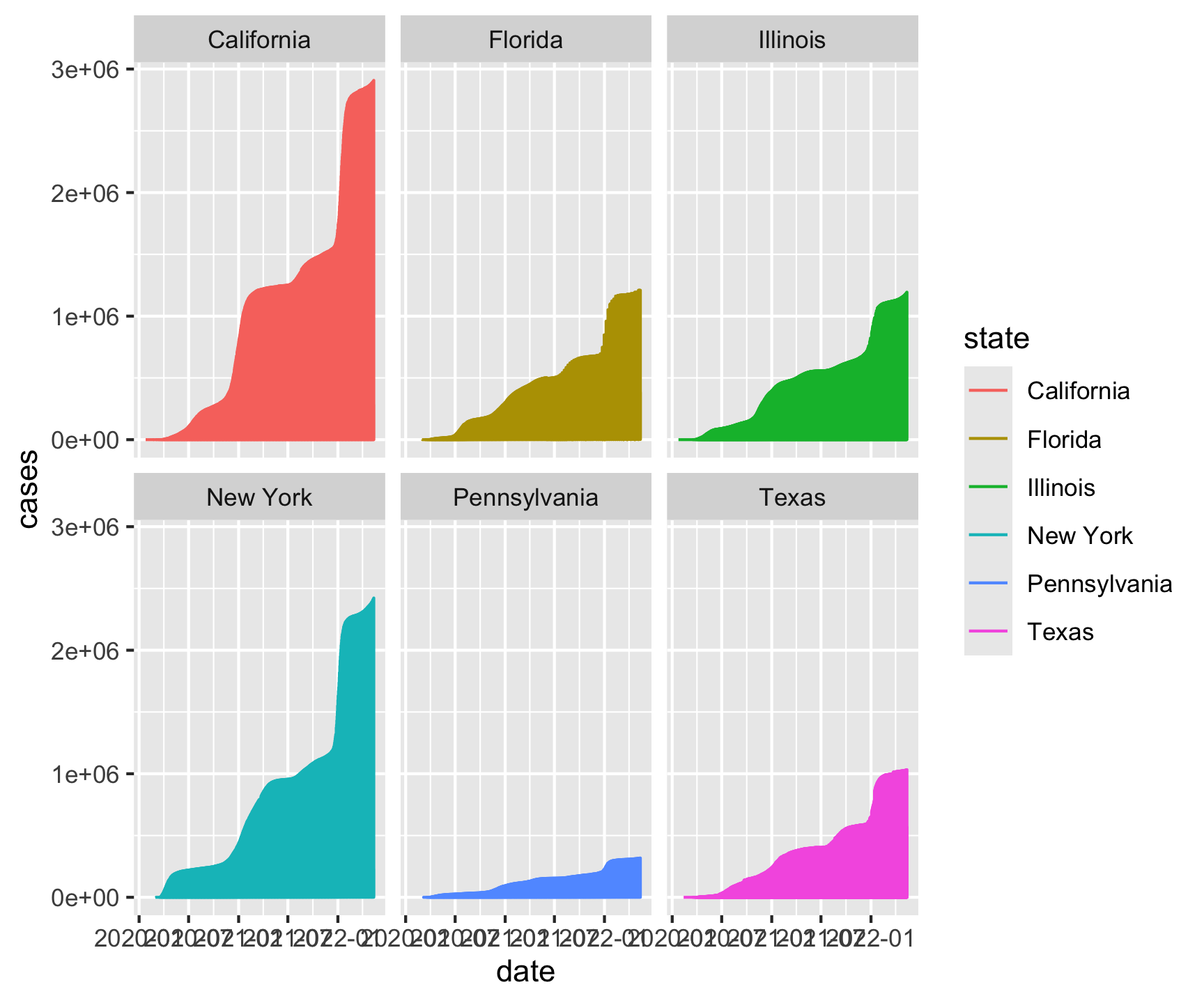
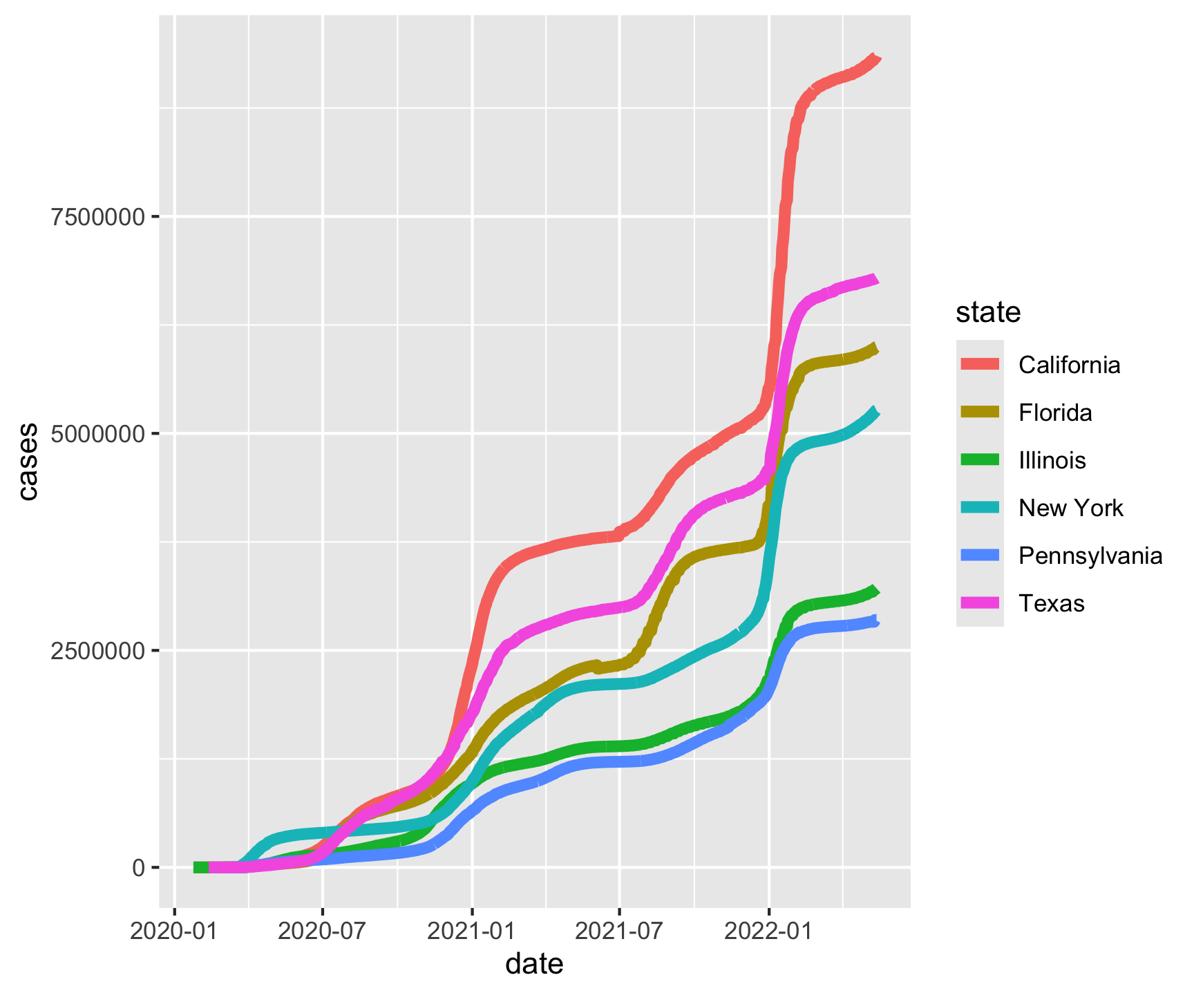
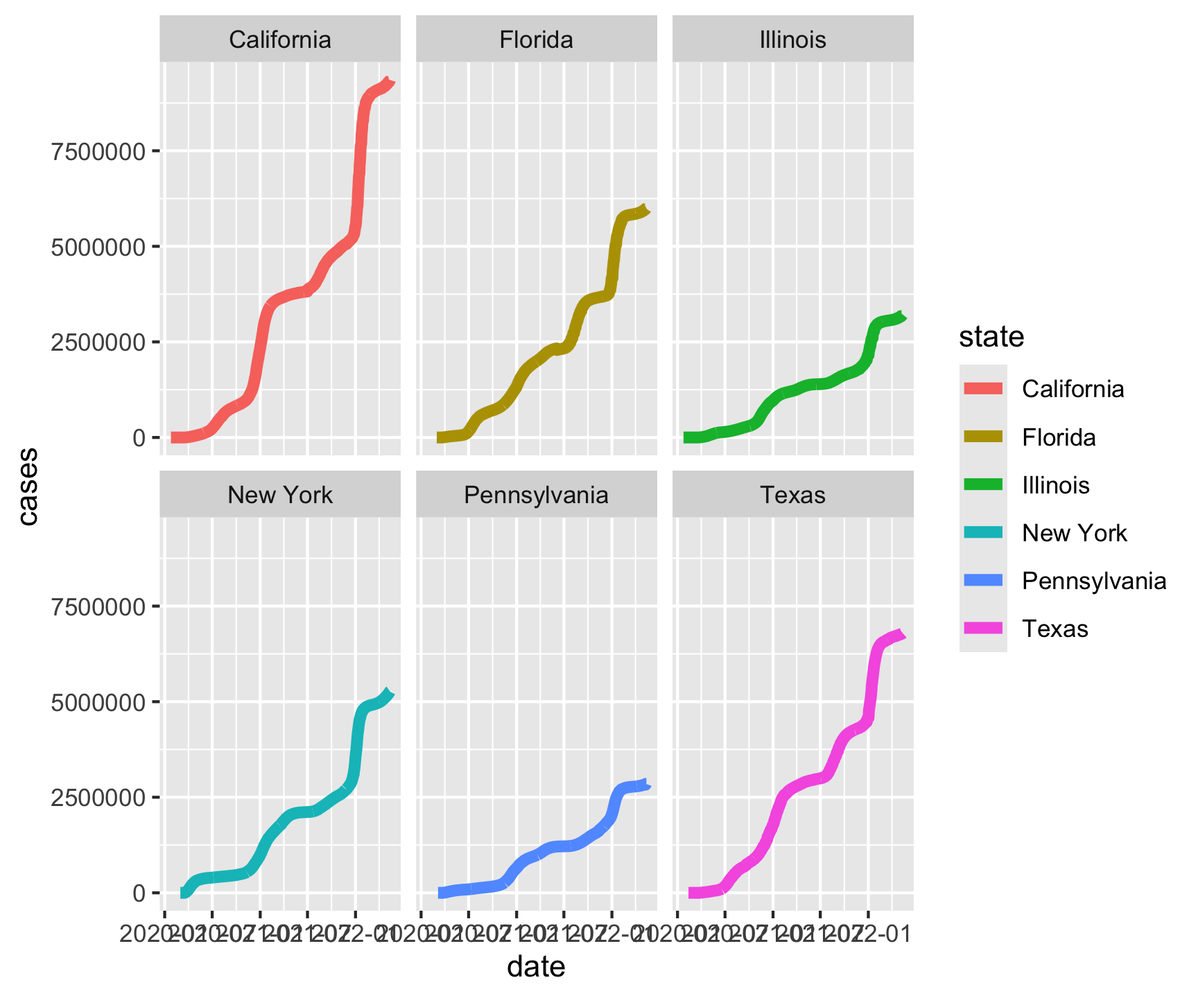
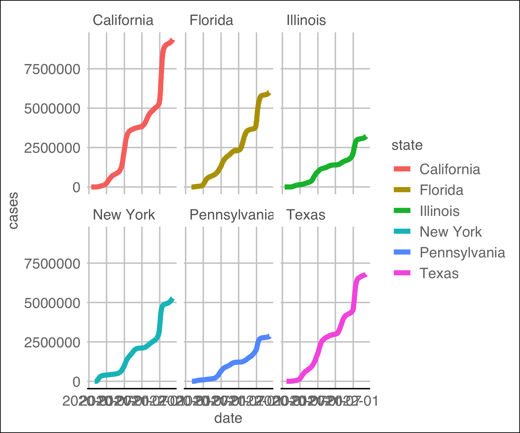
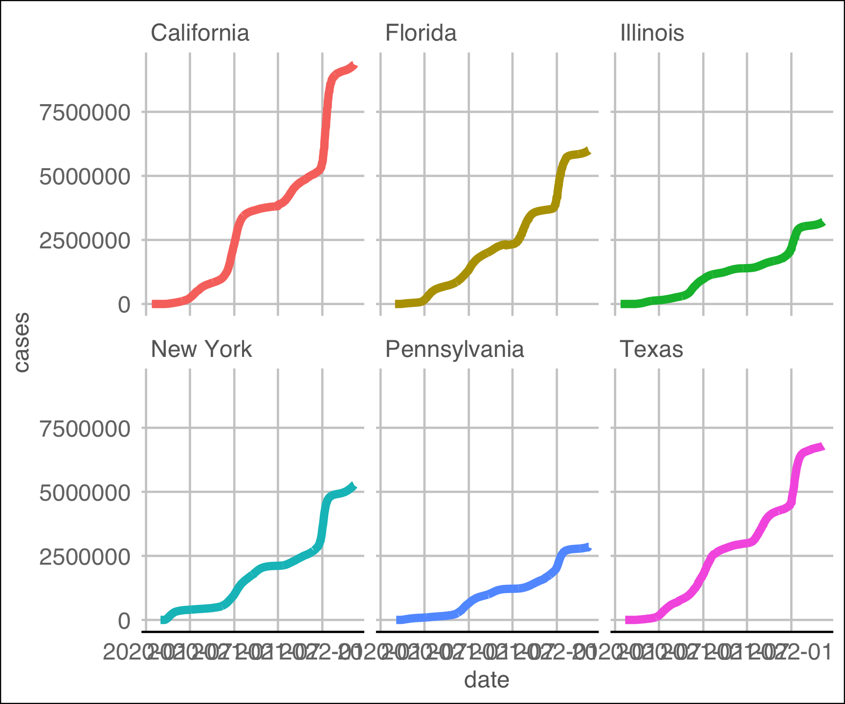
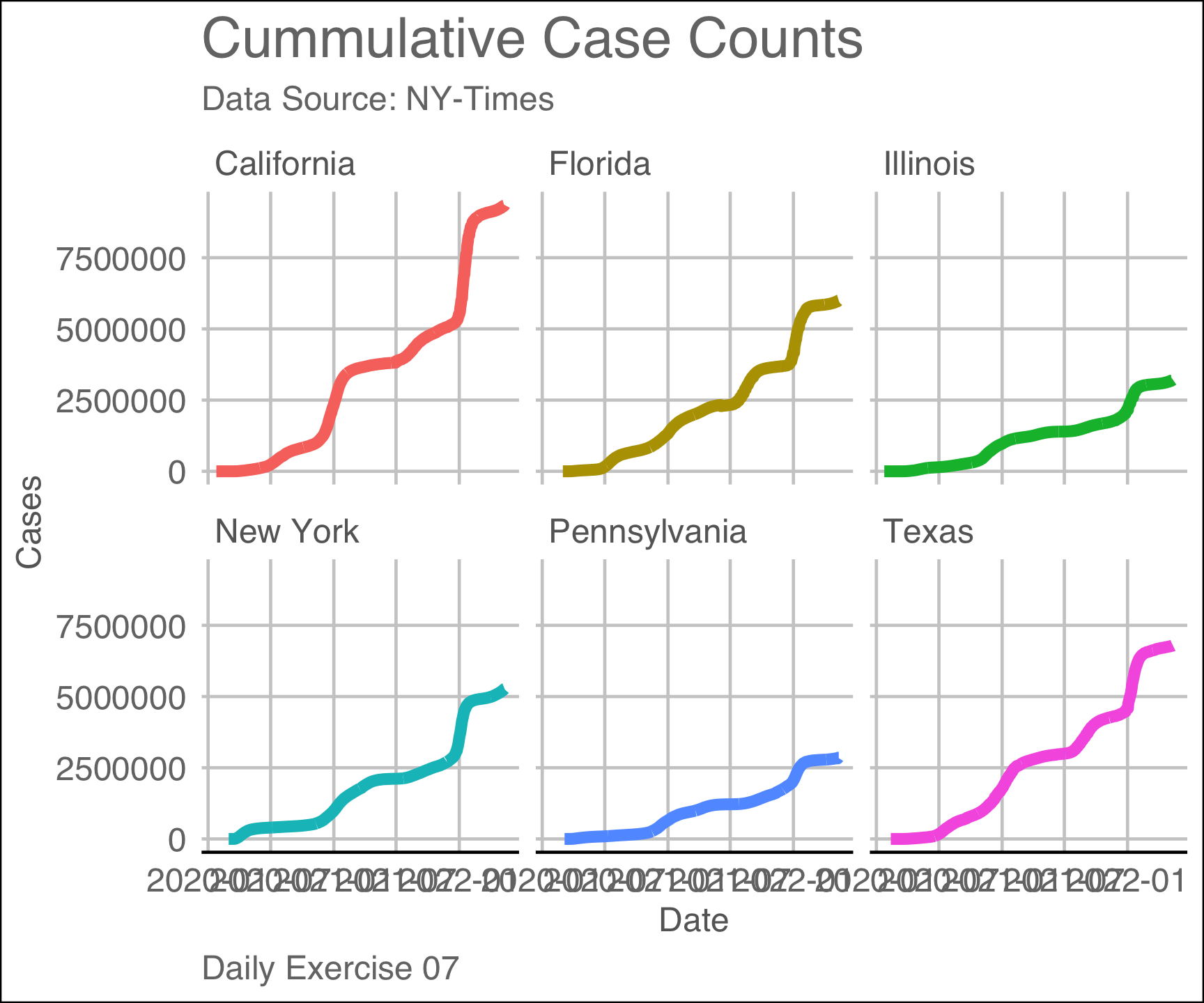
Make a faceted line plot (geom_line) of the 6 states with most cases. Your X axis should be the date and the y axis cases.
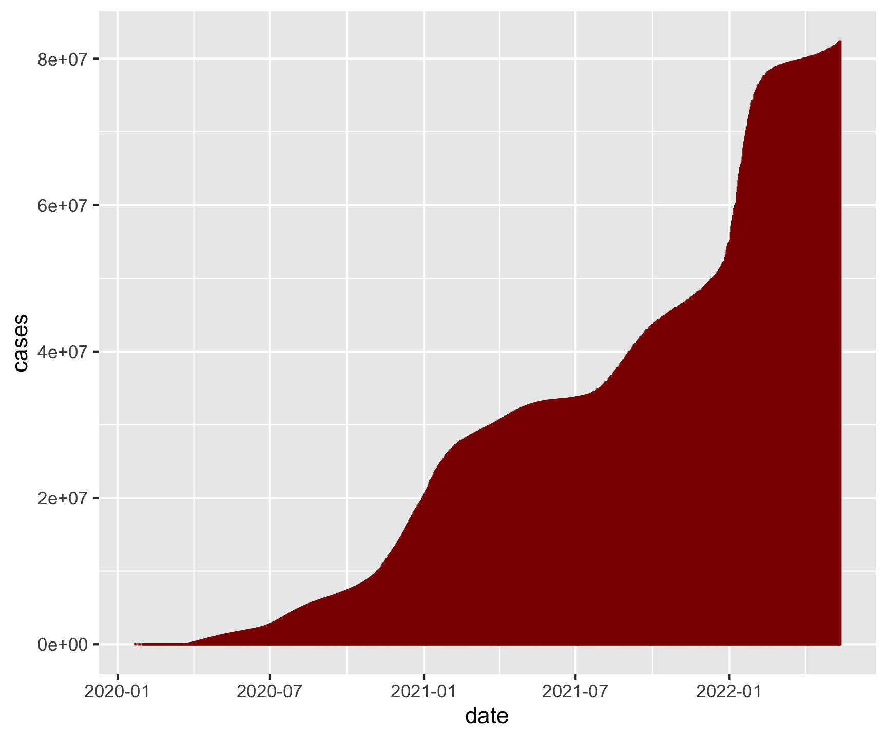
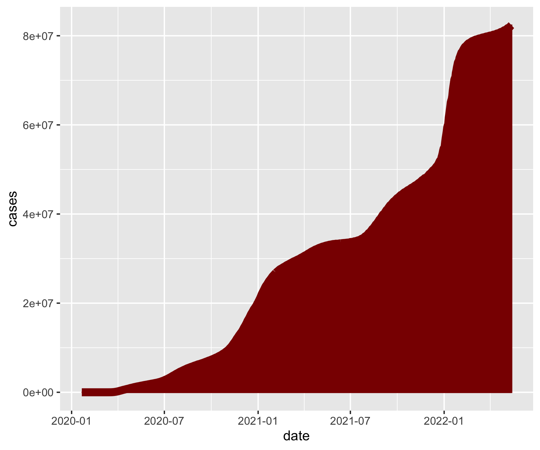
Make a column plot (geom_col) of daily total cases in the USA. Your X axis should be the date and the y axis cases.
library(tidyverse)url <-'https://raw.githubusercontent.com/nytimes/covid-19-data/master/us-counties.csv'covid <-read_csv(url)head(covid)# A tibble: 6 × 6 date county state fips cases deaths<date><chr><chr><chr><dbl><dbl>12020-01-21 Snohomish Washington 530611022020-01-22 Snohomish Washington 530611032020-01-23 Snohomish Washington 530611042020-01-24 Cook Illinois 170311052020-01-24 Snohomish Washington 530611062020-01-25 Orange California 0605910
Question 1: Close…
covid
# A tibble: 2,502,832 × 6
   date       county      state      fips  cases deaths
   <date>     <chr>       <chr>      <chr> <dbl>  <dbl>
 1 2020-01-21 Snohomish   Washington 53061     1      0
 2 2020-01-22 Snohomish   Washington 53061     1      0
 3 2020-01-23 Snohomish   Washington 53061     1      0
 4 2020-01-24 Cook        Illinois   17031     1      0
 5 2020-01-24 Snohomish   Washington 53061     1      0
 6 2020-01-25 Orange      California 06059     1      0
 7 2020-01-25 Cook        Illinois   17031     1      0
 8 2020-01-25 Snohomish   Washington 53061     1      0
 9 2020-01-26 Maricopa    Arizona    04013     1      0
10 2020-01-26 Los Angeles California 06037     1      0
# ℹ 2,502,822 more rows
# A tibble: 4,910 × 3
# Groups:   state [6]
   state      date       cases
   <chr>      <date>     <dbl>
 1 California 2020-01-25     1
 2 California 2020-01-26     2
 3 California 2020-01-27     2
 4 California 2020-01-28     2
 5 California 2020-01-29     2
 6 California 2020-01-30     2
 7 California 2020-01-31     3
 8 California 2020-02-01     3
 9 California 2020-02-02     6
10 California 2020-02-03     6
# ℹ 4,900 more rows
# A tibble: 4,910 × 3
   state      date       cases
   <chr>      <date>     <dbl>
 1 California 2020-01-25     1
 2 California 2020-01-26     2
 3 California 2020-01-27     2
 4 California 2020-01-28     2
 5 California 2020-01-29     2
 6 California 2020-01-30     2
 7 California 2020-01-31     3
 8 California 2020-02-01     3
 9 California 2020-02-02     6
10 California 2020-02-03     6
# ℹ 4,900 more rows
There will come a time when you need data from different sources.
When this happens we must join – or merge – multiple tables
Multiple tables of data are called *relational data** because the relations are an equal part of the data
To merge data, we have to find a point of commonality
That point – or attribute – of commonality is the relation
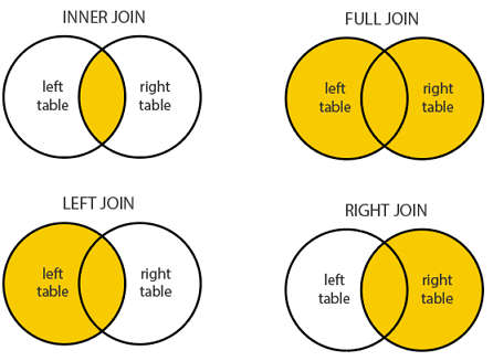
Relational Verbs
To work with relational data we need “verbs” that work with pairs (2) of tables.
Mutating joins: add new variables to one table from matching observations in another.
Filtering joins: filter observations from one table if they match an observation in the other table.
Set operations: treat observations as if they were set elements.
The most common place to find relational data is in a relational database management system (or RDBMS)
Keys
The variables used to connect a pair tables are called keys.
A key is a variable (or set of variables) that uniquely identifies an observation or “unit”.
Sometimes, a single variable is enough…
For example, each county in the USA is uniquely identified by its FIP code.
Each state is unique identified by its name
…
In other cases, multiple variables may be needed.
Keys
There are two types of keys:
Primary keys: uniquely identify observations in its own table.
Foreign keys: uniquely identify observations in another table.
A primary key and a corresponding foreign key form a relation.
Relations are typically one-to-many but can be one-to-one
A quick note on surrogate keys
Sometimes a table doesn’t have an explicit primary key.
If a table lacks a primary key, it’s sometimes useful to add one with mutate() and row_number().
Doing this creates a surrogate key.
gapminder |>slice(1:5) |>mutate(surrogate =row_number())# A tibble: 5 × 7 country continent year lifeExp pop gdpPercap surrogate<fct><fct><int><dbl><int><dbl><int>1 Afghanistan Asia 195228.88425333779.12 Afghanistan Asia 195730.39240934821.23 Afghanistan Asia 196232.010267083853.34 Afghanistan Asia 196734.011537966836.45 Afghanistan Asia 197236.113079460740.5
Today’s Data:
band_members# A tibble: 3 × 2 name band <chr><chr>1 Mick Stones 2 John Beatles3 Paul Beatles
band_instruments# A tibble: 3 × 2 name plays <chr><chr>1 John guitar2 Paul bass 3 Keith guitar
Mutating Joins
Mutating Joins add new variables to one table from matching observations in another.
1. Inner Join
inner_join(x, y): Return all rows from x where there are matching values in y, and all columns from x and y.
If there are multiple matches between x and y, all combination of the matches are returned. This is a mutating join.
name
band
Mick
Stones
John
Beatles
Paul
Beatles
name
plays
John
guitar
Paul
bass
Keith
guitar
inner_join(band_members, band_instruments, by = “name”)
name
band
Mick
Stones
John
Beatles
Paul
Beatles
name
plays
John
guitar
Paul
bass
Keith
guitar
name
band
plays
John
Beatles
guitar
Paul
Beatles
bass
2. Left Join
left_join(x, y): Return all rows from x, and all columns from x and y.
If there are multiple matches between x and y, all combination of the matches are returned.
name
band
Mick
Stones
John
Beatles
Paul
Beatles
name
plays
John
guitar
Paul
bass
Keith
guitar
left_join(band_members, band_instruments, by = “name”)
name
band
Mick
Stones
John
Beatles
Paul
Beatles
name
plays
John
guitar
Paul
bass
Keith
guitar
name
band
plays
Mick
Stones
NA
John
Beatles
guitar
Paul
Beatles
bass
3. Right Join
right_join(x, y): Return all rows from x where there are matching values in y, and all columns from x and y.
If there are multiple matches between x and y, all combination of the matches are returned.
name
band
Mick
Stones
John
Beatles
Paul
Beatles
name
plays
John
guitar
Paul
bass
Keith
guitar
right_join(band_members, band_instruments, by = “name”)
name
band
Mick
Stones
John
Beatles
Paul
Beatles
name
plays
John
guitar
Paul
bass
Keith
guitar
name
band
plays
John
Beatles
guitar
Paul
Beatles
bass
Keith
NA
guitar
4. Full Join
full_join(x, y): Return all rows and columns from both x and y.
name
band
Mick
Stones
John
Beatles
Paul
Beatles
name
plays
John
guitar
Paul
bass
Keith
guitar
full_join(band_members, band_instruments, by = “name”)
name
band
Mick
Stones
John
Beatles
Paul
Beatles
name
plays
John
guitar
Paul
bass
Keith
guitar
name
band
plays
Mick
Stones
NA
John
Beatles
guitar
Paul
Beatles
bass
Keith
NA
guitar
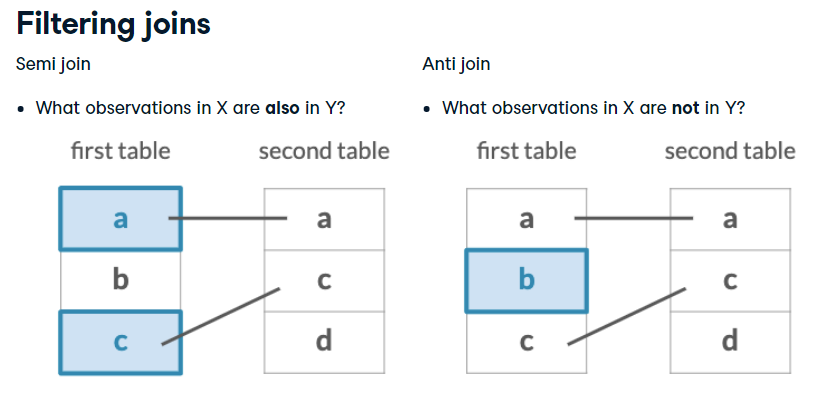
Filtering Joins
“Filtering” joins keep cases from the LHS that have a defined relation from the RHS
Keeps or removes observations from the first table
Doesn’t add new variables
Semi Join
semi_join(x, y): Return all rows from x where there are matching values in _ y_, keeping just columns from x.
name
band
Mick
Stones
John
Beatles
Paul
Beatles
name
plays
John
guitar
Paul
bass
Keith
guitar
semi_join(band_members, band_instruments, by = “name”)
name
band
Mick
Stones
John
Beatles
Paul
Beatles
name
plays
John
guitar
Paul
bass
Keith
guitar
name
band
John
Beatles
Paul
Beatles
Anti Join
anti_join(x, y): Return all rows from x where there are not matching values in y, keeping just columns from x.
name
band
Mick
Stones
John
Beatles
Paul
Beatles
name
plays
John
guitar
Paul
bass
Keith
guitar
anti_join(band_members, band_instruments, by = “name”)
name
band
Mick
Stones
John
Beatles
Paul
Beatles
name
plays
John
guitar
Paul
bass
Keith
guitar
name
band
Mick
Stones
When keys dont share a name
(band_members2 = band_members |>select(first_name = name, band))# A tibble: 3 × 2 first_name band <chr><chr>1 Mick Stones 2 John Beatles3 Paul Beatles
inner_join(band_members2, band_instruments, by =c('first_name'='name'))# A tibble: 2 × 3 first_name band plays <chr><chr><chr>1 John Beatles guitar2 Paul Beatles bass
Return to the COVID example!
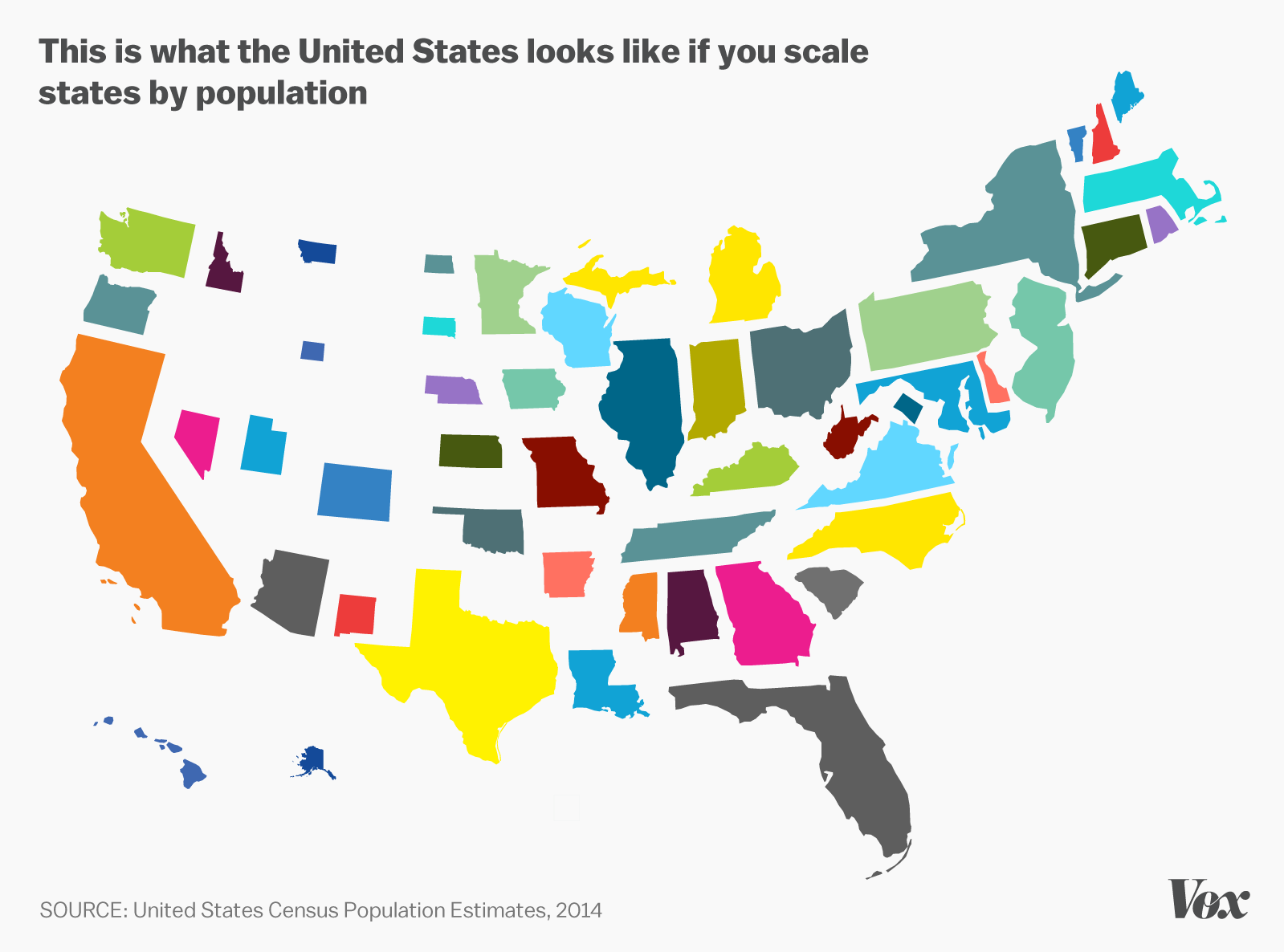
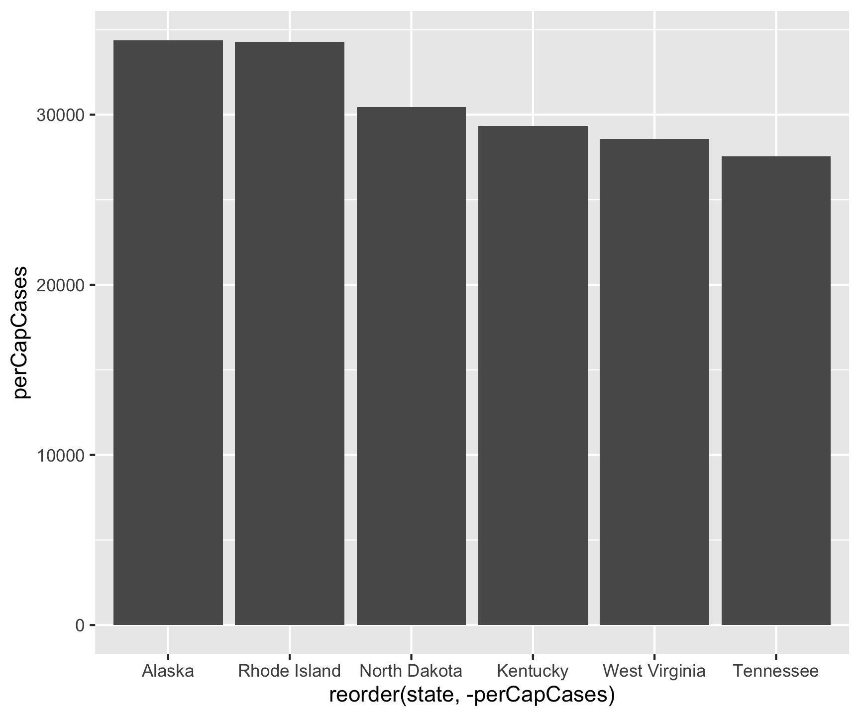
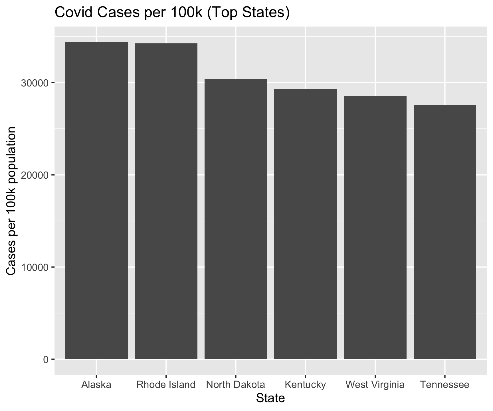
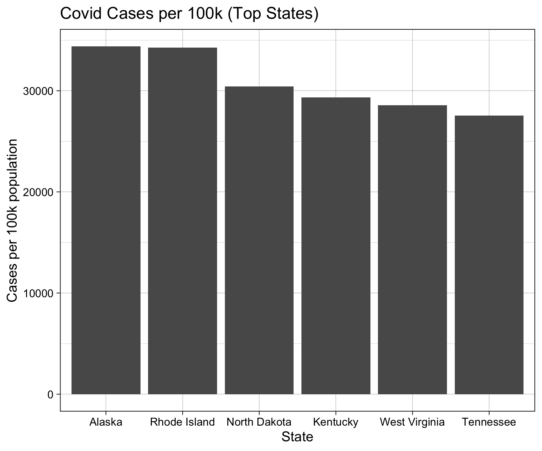
So far, we’ve looked at raw COVID counts. With a lot of data, raw counts are very misleading
For example does comparing the total cases in California really compare to total cases in Rhode Island given the difference in population?
Here is a perfect example of time when multiple datasets are needed to best answer a question!
Population data
The U.S. Census is the primary agency tasked with understanding our population
# A tibble: 66 × 2
   name                 pop2024
   <chr>                  <dbl>
 1 United States      340110988
 2 Northeast Region    57832935
 3 New England         15386085
 4 Middle Atlantic     42446850
 5 Midwest Region      69596584
 6 East North Central  47619171
 7 West North Central  21977413
 8 South Region       132665693
 9 South Atlantic      69676509
10 East South Central  19916866
# ℹ 56 more rows
# A tibble: 66 × 3
   name                 pop2024 pop2024_per100k
   <chr>                  <dbl>           <dbl>
 1 United States      340110988           3401.
 2 Northeast Region    57832935            578.
 3 New England         15386085            154.
 4 Middle Atlantic     42446850            424.
 5 Midwest Region      69596584            696.
 6 East North Central  47619171            476.
 7 West North Central  21977413            220.
 8 South Region       132665693           1327.
 9 South Atlantic      69676509            697.
10 East South Central  19916866            199.
# ℹ 56 more rows
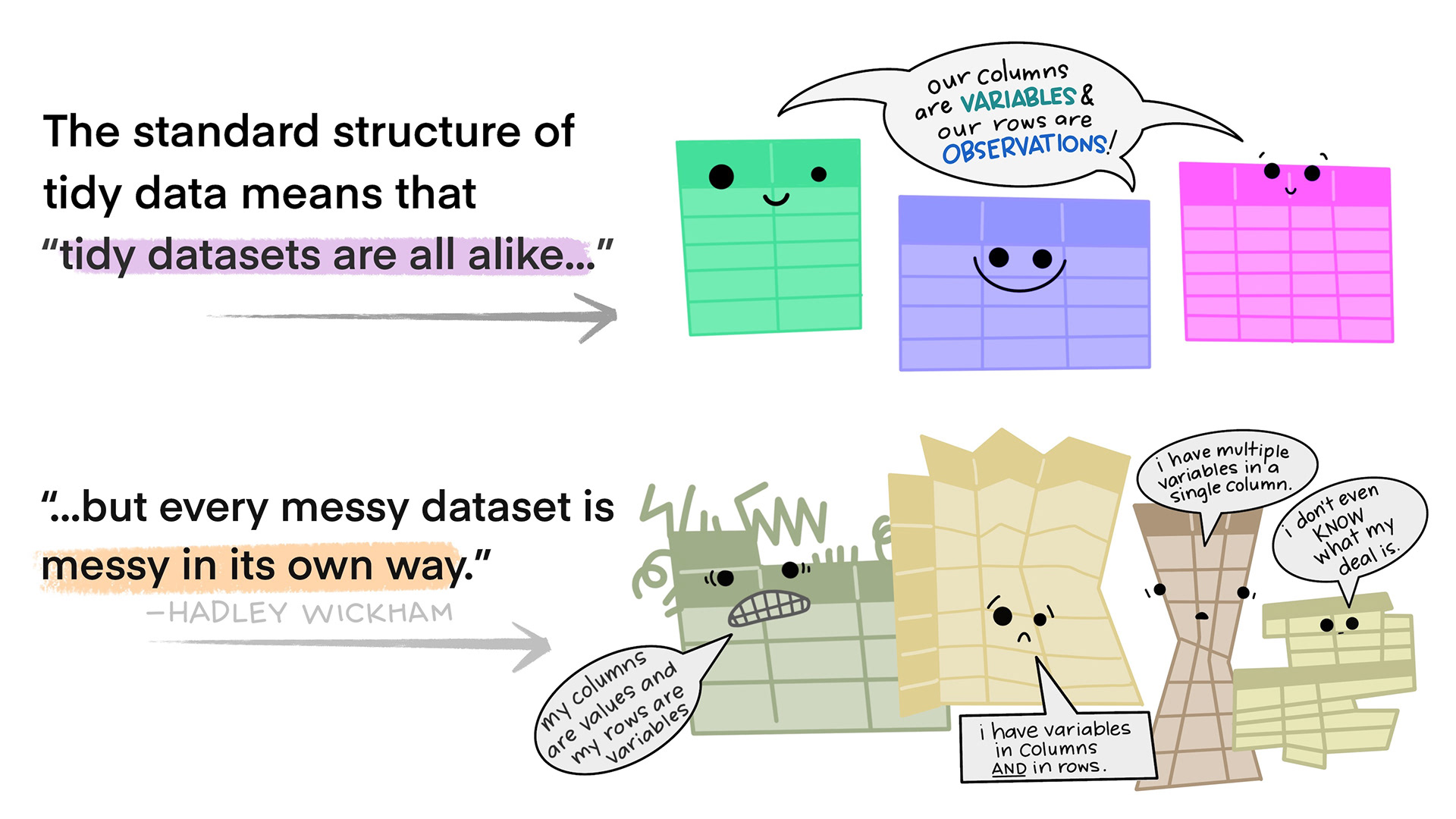
These are all representations of the same underlying data, but they are not equally easy to use. One dataset, the tidy dataset, will be much easier to work with inside the tidyverse.
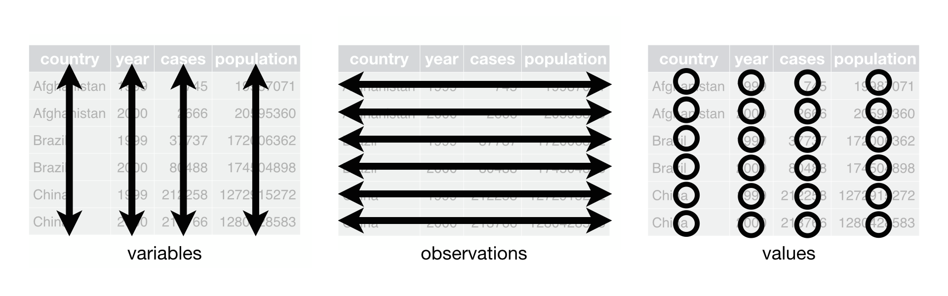
Tidy data demands three interrelated rules
Each variable must have its own column.
Each observation must have its own row.
Each value must have its own cell.
It’s impossible to only satisfy \(2/3\) so … an simpler guideline:
Put each dataset in a tibble.
Put each variable in a column.
BUT … the world is messy …
For most real problems, you’ll need to do some cleaning/tidying …
Once you understand what data you have, you typically have to resolve one of two common issues:
One variable might be spread across multiple columns.
One observation might be scattered across multiple rows.
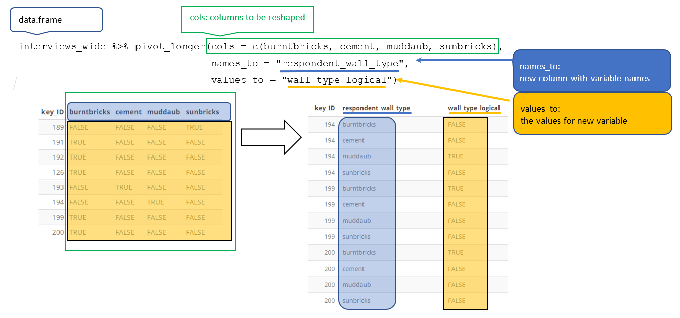
To fix these, we look at the tidyr package (within the tidyverse)
We use it to solve the opposite problem… when an observation is scattered across multiple rows.
table_long# A tibble: 8 × 4 country year type value<fct><int><chr><dbl>1 Brazil 1952 lifeExp 50.92 Brazil 1952 gdpPercap 2109.3 Brazil 2007 lifeExp 72.44 Brazil 2007 gdpPercap 9066.5 India 1952 lifeExp 37.46 India 1952 gdpPercap 547.7 India 2007 lifeExp 64.78 India 2007 gdpPercap 2452.
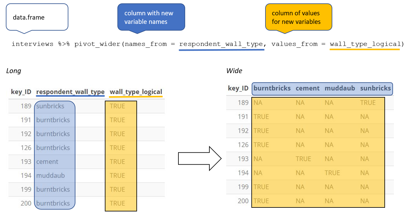
Wider (and shorter)
To allow an variable to become a set of columns, we need to pivot the data making the data wider and shorter
To do this we use tidyr::pivot_wider()
Wider
table_long# A tibble: 8 × 4 country year type value<fct><int><chr><dbl>1 Brazil 1952 lifeExp 50.92 Brazil 1952 gdpPercap 2109.3 Brazil 2007 lifeExp 72.44 Brazil 2007 gdpPercap 9066.5 India 1952 lifeExp 37.46 India 1952 gdpPercap 547.7 India 2007 lifeExp 64.78 India 2007 gdpPercap 2452.
table_long |>pivot_wider(names_from = type, values_from = value)# A tibble: 4 × 4 country year lifeExp gdpPercap<fct><int><dbl><dbl>1 Brazil 195250.92109.2 Brazil 200772.49066.3 India 195237.4547.4 India 200764.72452.
Example
Remember the idea of “binding”? Where a set of values are “bound” to a name?
You job: - Always consider what - for your analysis - is a name and what is data
Often your needs don’t match the way data was collected/curated by others!
Your needs can range dramatically within a workflow as well
What needs to be manipulated?
How do you establish keys?
What is needed for visualization?
…
Example
Wide
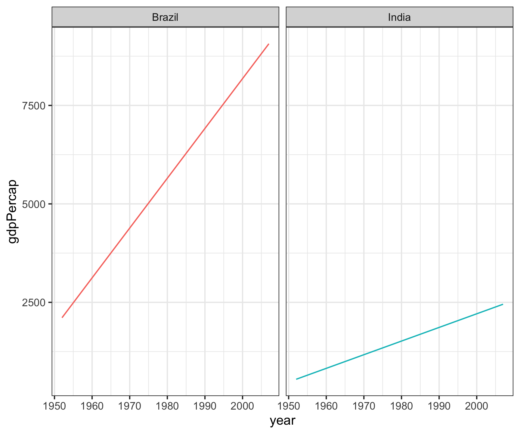
# All country/Year/GDP combinations are unique rowstable_wide# A tibble: 4 × 4 country year lifeExp gdpPercap<fct><int><dbl><dbl>1 Brazil 195250.92109.2 Brazil 200772.49066.3 India 195237.4547.4 India 200764.72452.table_wide |>ggplot(aes(x = year, y = gdpPercap)) +geom_line(aes(color = country)) +facet_wrap(~country) +theme_bw() +theme(legend.position ="none")
Long
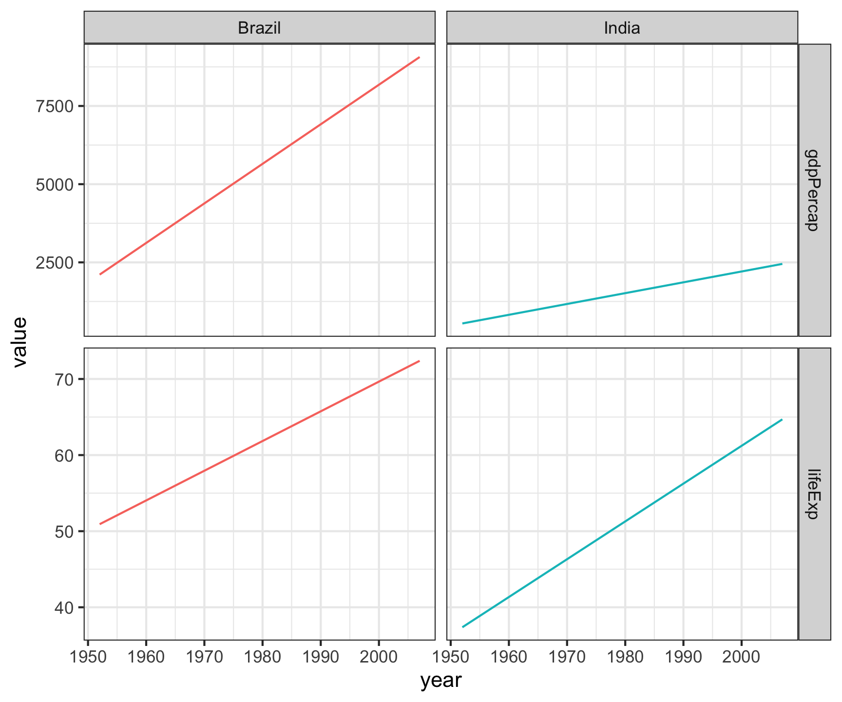
# All country/Year/LifeExp/GDP combinations are unique rowstable_long# A tibble: 8 × 4 country year type value<fct><int><chr><dbl>1 Brazil 1952 lifeExp 50.92 Brazil 1952 gdpPercap 2109.3 Brazil 2007 lifeExp 72.44 Brazil 2007 gdpPercap 9066.5 India 1952 lifeExp 37.46 India 1952 gdpPercap 547.7 India 2007 lifeExp 64.78 India 2007 gdpPercap 2452.table_long |>ggplot(aes(x = year, y = value)) +geom_line(aes(color = country)) +facet_grid(type~country, scales ="free_y") +theme_bw() +theme(legend.position ="none")
Pivot within workflow…
gapminder
# A tibble: 1,704 × 6
   country     continent  year lifeExp      pop gdpPercap
   <fct>       <fct>     <int>   <dbl>    <int>     <dbl>
 1 Afghanistan Asia       1952    28.8  8425333      779.
 2 Afghanistan Asia       1957    30.3  9240934      821.
 3 Afghanistan Asia       1962    32.0 10267083      853.
 4 Afghanistan Asia       1967    34.0 11537966      836.
 5 Afghanistan Asia       1972    36.1 13079460      740.
 6 Afghanistan Asia       1977    38.4 14880372      786.
 7 Afghanistan Asia       1982    39.9 12881816      978.
 8 Afghanistan Asia       1987    40.8 13867957      852.
 9 Afghanistan Asia       1992    41.7 16317921      649.
10 Afghanistan Asia       1997    41.8 22227415      635.
# ℹ 1,694 more rows
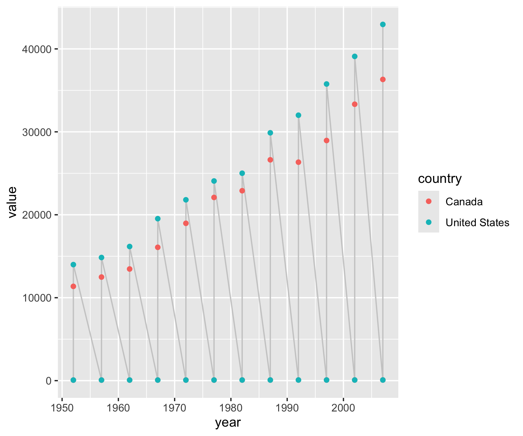
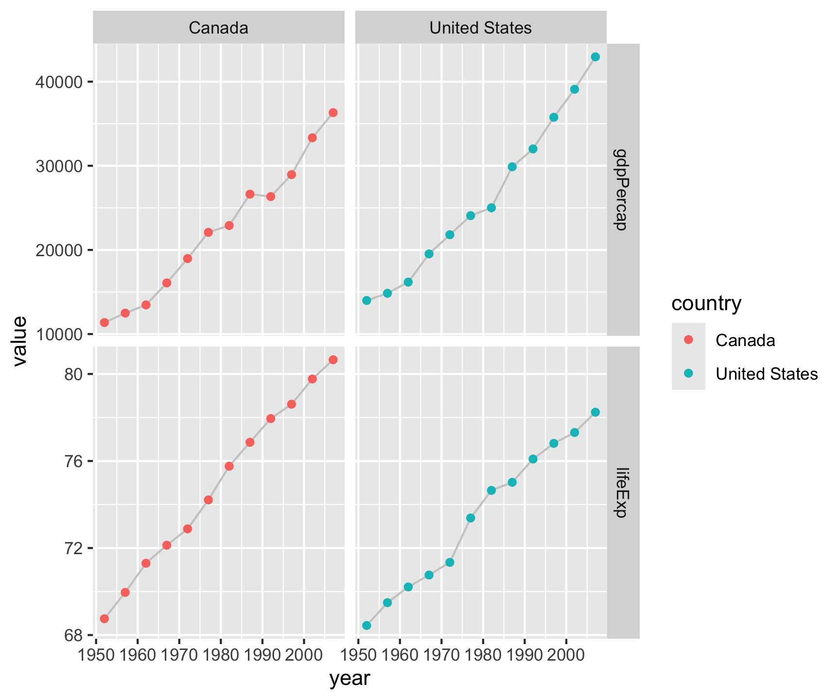
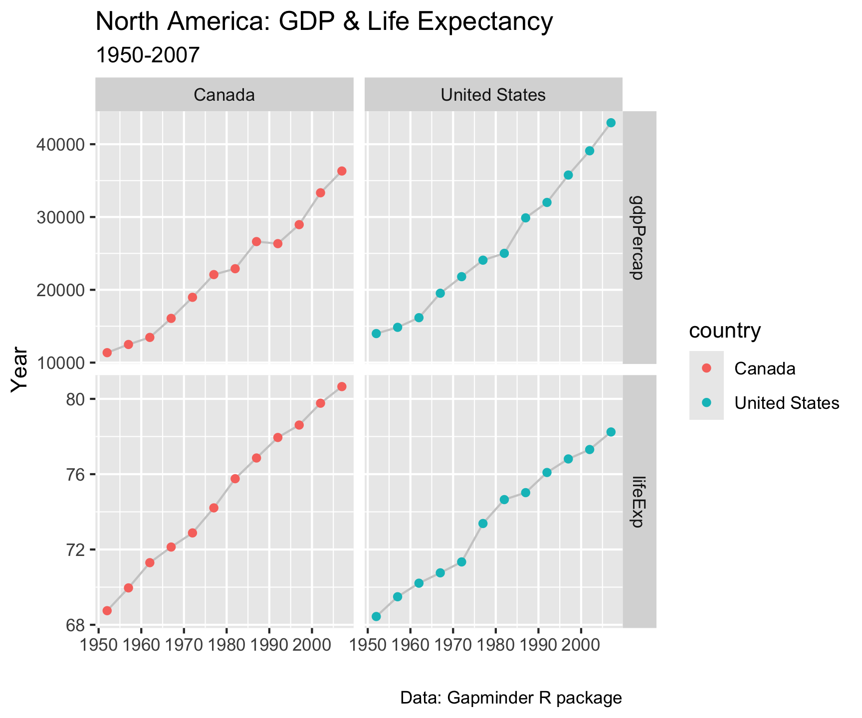
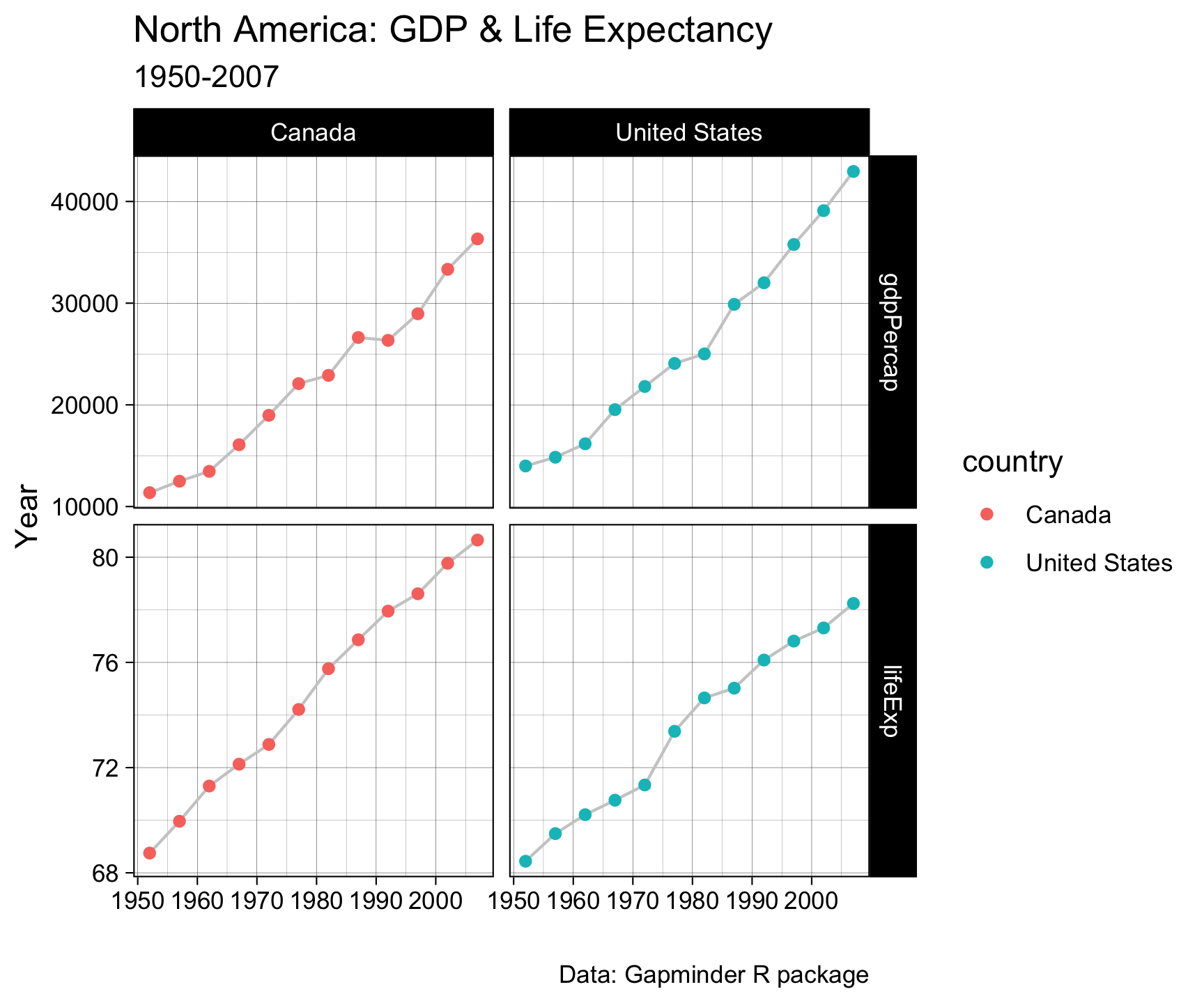
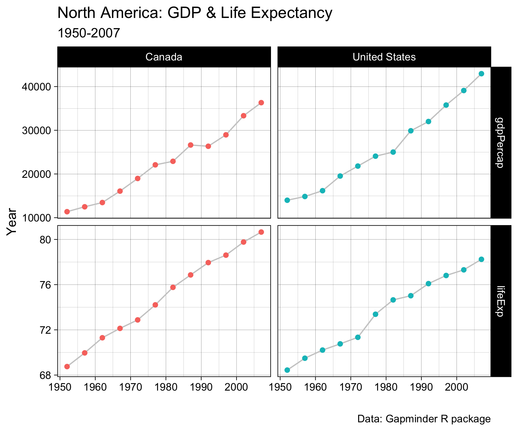
gapminder |>filter(country %in%c("Canada", "United States")) |>select(country, year, lifeExp, gdpPercap) |>pivot_longer(cols =c('lifeExp', 'gdpPercap')) |>ggplot(aes(x = year, y = value)) +geom_line(col ='gray80') +geom_point(aes(col = country)) +facet_grid(name~country, scales ="free_y") +labs(x ="", y ="Year",title ="North America: GDP & Life Expectancy",subtitle ="1950-2007",caption ="Data: Gapminder R package")
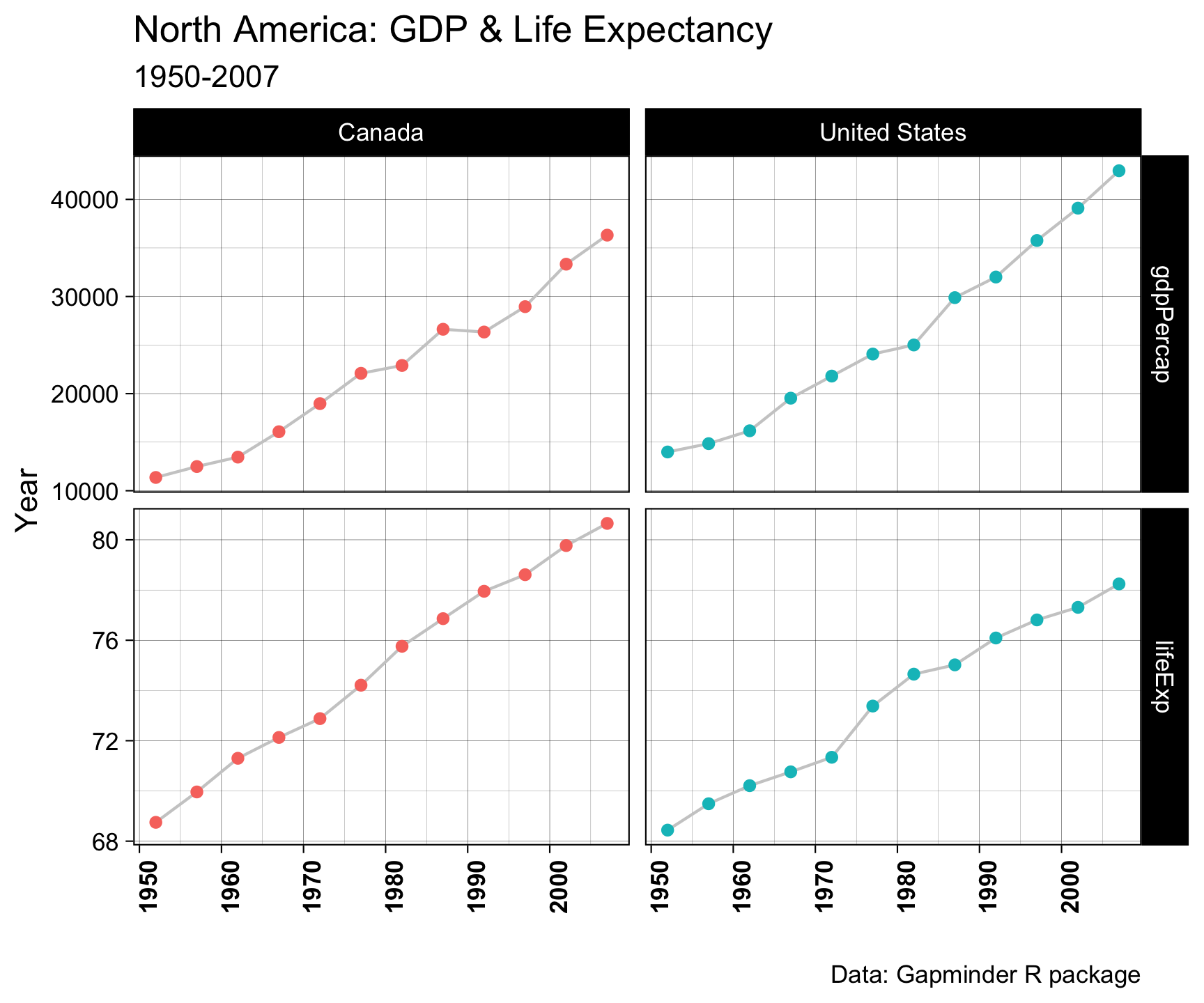
Pivot within workflow…
gapminder |>filter(country %in%c("Canada", "United States")) |>select(country, year, lifeExp, gdpPercap) |>pivot_longer(cols =c('lifeExp', 'gdpPercap')) |>ggplot(aes(x = year, y = value)) +geom_line(col ='gray80') +geom_point(aes(col = country)) +facet_grid(name~country, scales ="free_y") +labs(x ="", y ="Year",title ="North America: GDP & Life Expectancy",subtitle ="1950-2007",caption ="Data: Gapminder R package") +theme_linedraw()
Pivot within workflow…
gapminder |>filter(country %in%c("Canada", "United States")) |>select(country, year, lifeExp, gdpPercap) |>pivot_longer(cols =c('lifeExp', 'gdpPercap')) |>ggplot(aes(x = year, y = value)) +geom_line(col ='gray80') +geom_point(aes(col = country)) +facet_grid(name~country, scales ="free_y") +labs(x ="", y ="Year",title ="North America: GDP & Life Expectancy",subtitle ="1950-2007",caption ="Data: Gapminder R package") +theme_linedraw() +theme(legend.position ="none")
Pivot within workflow…
gapminder |>filter(country %in%c("Canada", "United States")) |>select(country, year, lifeExp, gdpPercap) |>pivot_longer(cols =c('lifeExp', 'gdpPercap')) |>ggplot(aes(x = year, y = value)) +geom_line(col ='gray80') +geom_point(aes(col = country)) +facet_grid(name~country, scales ="free_y") +labs(x ="", y ="Year",title ="North America: GDP & Life Expectancy",subtitle ="1950-2007",caption ="Data: Gapminder R package") +theme_linedraw() +theme(legend.position ="none") +theme(axis.text.x =element_text(angle =90, face ="bold"))
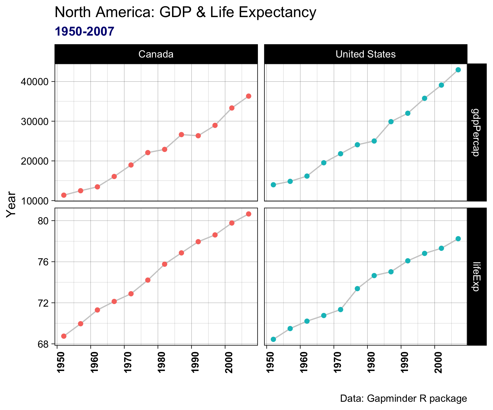
Pivot within workflow…
gapminder |>filter(country %in%c("Canada", "United States")) |>select(country, year, lifeExp, gdpPercap) |>pivot_longer(cols =c('lifeExp', 'gdpPercap')) |>ggplot(aes(x = year, y = value)) +geom_line(col ='gray80') +geom_point(aes(col = country)) +facet_grid(name~country, scales ="free_y") +labs(x ="", y ="Year",title ="North America: GDP & Life Expectancy",subtitle ="1950-2007",caption ="Data: Gapminder R package") +theme_linedraw() +theme(legend.position ="none") +theme(axis.text.x =element_text(angle =90, face ="bold")) +theme(plot.subtitle =element_text(color ="navy", face ="bold"))
Pivot within workflow…
gapminder |>filter(country %in%c("Canada", "United States")) |>select(country, year, lifeExp, gdpPercap) |>pivot_longer(cols =c('lifeExp', 'gdpPercap')) |>ggplot(aes(x = year, y = value)) +geom_line(col ='gray80') +geom_point(aes(col = country)) +facet_grid(name~country, scales ="free_y") +labs(x ="", y ="Year",title ="North America: GDP & Life Expectancy",subtitle ="1950-2007",caption ="Data: Gapminder R package") +theme_linedraw() +theme(legend.position ="none") +theme(axis.text.x =element_text(angle =90, face ="bold")) +theme(plot.subtitle =element_text(color ="navy", face ="bold")) +theme(plot.caption =element_text(color ="gray50", face ="italic"))
Summary
When to Use Long Data?
Easier for aggregation, analysis, and plotting.
Works well with ggplot2 and other tidyverse tools.
Facilitates handling of missing values.
Preferred for repeated measures or time series data.
When to Use Wide Data?
Simpler for certain analyses (e.g., regression models).
Easier to read when dealing with few variables.
Can be easier for sharing datasets with non-technical audiences.
Assignment
In your ess-330-daily-exercises/R directory
Create a new file called day-08.R
Open that file.
Add your name, date, and the purpose of the script as comments (preceded by #)
Assignment
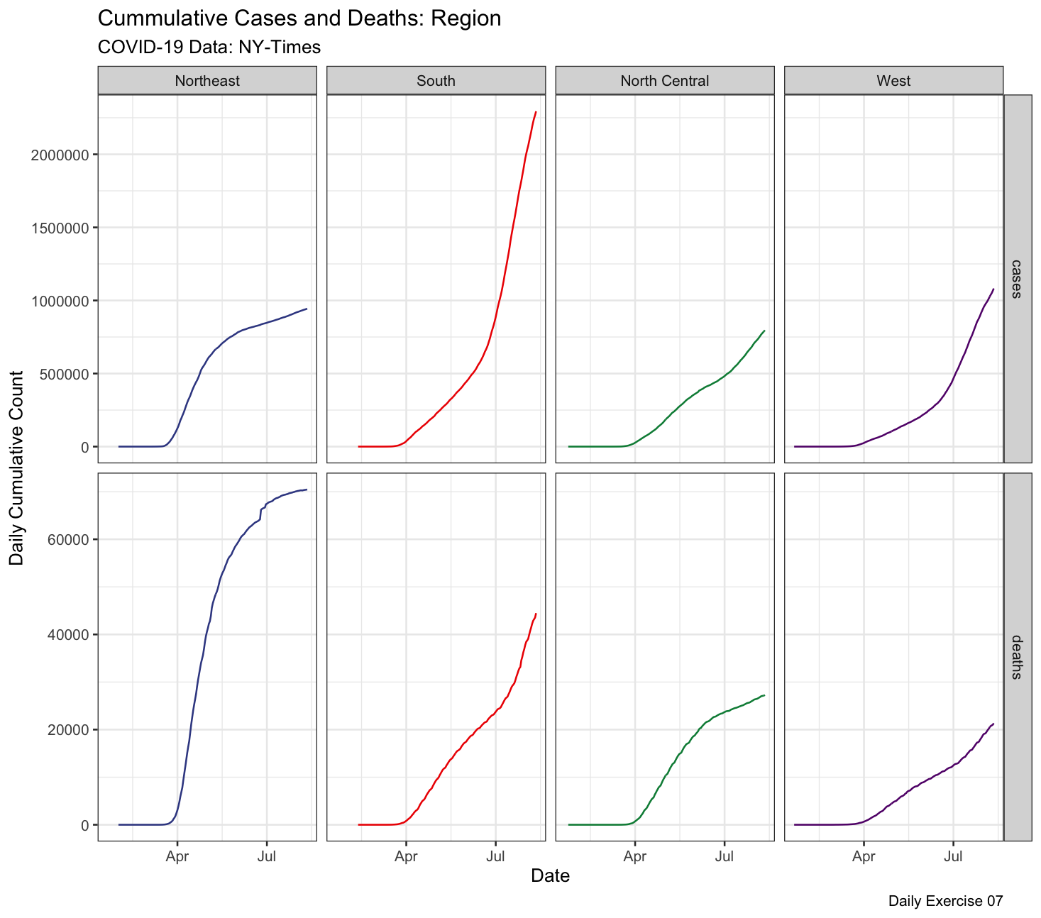
Question 1: Make a faceted plot of the cumulative cases & deaths by USA region. Your x axis should be the date and the y axis value/count. To do this you will need to join and pivot the COVID-19 data.
We can break this task into 7 steps:
Read in the COVID-19 data
Create a new data.frame using the available state.abb, state.name, state.region objects in base R. Be intentional about creating a primary key to match to the COVID data!
df =data.frame(region = state.region, ..., ...)
Join your new data.frame to the raw COVID data. Think about right, inner, left, or full join…
split-apply the joined data to determine the daily, cumulative, cases and deaths for each region
Pivot your data from wide format to long
Plot your data in a compelling way (setup, layers, labels, facets, themes)
Save the image to your img directory with a good file name and extension!
Submission:
Push your work to Github
Turn in your Rscript, image, and repo URL to the Canvas dropbox