Map
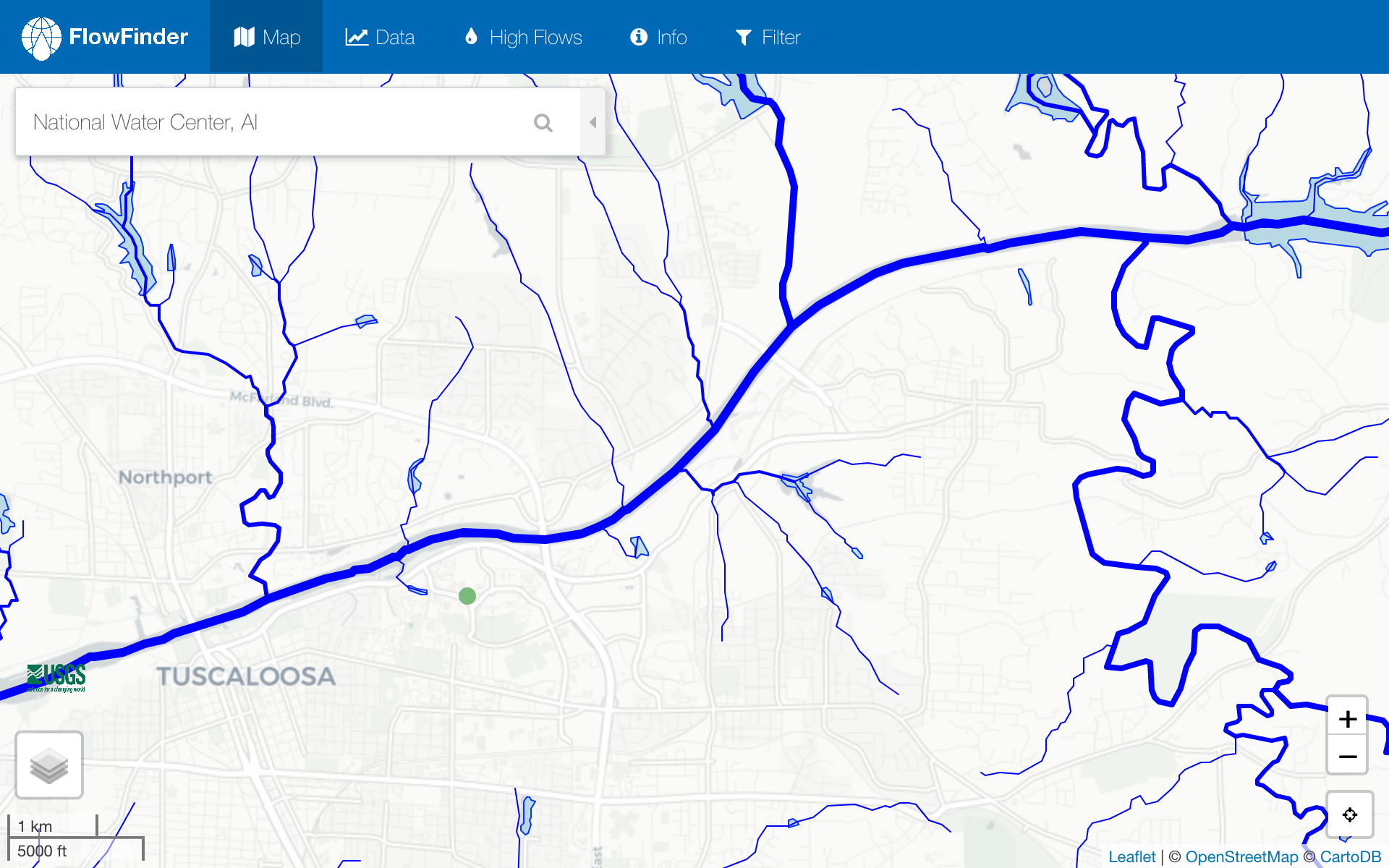
The map tab acts as the landing page for FlowFinder and allows users to define and explore their area of interest (AOI).
Map Tab
Overview
The map tab acts as the landing page for FlowFinder and allows users to define and explore their area of interest (AOI).

Location Navigation:
-
Initial Load — When FlowFiner is initiated, it defaults to one of the following locations in decreasing priority:
- User's geolocation based on the devices location services
- IP-based location (using GeoIPLookup.io)
- National Water Center in Alabama
-
Thereafter — Any of the following can be used to alter the AOI:
-
Search Bar - Locations can be entered in the search bar either via common names or lat/lon pairs:
ColoradoColorado SpringsCostco near UCSB34.4145937 -119.84581949869
- Current Location Button - Moves to a users current location when possible.
-
Search Bar - Locations can be entered in the search bar either via common names or lat/lon pairs:
Area of Interest (AOI)
The area of interest defaults to a 225 square mile reqion centered at the searched location and is distinguished by a red box.
Map Features and Interactability
The map is comprised of several features, each of which can be interacted with by clicking on the element
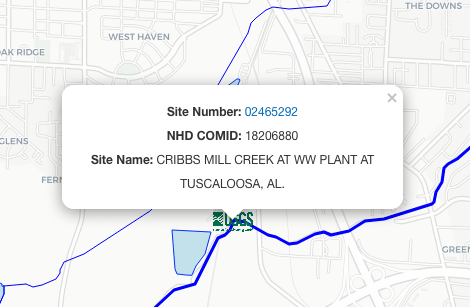
USGS Stations
USGS stations are marked with the USGS logo. The label provides basic information about the station and a link to the stations homepage on waterdata.usgs.gov.
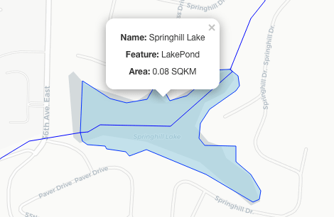
Water Bodies
Water bodies are shaded in blue, clicking on one provides basic information on it.
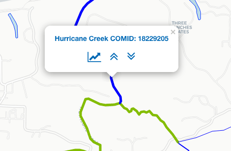
NHD Flowlines
The width of a flowline is determined by its stream order. Clicking on one shows the streams unique COMID and provides buttons to highlight streams directly upstream (green) or downstream (red) as well as switch to the data tab for the stream.
Data
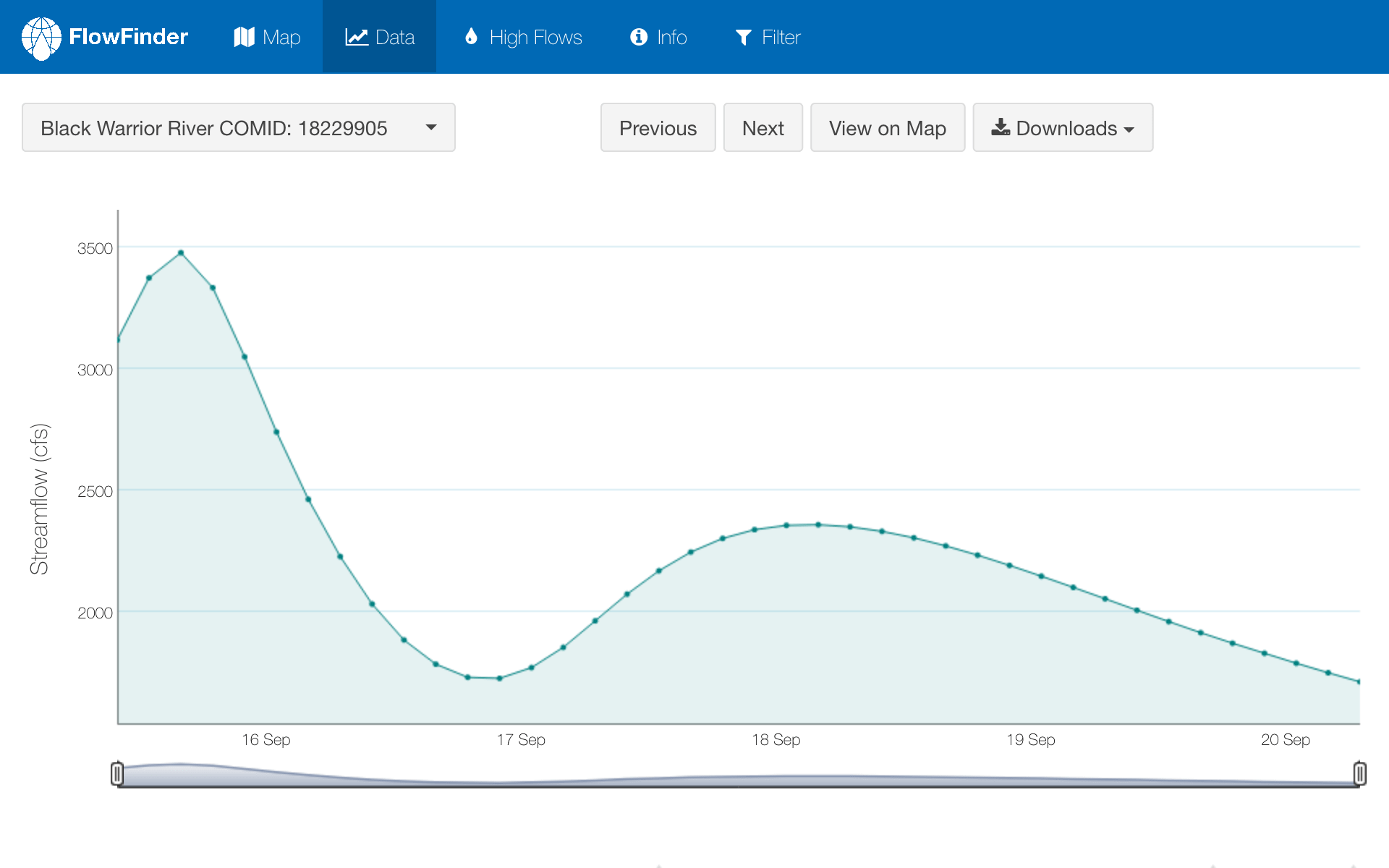
The data tab serves as a location to interact with, view, and download data for one or multiple NHD streams.
Data Tab
Overview
The data tab serves as a location to interact with, view, and download data for one or multiple NHD streams.

Stream Selection
- Initial Selection — If a user selects a stream in the map tab, it will be defaulted to when brought to the data tab. Otherwise, selection defaults to the reach with the highest flow measurement over the five day period.
-
Thereafter — Any of the following can be used to alter the selection:
- Dropdown - The drop down menu can be used to select any number of streams. Blue text indicates reaches with non-zero flows over the five day time period while grayed out text represents reaches with consistent 0 flow.
- Previous/Next Buttons - These buttons can be used to cycle through streams. Only available when one stream is selected.
- Eye Buttons - In the tables below the graph, the eye buttons can be used to switch to one or multiple streams.
Plot
A dygraph is constructed based on the selected stream(s).
Interactability
Hovering hover the graph will display values for each data point in the time series. A region can be zoomed in on either by clicking and dragging over the region of interest on the graph or using the slider below the x-axis.
Additional Data
When only one reach is selected, the following data is also shown when possible:
- A red horizontal line representing the reaches mean monthly flow.
- Behind the plot is a gray shaded bar indicating one standard deviation of the foretasted data.
Data Tables
When one stream is selected, two tables display streams that are up/downstream from the one selected. Eye-icon buttons provide a convenient way to select this streams.

Downloads
Another core task of the Data tab is that ability to download the NHD and flow data as well PNG images and interactive HTML files of the data. Clicking on the ‘Downloads’ button presents the user with a menu of radio buttons. The user can select as many as they like and the selections are downloaded as a zip file. Options for download include:
- A .csv of the flow values (COMID, dateTime (UTC), dataTime local, and flow values (cfs))
- The same data as a RData file
- A shapefile of the NHD flowlines
- A PNG of the flow data time series
- An interactive HTML file of the flow data currently on the plot
- An interactive HTML file of the High Flow Tab
- An interactive HTML file of the Map Tab
High Flows
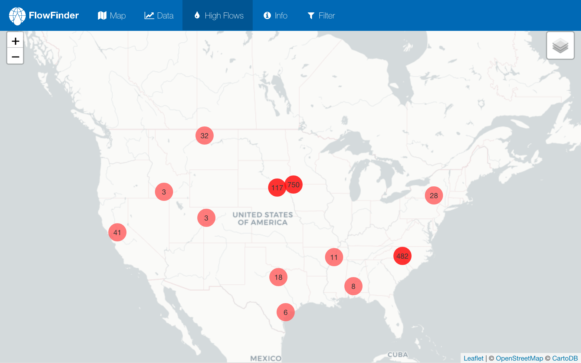
The high flows tab maps and graphs data for streams detected to have a high probability of flooding.
High Flows Tab
Overview
The high flows tab maps and provides data for the 1,500 reaches with the highest percent exceedance from the their monthly average. It therefore serves as basis for flood detection.

Map
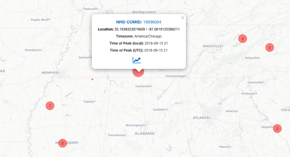
The map uses a modified version of the leaflet clustering function to group reaches at high zoom levels. Hovering over a marker generates a convex hule outlining the points clustered to that area. Double clicking on a marker, or zooming in manually, causes these clusters to dissipate to finer resolution clusters. Zooming in far enough will yield the individual reach markers. Clicking on one of these will prompt a popup window containing the reaches COMID, local time zone, Time of Peak Flow both in local and UTC time, and a button to graph the stream’s flow data.
Plots
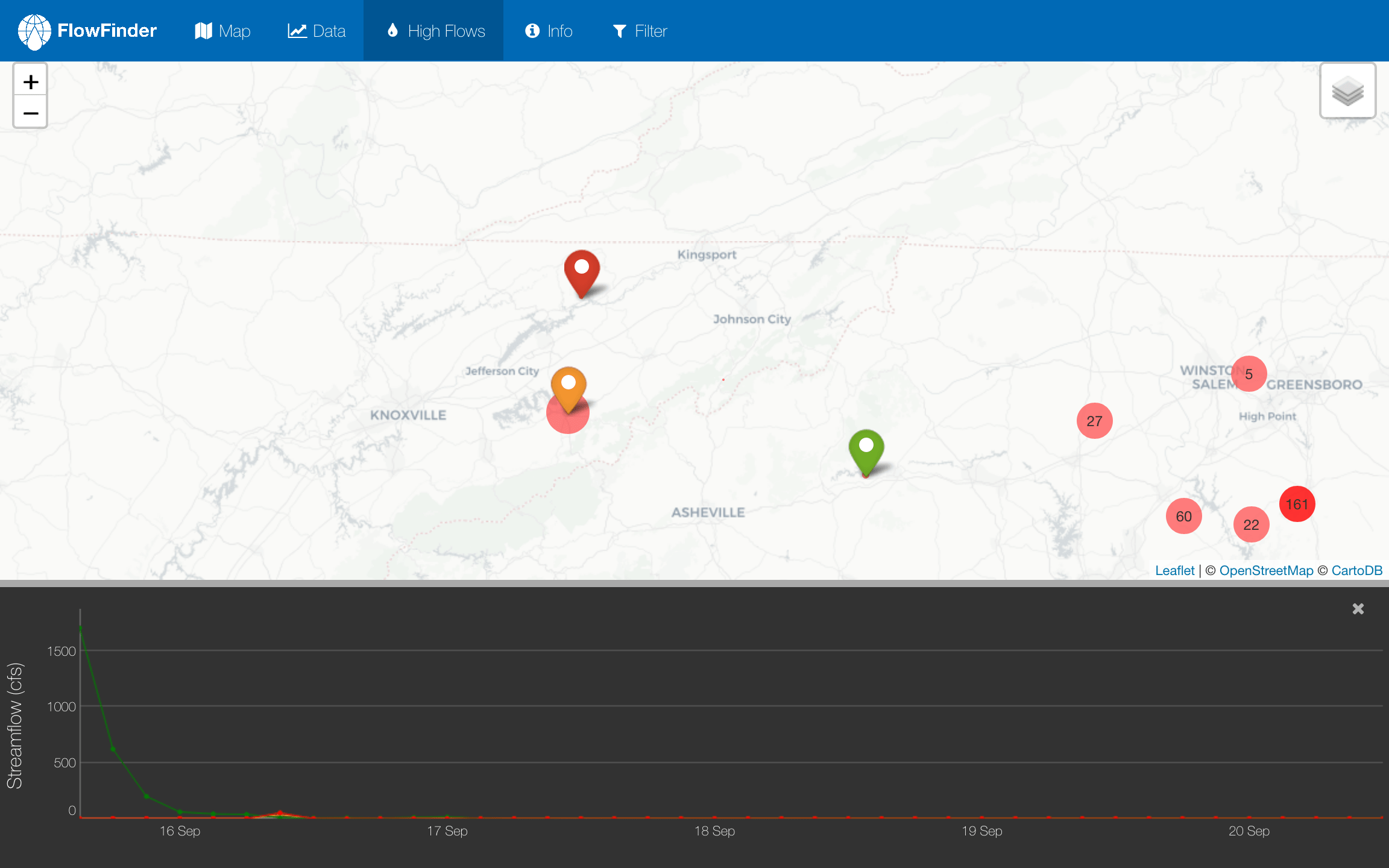
When a user selects a stream to graph, a colored marker will be placed at its location and a dygraph will appear in the bottom portion of the screen. Multiple streams can be plotted, and the marker color will match the color of the data points/line.
Info
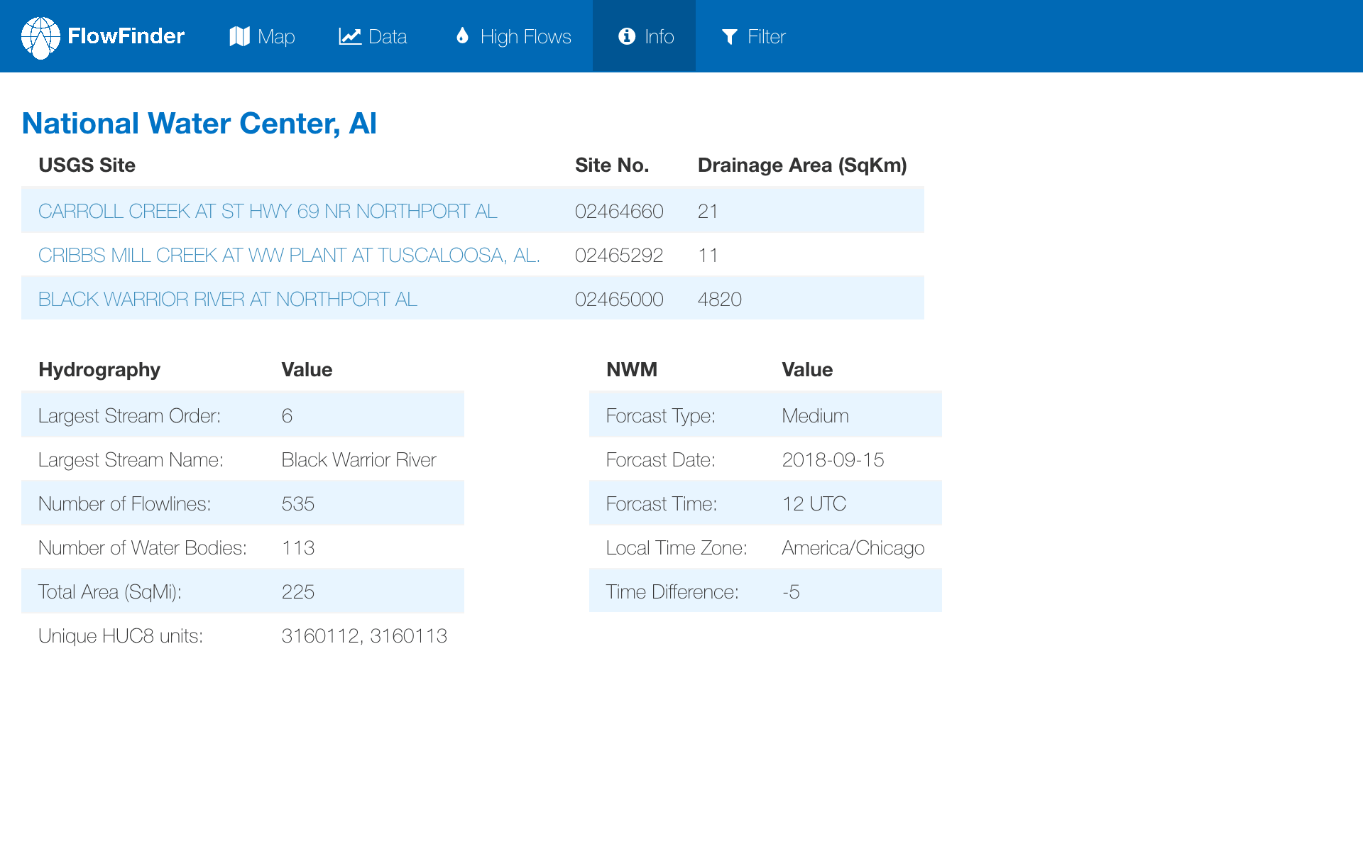
The info tab contains metadata relating to the NHD and USGS networks in the AOI, as well as the NWM data being accessed.
Info Tab
Overview
The info tab which contains tables of metadata relating to the NHD and USGS networks in the AOI, as well as the NWM data being accessed.

Table 1: USGS NWIS Stations
The first table provides information regarding the local USGS NWIS stations - specifically the site name (hyperlinked to the stations unique NWIS web page), site ID, and drainage area.
Table 2: NHD and Hydrologic Network
The second table displays information about the NHD and hydrologic network in the AOI - specifically the name and order of the largest Straler number, the total area (always 225 square miles), the unique HUC8 units intersected and the total number of NHD reaches and water bodies.
Table 3: NWM Data Summary
The last table provides information regarding the NWM Data being displayed including the forecast configuration, date and time of forecast, local time zone and hour offset from UTC.
Filter
The filter tab provides an easy way to filter, vizualize and compare stream data on a large scale.
Filter Tab
Overview
The filter tab provides an easy way to visualize and compare stream data on a large scale and filter results based on unique traits.
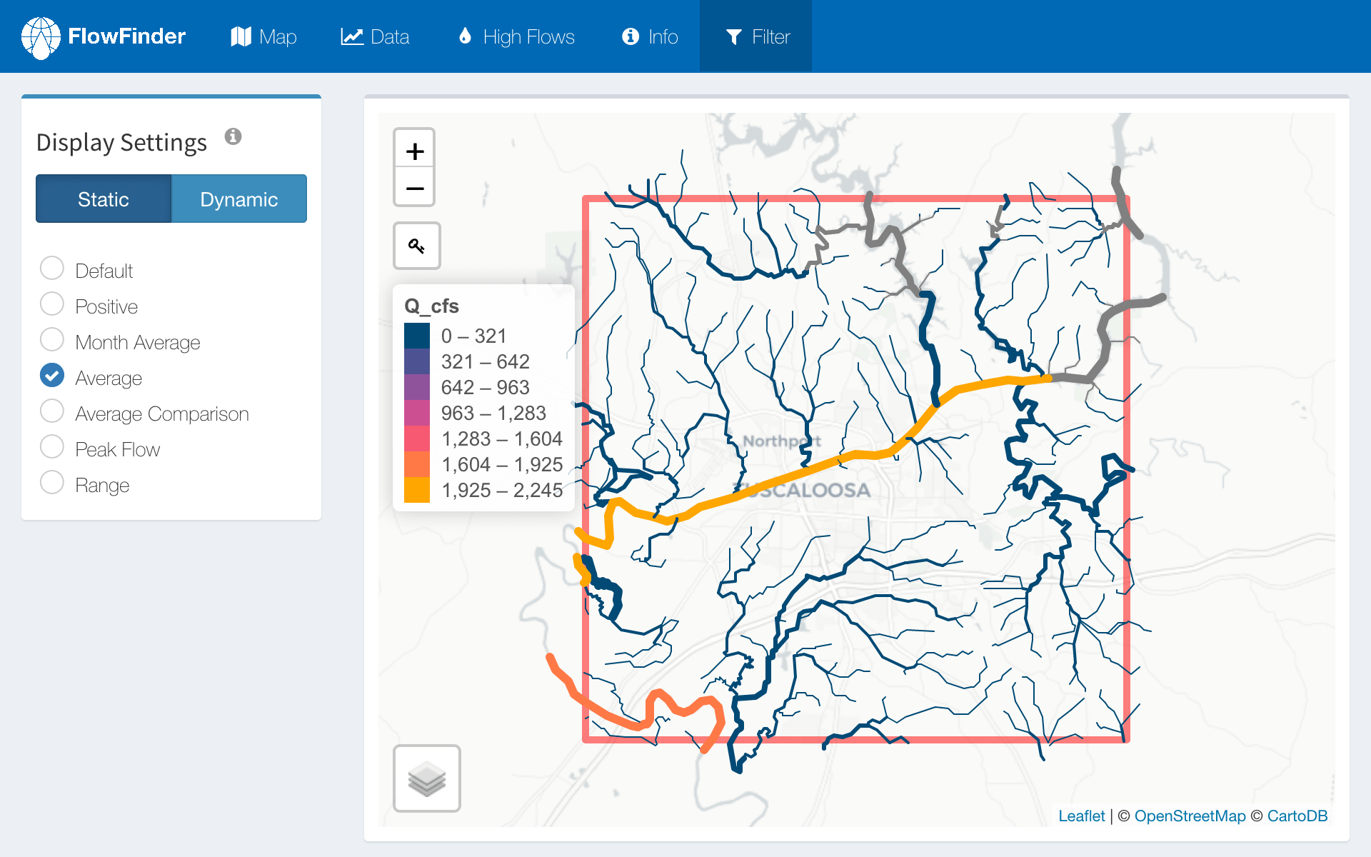
The page layout can be split into three pieces: (1) Display Settings (2) Map (3) Filterable Table.

Display Settings
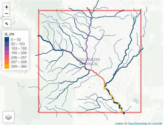
The display settings determine the data/color scheme used to map the NHD flowlines and are grouped into two sections: Static and Dynamic.
- Static options - used to map summary statistics for flow data such as maximums and means
- Dynamic options - used to map data as a function of time and can be looped through as a means of animation
The tables below summarize the what each display settings does, and can also be accessed in the app via the info icon next to the "Display Settings" title.
| Color Scheme | |
|---|---|
| Default | All streams are blue |
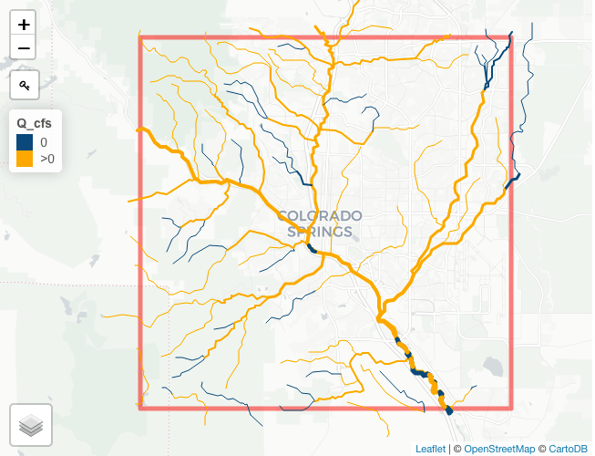
| Positive | Blue: Streams with at least one measured value (Q_cfs) > 0 Grey: Streams with no flow during time range |
| Month Average | *Stream colors are determined by the monthly long term monthly average for each stream |
| Average | *Stream colors are determined by the average stream value during the time range |
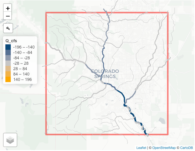
| Average Comparison | *Stream colors are determined by the subtracting the long term average from the current average |
| Peak Flow | *Stream colors are determined by the maximum flow during the time range |
| Range | *Stream colors are determined by subtracting the minimum value during the time range from the maximum |
| Note: | |
| In all cases, stream width is determined by stream order. | |
| * The range of values (Qcfs) are determined, split into 8 equal categories, and mapped to a color palette | |
| Color Scheme | |
|---|---|
| Time Series | *Stream colors are determined by the value during each time step |
| Change | *Stream colors are determined by calculating the change between the current point and the next |
| Positive | Yellow: Streams with at least one measured value (Q_cfs) > 0 Blue: Streams with no flow during time range |
| Note: | |
| In all cases, stream width is determined by stream order. | |
| * The range of values (Qcfs) are determined, split into 8 equal categories, and mapped to a color palette | |
Filterable Table
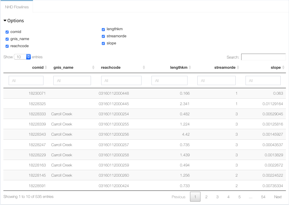
A table is provided that can be used view data for each stream. These attributes can be filtered and only the resulting streams will be mapped.
Options
The following options can be added or removed from the table:
COMIDStream LengthGNIS NameStream OrderReach CodeSlope
Filtering
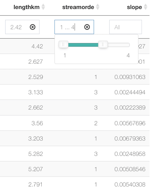
The table can be filtered in two ways:
- Search Bar - The search bar can be used to filter across any column
- Column Filters - Above each column there is a box that can be to filter values. Depending on the data type, you can either enter text or use a slider.
Map
The displayed map is dependent on the display settings and filtered table. In all cases, a legend is shown and stream width is dependent on stream order.
Additional Resources
The following resources maybe of help if you are interested in learning more about the tools and data FlowFinder uses.